Studio · Live site
Web design services that convert.
A studio site people finish on a phone — offer, print, WhatsApp.
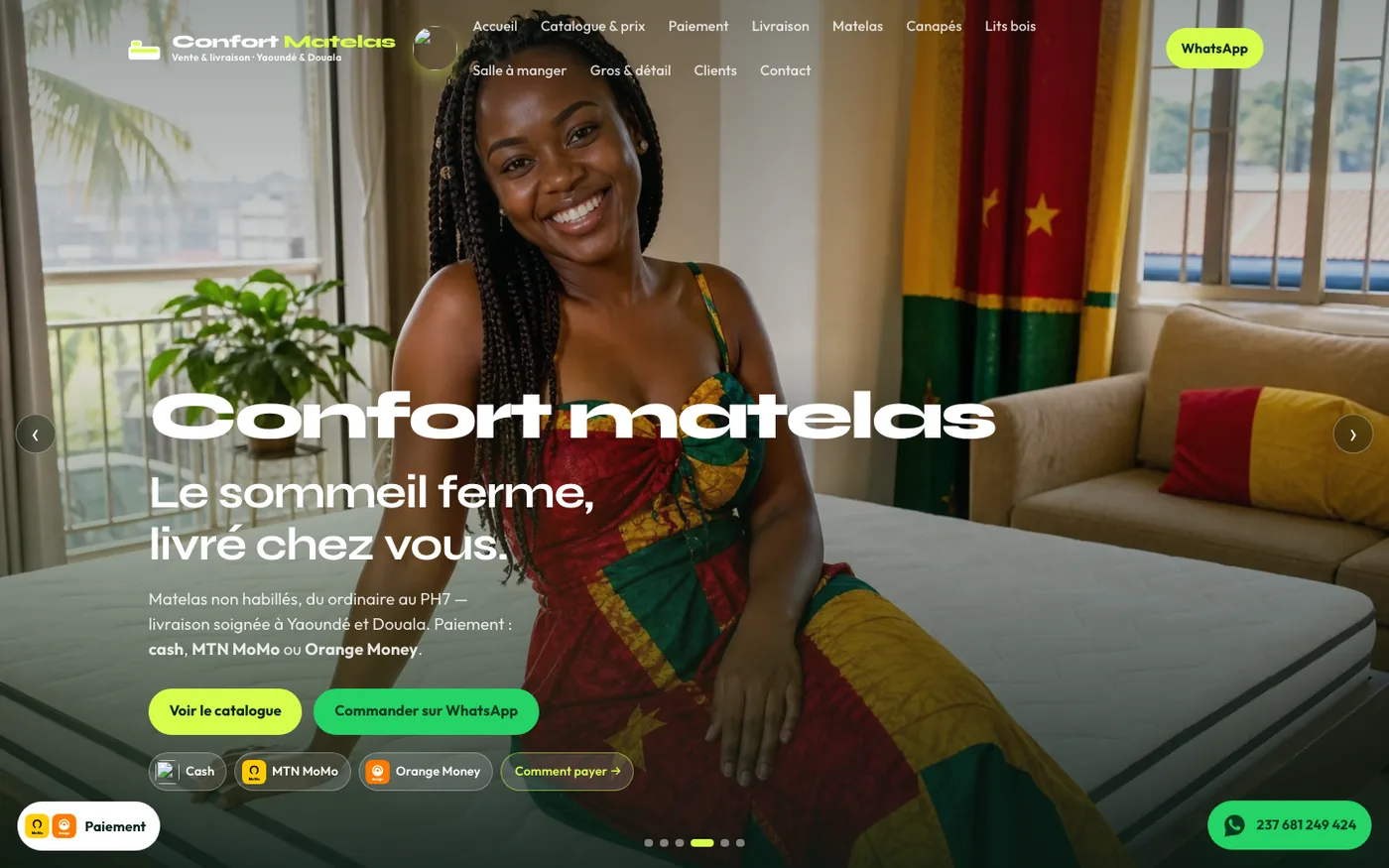
// Websites we built
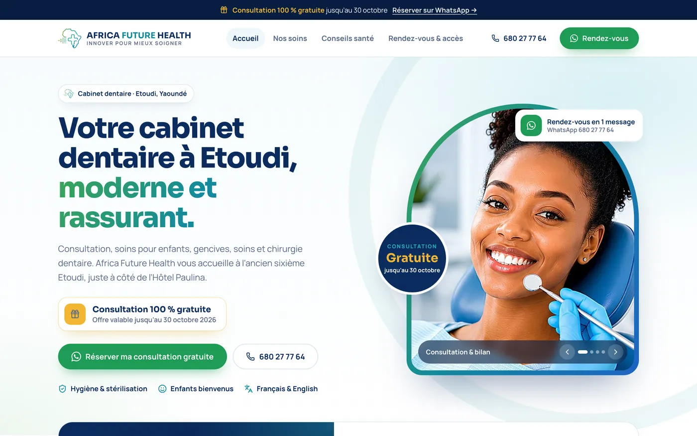
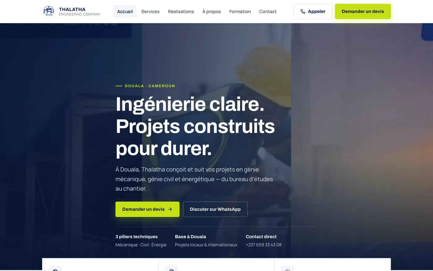
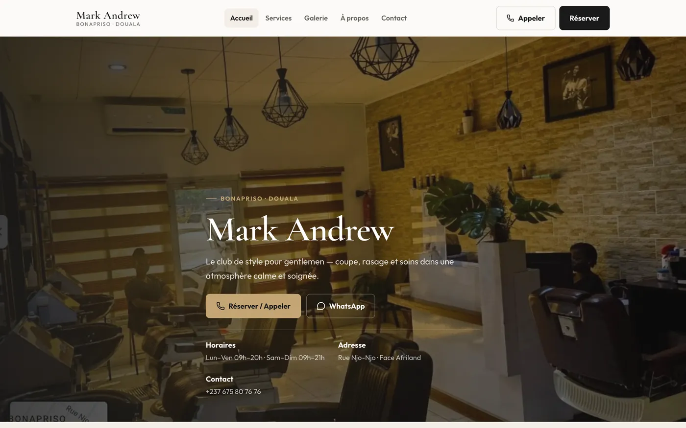
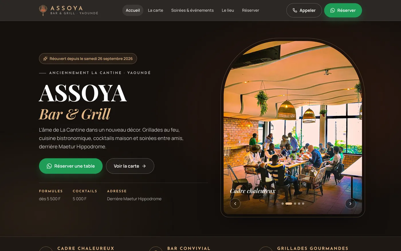
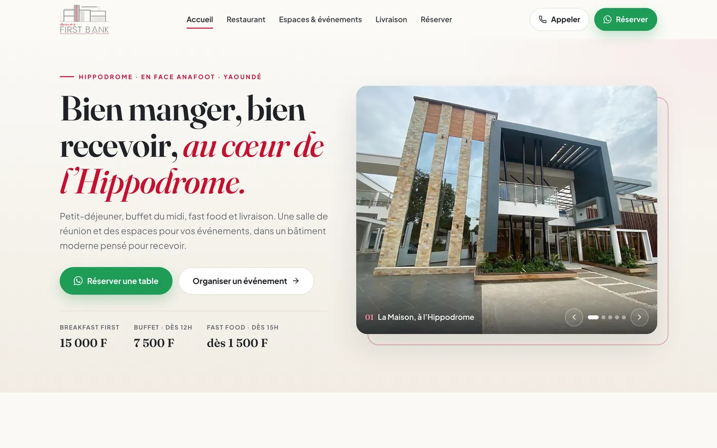
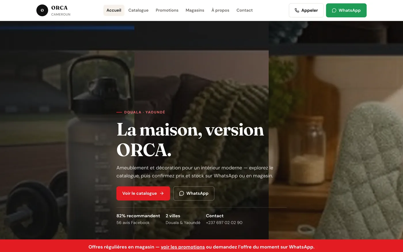
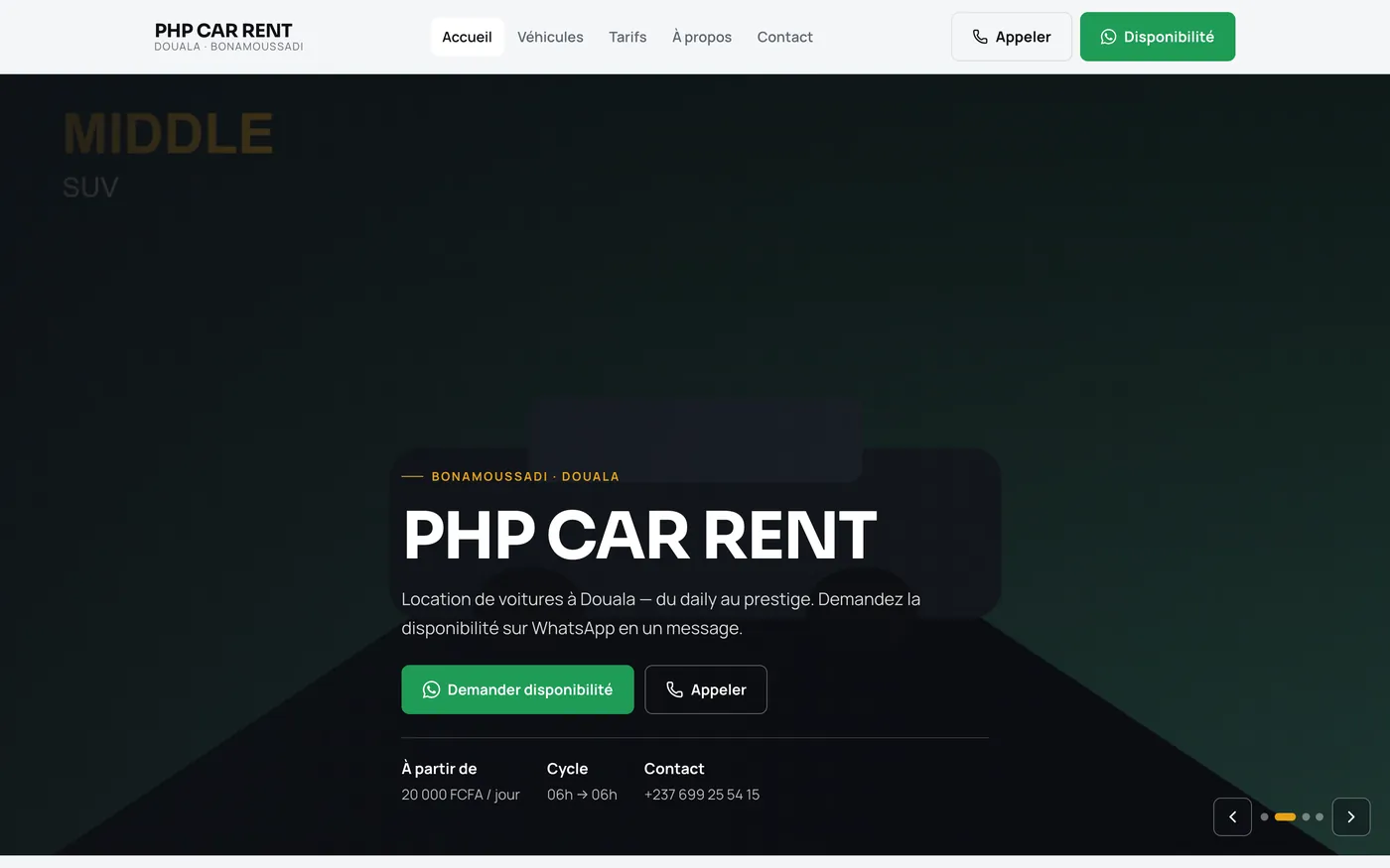
Four websites running for clients today, then the concepts we designed for businesses in Yaoundé and Douala, published as live previews. Every screen opens the real site in a new tab.
// What’s in a site
We build sites people enjoy finishing — on a phone, without a hunt. Classic type. Natural photos. A short path to WhatsApp. The flyer and the stand say the same thing. Starting from $300 — see website prices. Longer version: hire a web designer.
Type, colour and space that feel like the room you already keep. Classic, not trendy. Natural photos. Nothing extra on the page for the sake of looking busy.
Someone is holding a phone in a queue. We make the next tap obvious — and a little pleasant. Fewer steps to enquire, book or buy. Tested on real phones, not a lab.
The site, the flyer and the stand tell one story. Same title, same ask, same tone. Your business feels like one piece, not a pile of files.
Short pages. Clear hierarchy. White space that lets the photo breathe. If it doesn’t help someone finish, it doesn’t go on.
One site that fits a phone, a tablet and a desk without breaking. Most of your clients will never see the desktop version first.
A button that opens a chat already started. Titles and speed search engines can follow — hire SEO when the path already converts.
// Live websites
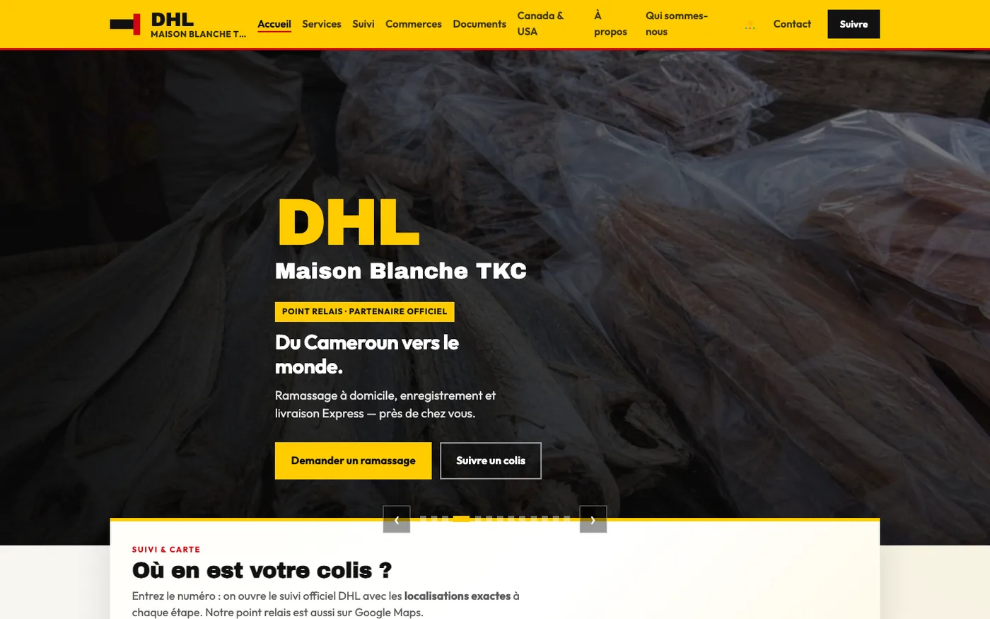
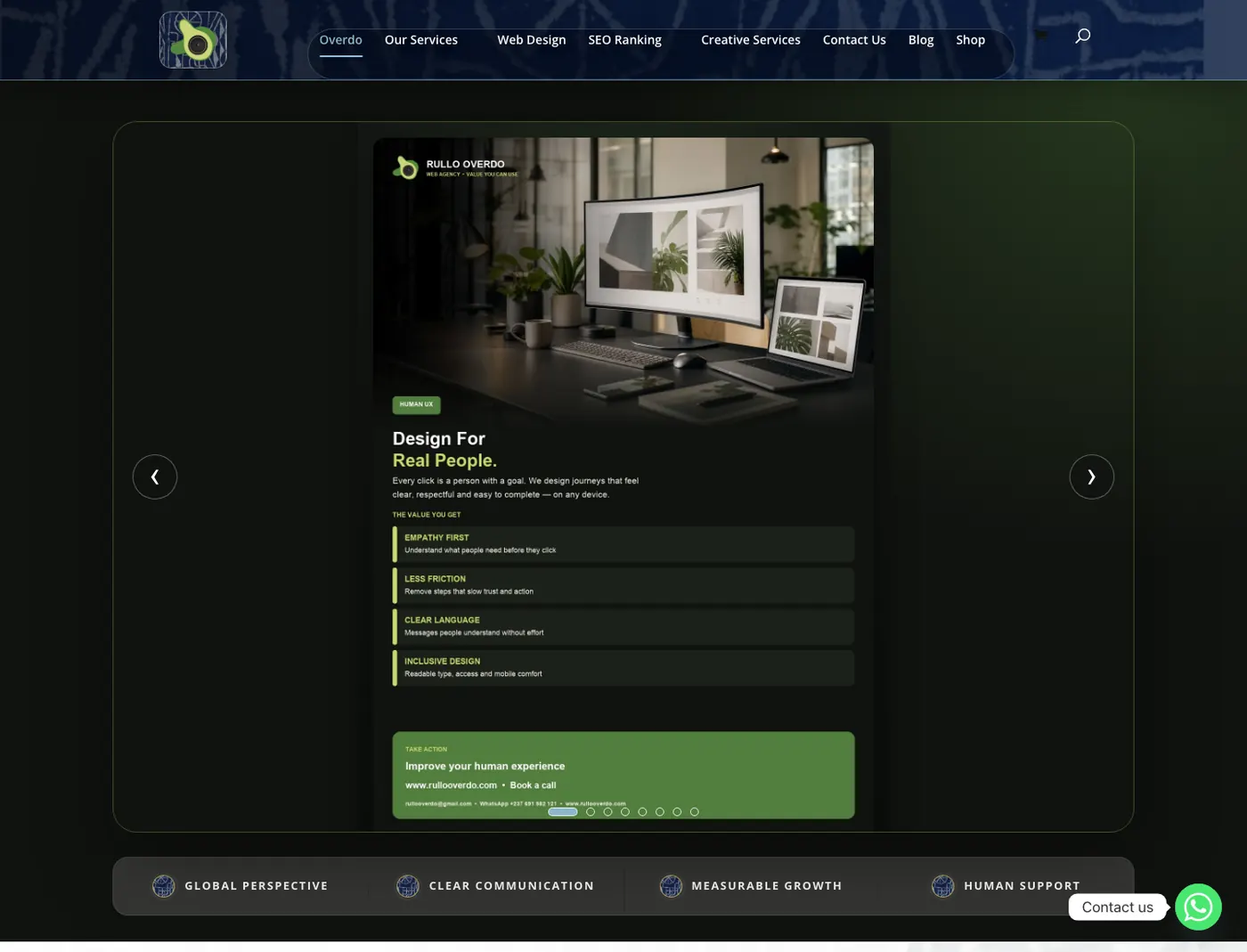
Fashion, logistics, furniture and the studio — tap a case, or open the live URL.
// Sites we build
Open a realistic site for the trades we serve — home, then the page that does the work. Human, minimal, elegant. WhatsApp is the next step. Starting from $300 — website prices.
Sauce · Demo site
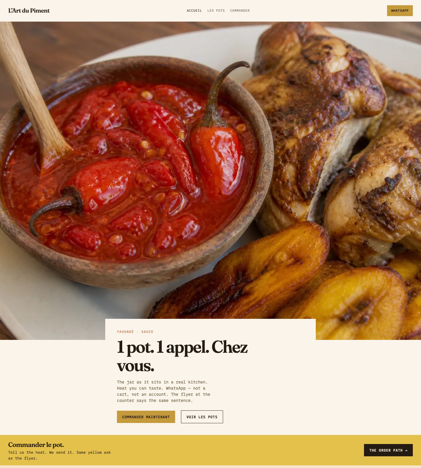
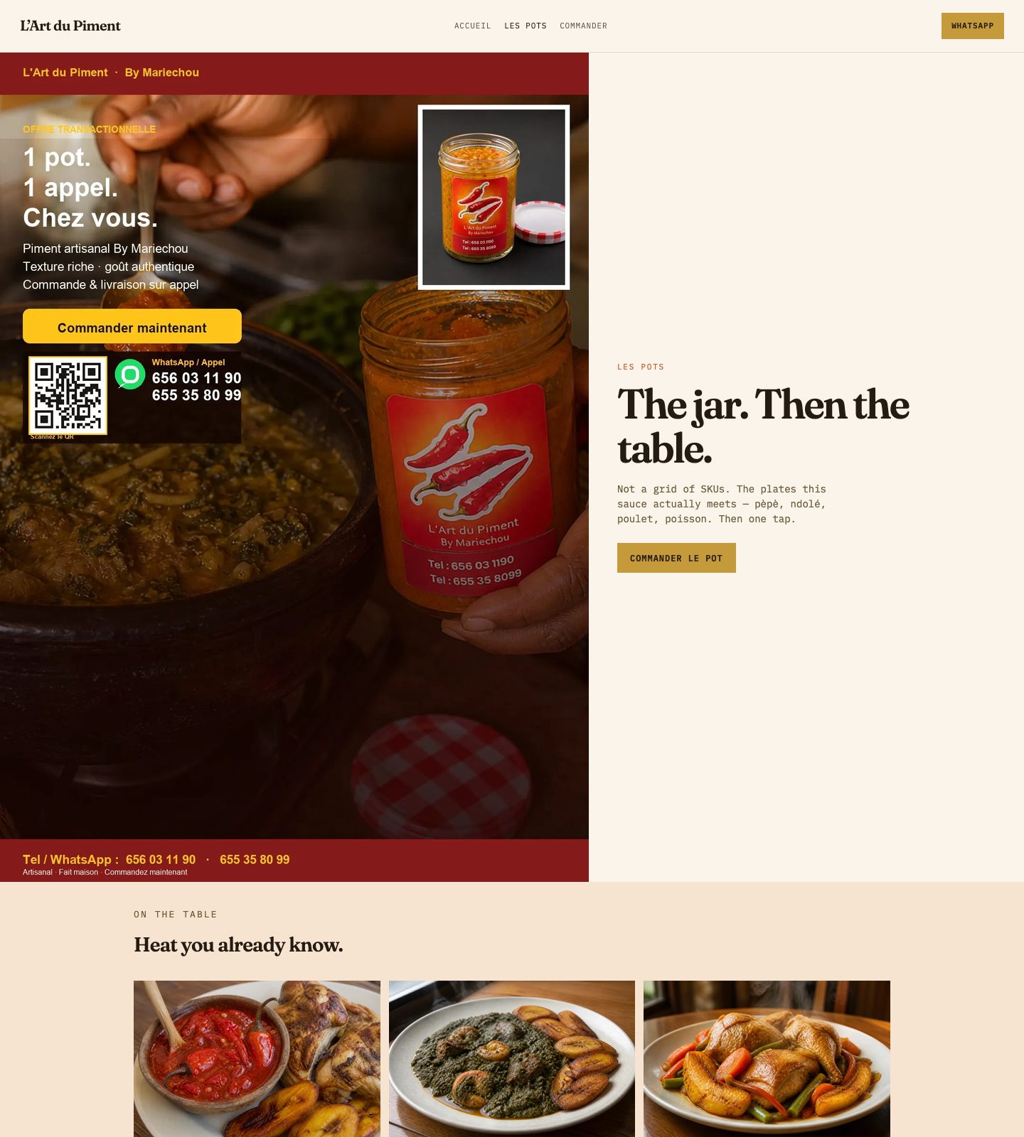
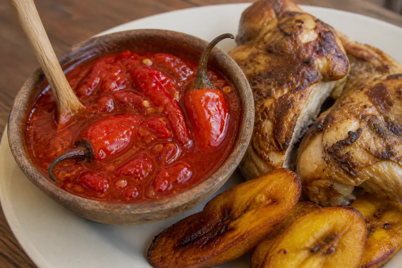
A shop that sells a jar: photograph the jar, one red button, WhatsApp — the flyer already printed. Open the realistic site.
Open L’Art du Piment →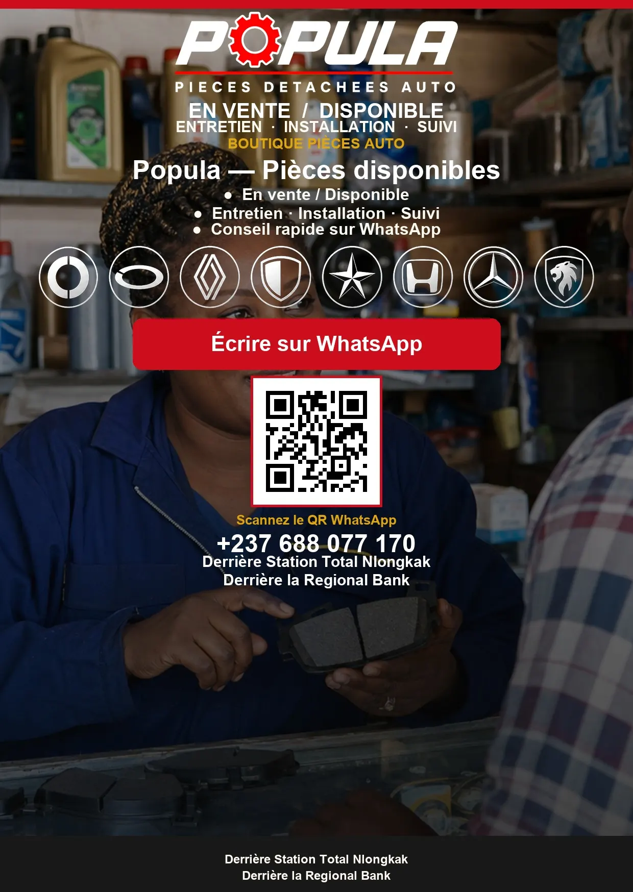
Auto parts · Demo site
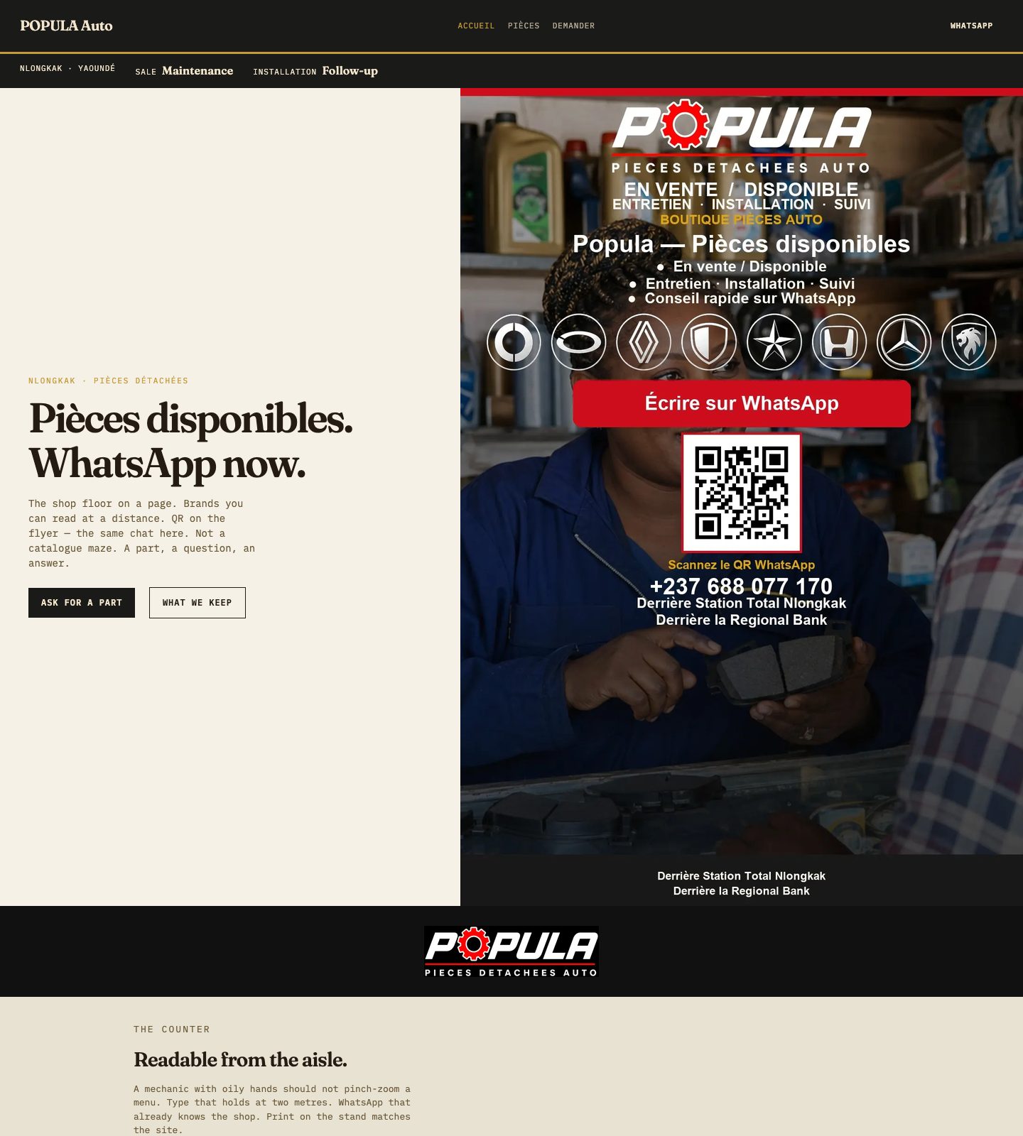
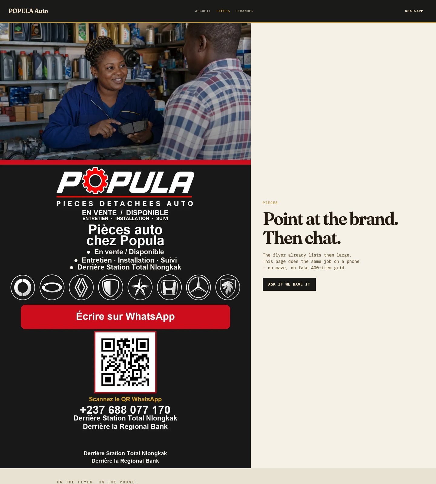
Nlongkak on the footer. Brands you can read. Photo of the part beats a fake catalogue. Sale, maintenance, installation, follow-up.
Open POPULA Auto →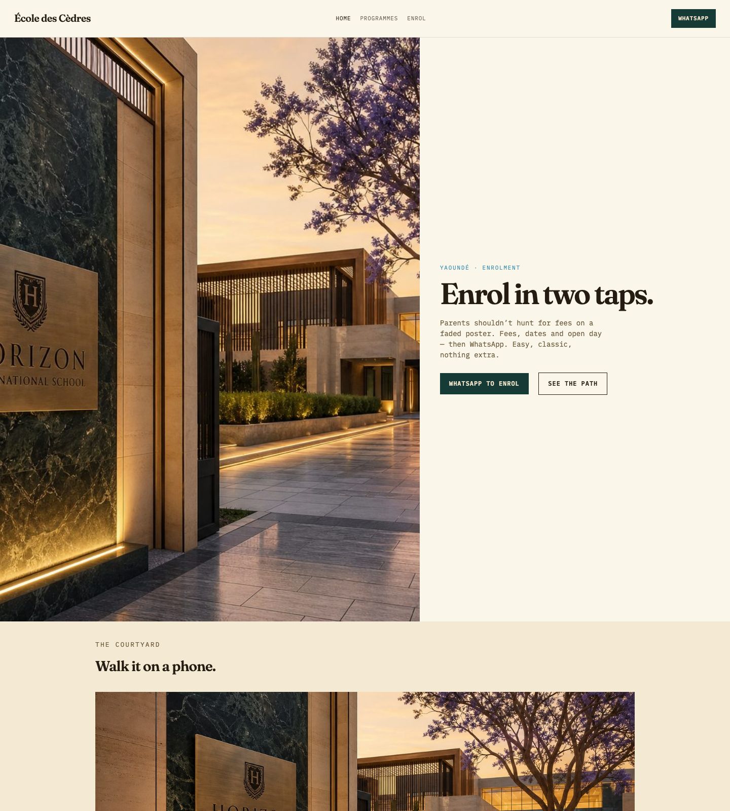
The path
Enrol. Book. Consult. Ask. One job per page. Classic type, natural photos, a short path to WhatsApp.
Open a school site →
What you buy
A working site. Then search and matching print. Then the full job. Prices move with the work — we say so before we design.
See website prices →// Choose your build
Modern, minimal design. Clear UX. Pages that load. Pick who you are — we bring the path, the WhatsApp, and the print that matches. Easy to use. A little fun. Classic enough to last.
01 · New site
You have no site, or one that no longer feels like you. We design a calm first site: home, offer, contact — classic type, natural photos, WhatsApp on the pages that matter. Nothing extra.
02 · Rebuild
The site exists — it’s slow, unclear, or hard on a phone. We keep what still works, cut the maze, and make the next tap obvious. Same name. A human journey.
Schools
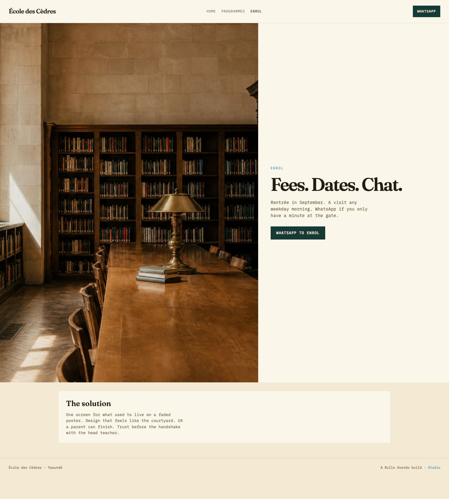
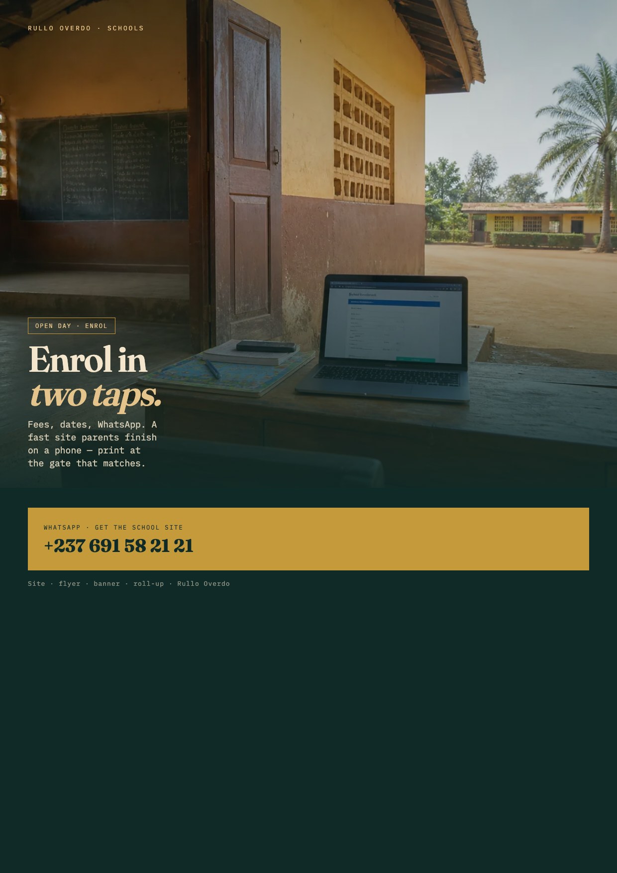
Parents shouldn’t hunt for fees on a faded poster. A calm school site — clear type, short pages, one WhatsApp. The gate flyer matches. Easy, classic, nothing extra.
Open the school site →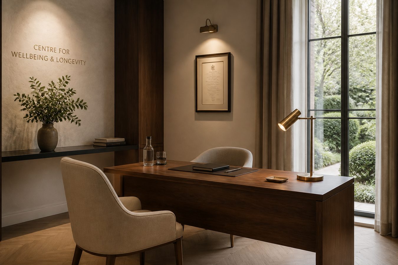
Clinics
Hours, services, location — then WhatsApp. Nearby patients find you without five phone calls. Calm pages, one path.
Get the clinic site →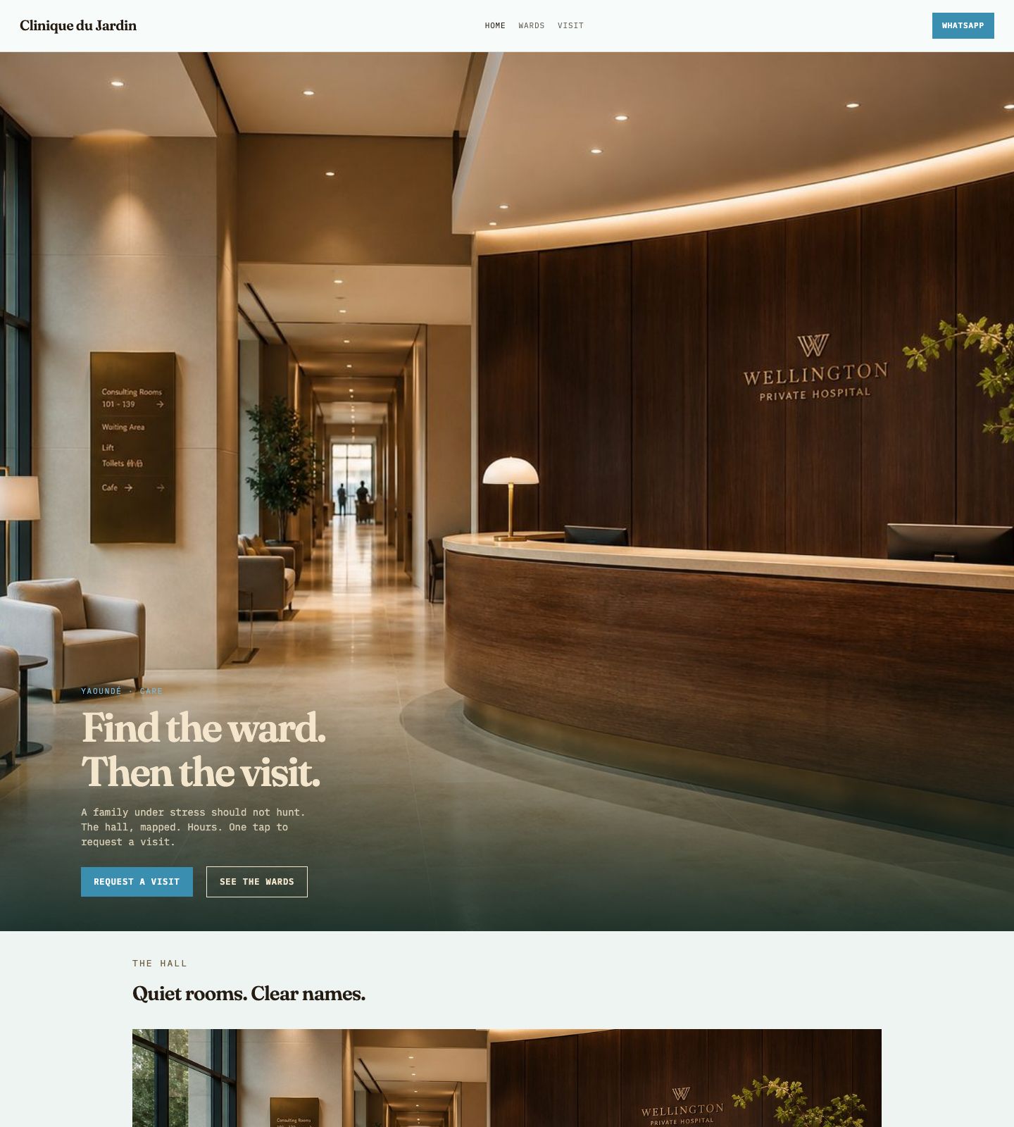
Hospitals
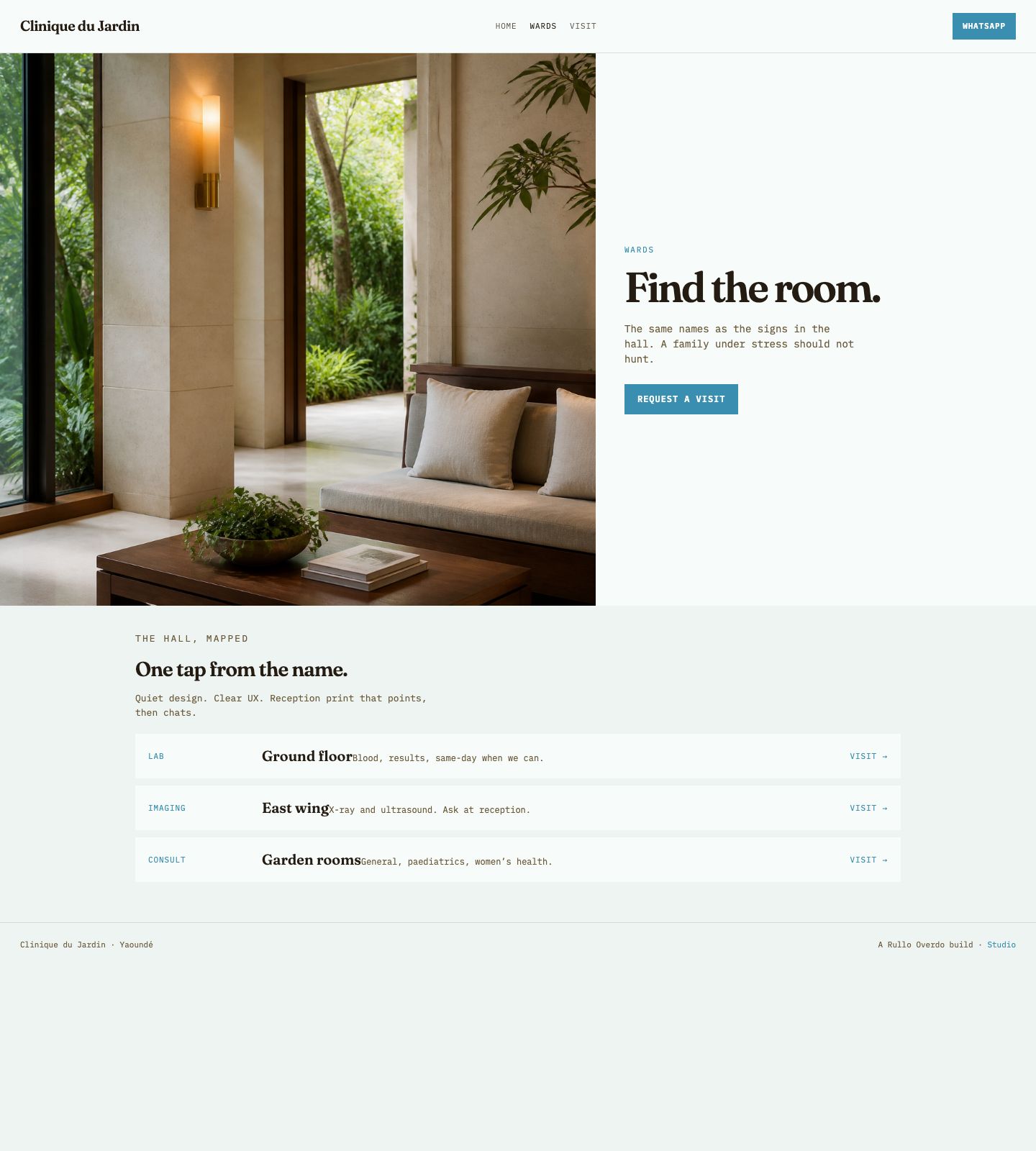
Finding a ward shouldn’t feel like a maze. We put the hall on a simple page. Quiet design. The same words at reception.
Open the hospital site →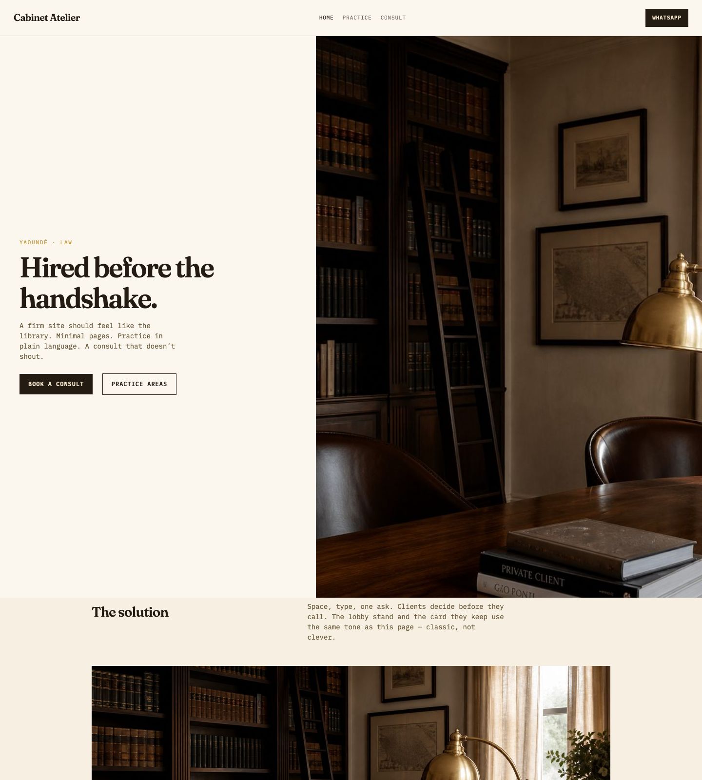
Law firms
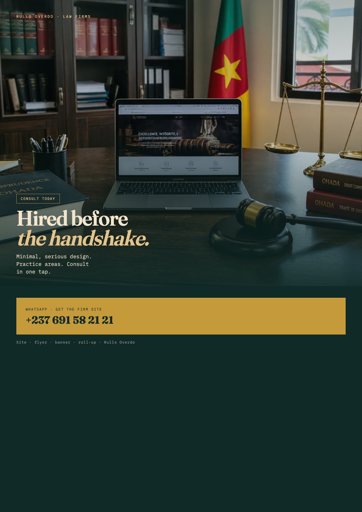
A firm site should feel like the room you already keep. Minimal pages, plain practice areas, a consult that doesn’t shout. Classic — not clever.
Open the firm site →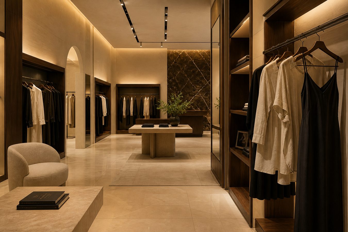
Shops
Lookbook, prices you can read, WhatsApp. The same ease as the floor — minimal, a bit of fun, nothing crowded.
Get the shop site →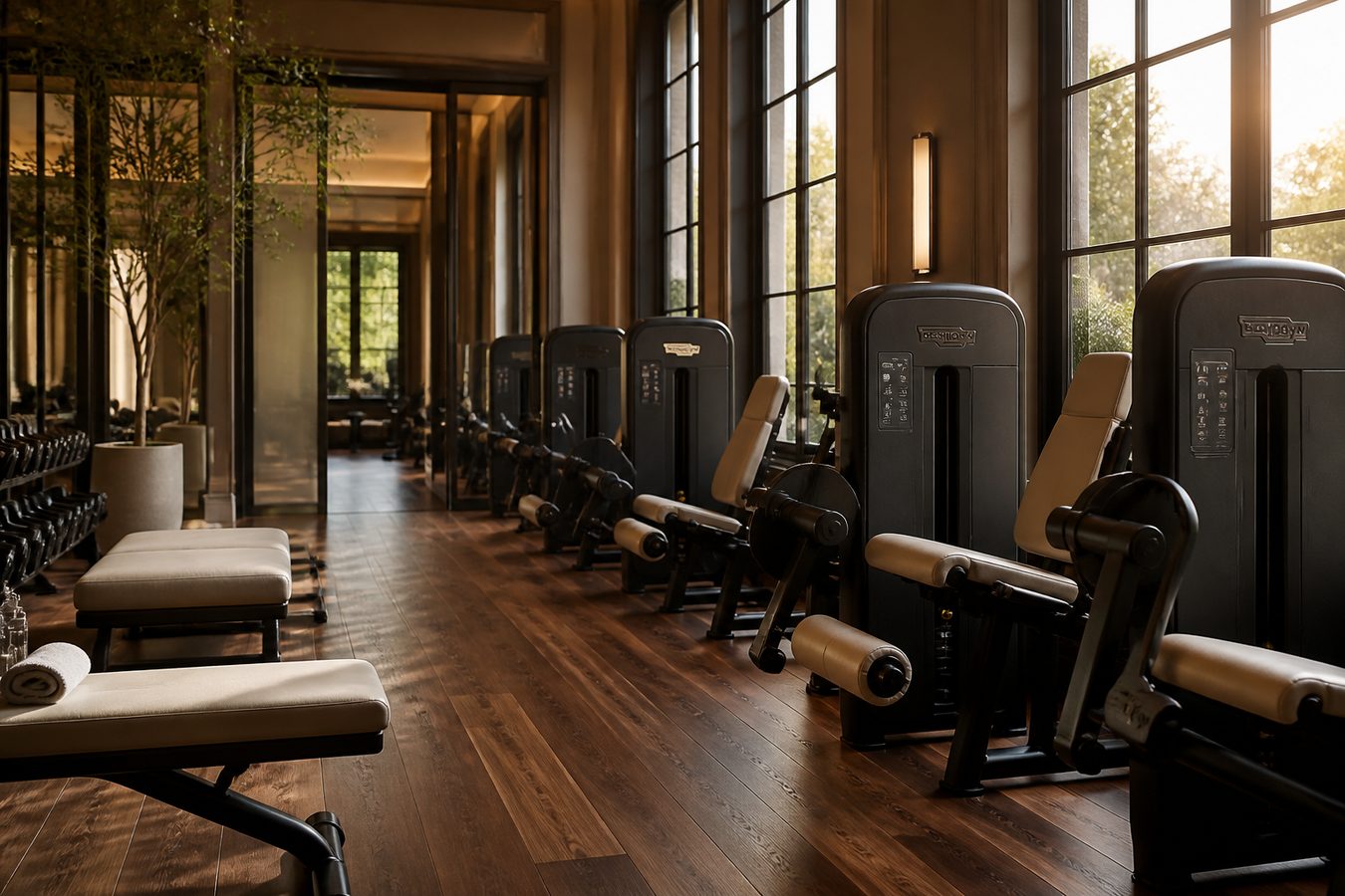
Gyms
See the floor, read the pack, book. That’s the whole journey. Fun and short — no eight-field form before a trial.
Get the gym site →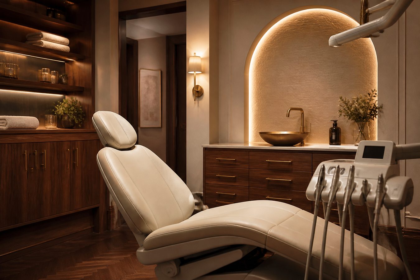
Dentist
Hours on the first screen. Services in plain words. WhatsApp for the chair. Calm, minimal — as quiet as the waiting room.
Get the dentist site →
Shopping
Catalogue, hours, WhatsApp. A mall or street shop people finish on a phone. Same story as the flyer — coherent, uncluttered.
Get the shop site →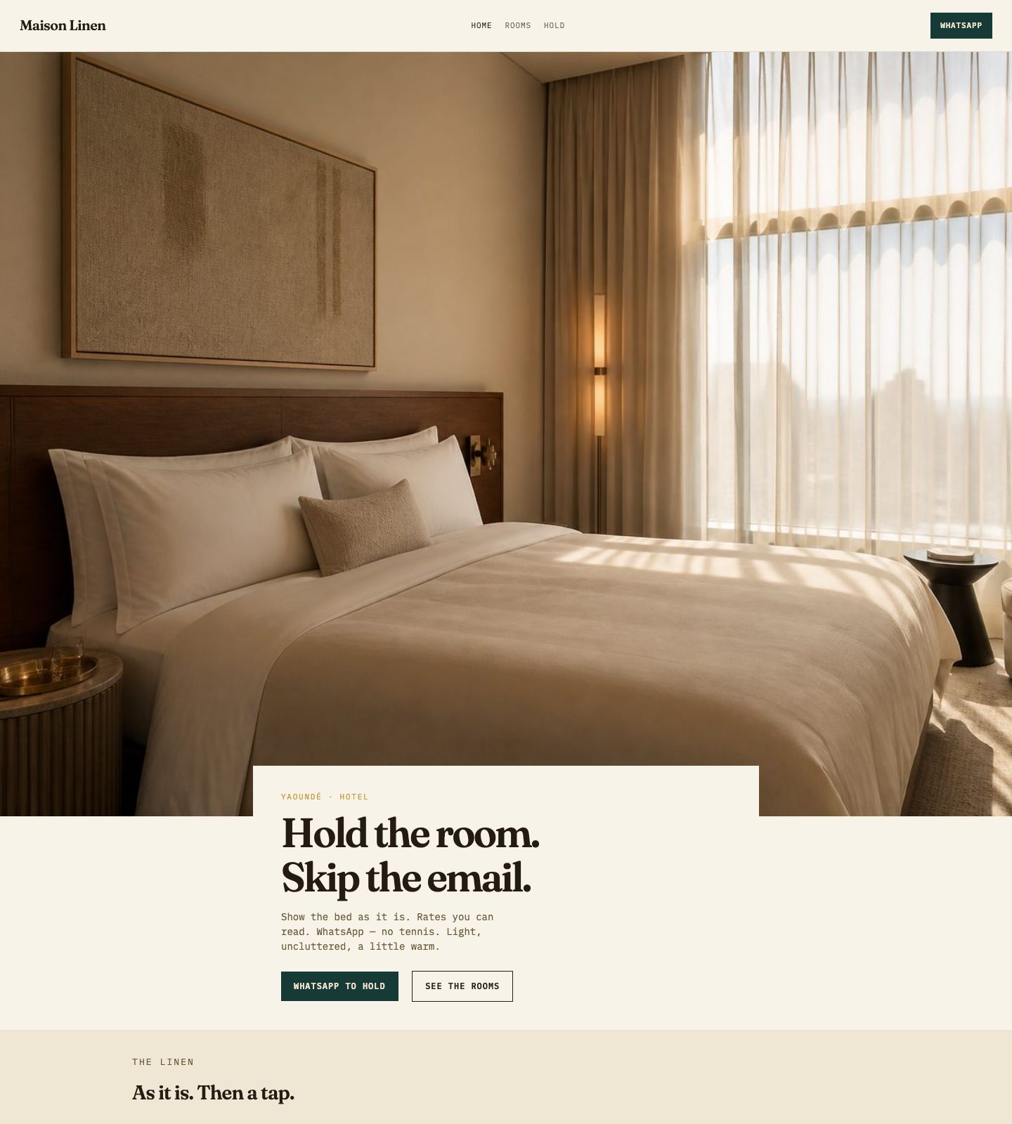
Hotels
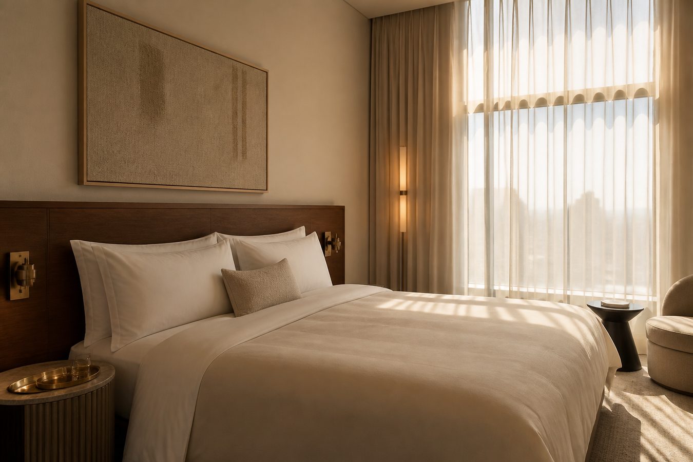
Show the room as it is. Rates you can read. WhatsApp to hold the stay — no email tennis. Light, uncluttered, a little warm.
Open the hotel site →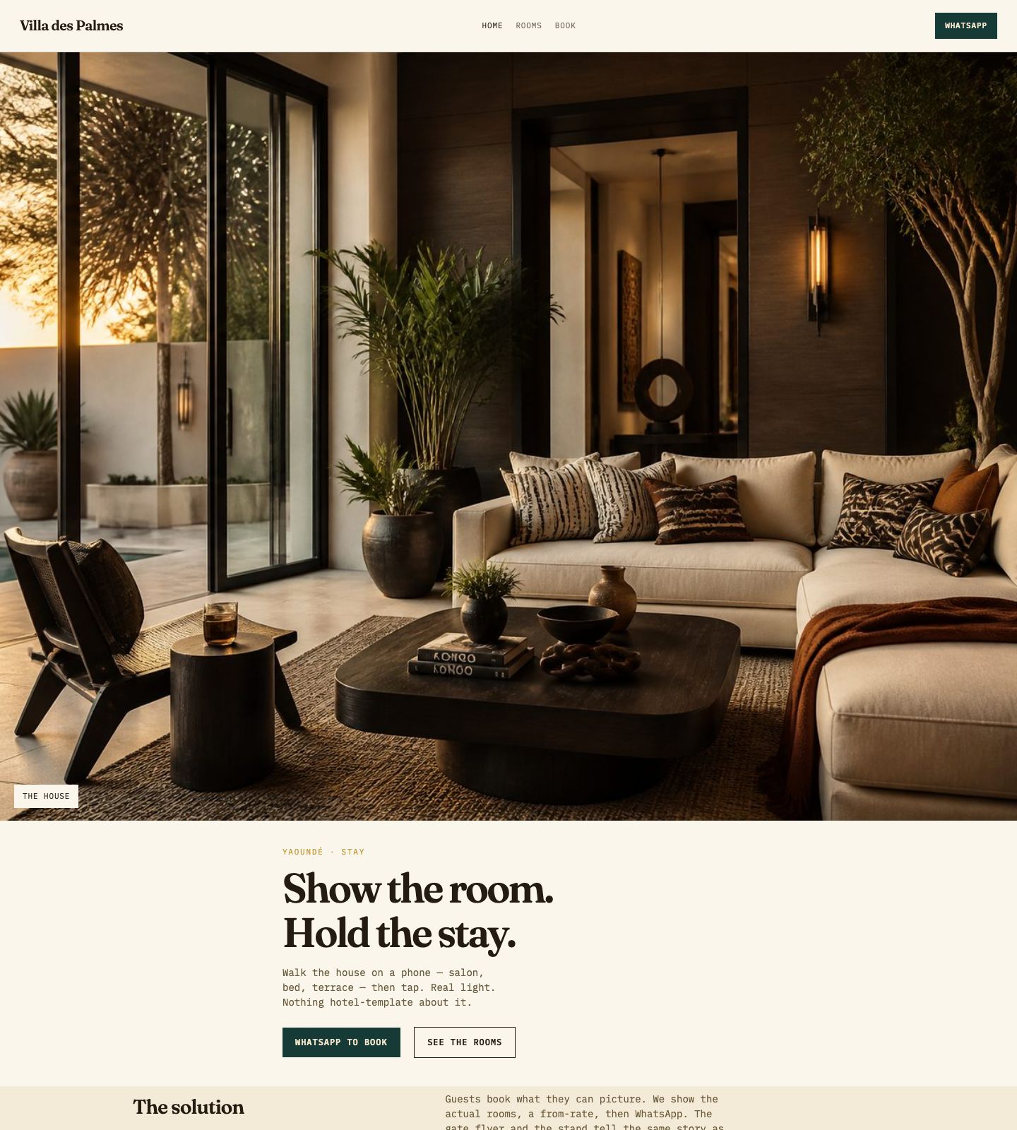
Guest apartments
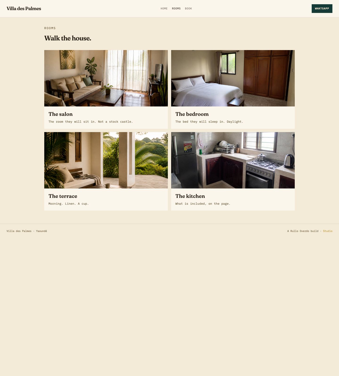
Real rooms, real light. Guests pick a stay the way they’d walk the house — then a tap to book. Coherent with the gate flyer.
Open the guest house site →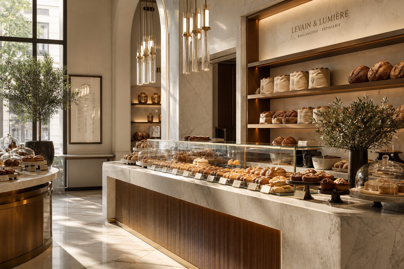
Bakeries
Today’s bake, a photo, pre-order on WhatsApp. A page as simple as the counter. The flyer repeats it.
Get the bakery site →
Restaurants
ASSOYA and La Maison de la First Bank, Yaoundé: the plate, the room, then WhatsApp. Menu flyer on the table, roll-up at the door.
Restaurant websites →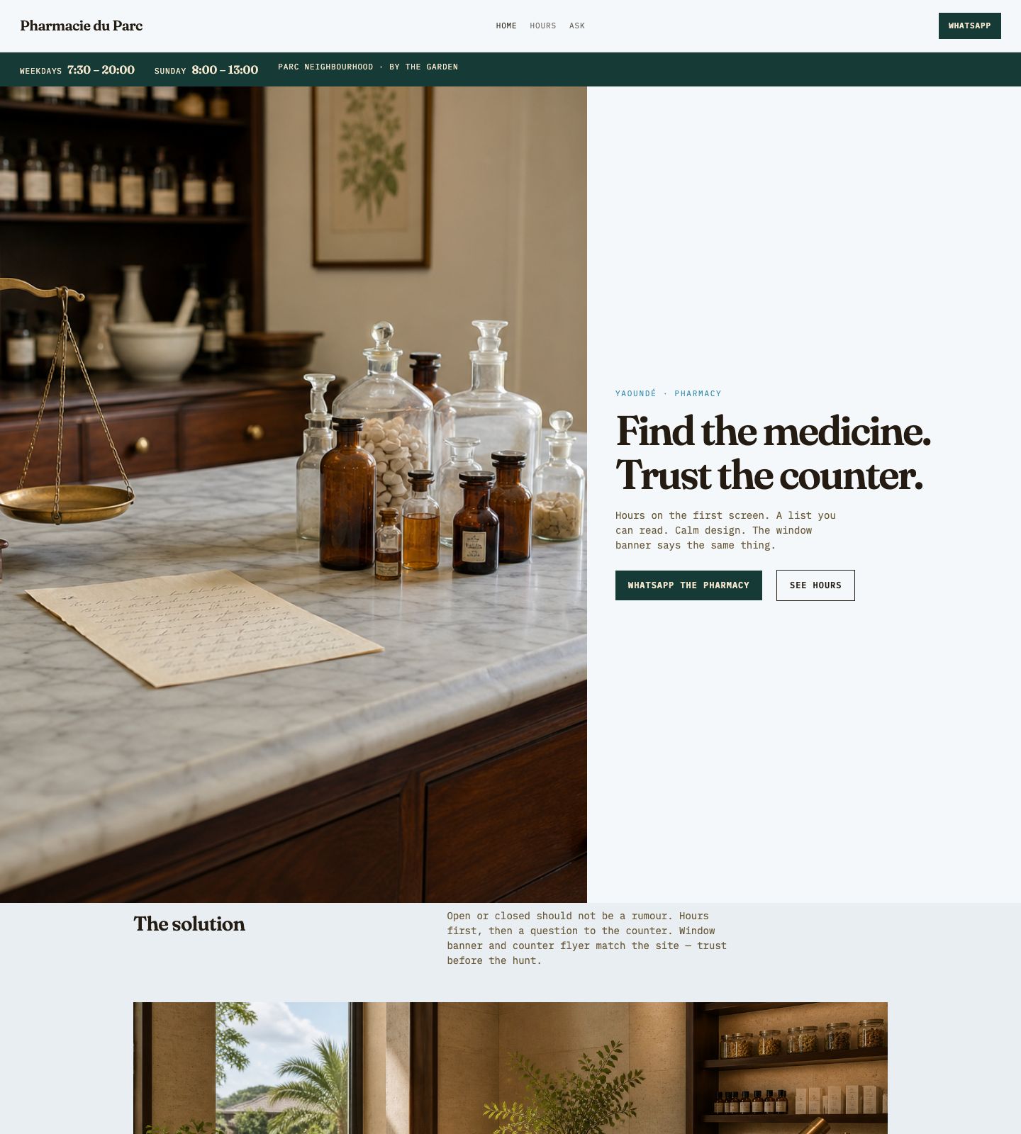
Pharmacies
Hours, location, a list you can read. Calm design. Human UX. Window banner and counter flyer say the same thing.
Open the pharmacy site →
Sauce · Food
A jar site that smells like lunch. Photograph the jar, one red button, WhatsApp — the flyer already on the counter. Design, UX, one offer.
Open the sauce site →
Auto parts
Nlongkak. Brands you can read at a distance. Photo of the part beats a fake catalogue. Sale, maintenance, installation, follow-up — one number.
Open the auto site →
Fashion
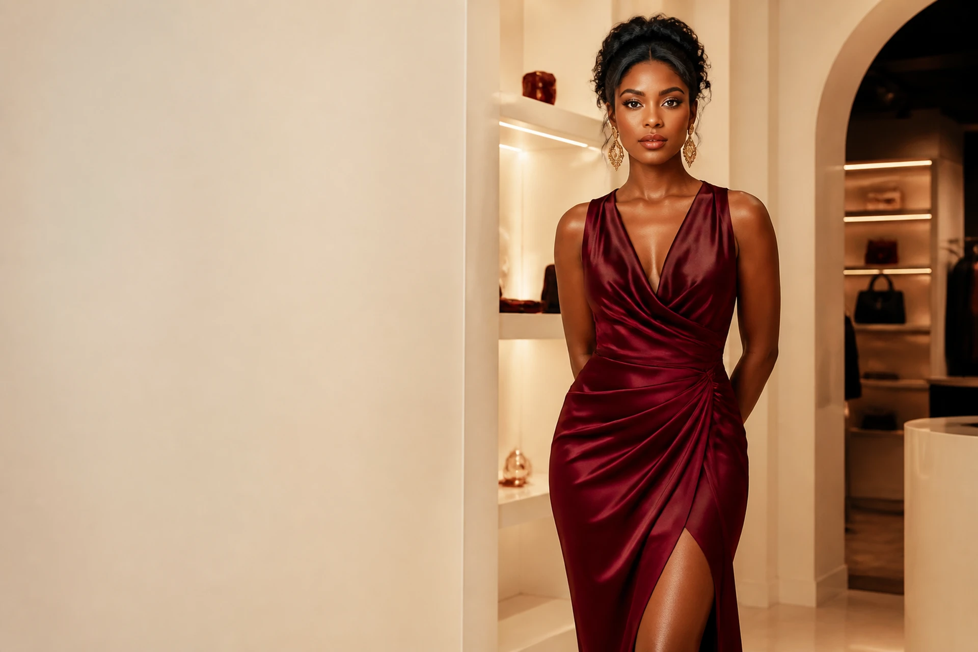
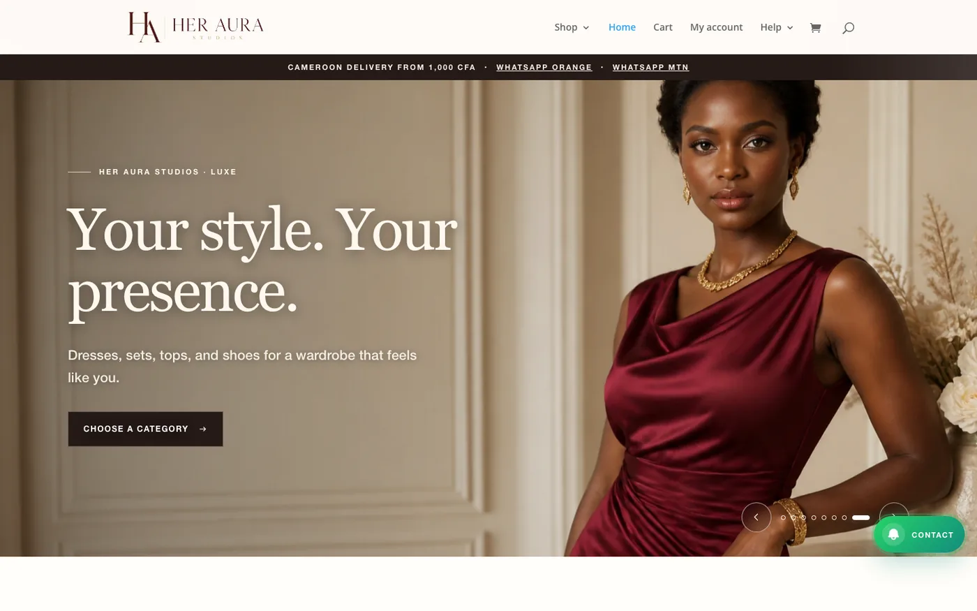
The burgundy lookbook and the lady in cream silk — then prices, then chat. Designed to feel like the boutique: uncluttered, a little fun, easy to finish.
Get the boutique site →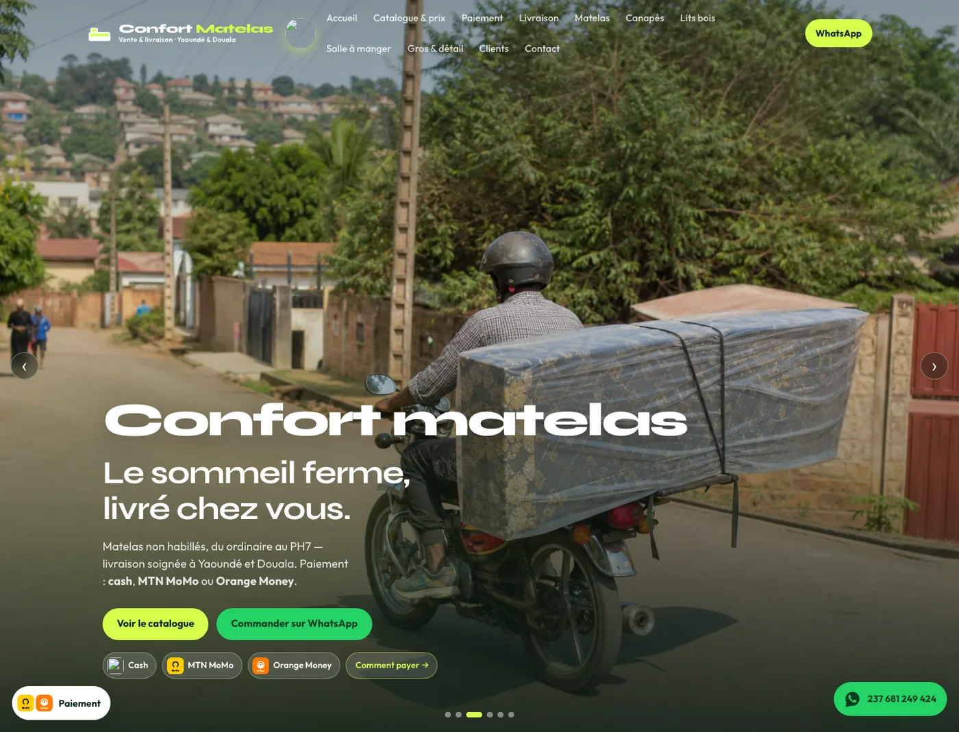
Furniture · Live site
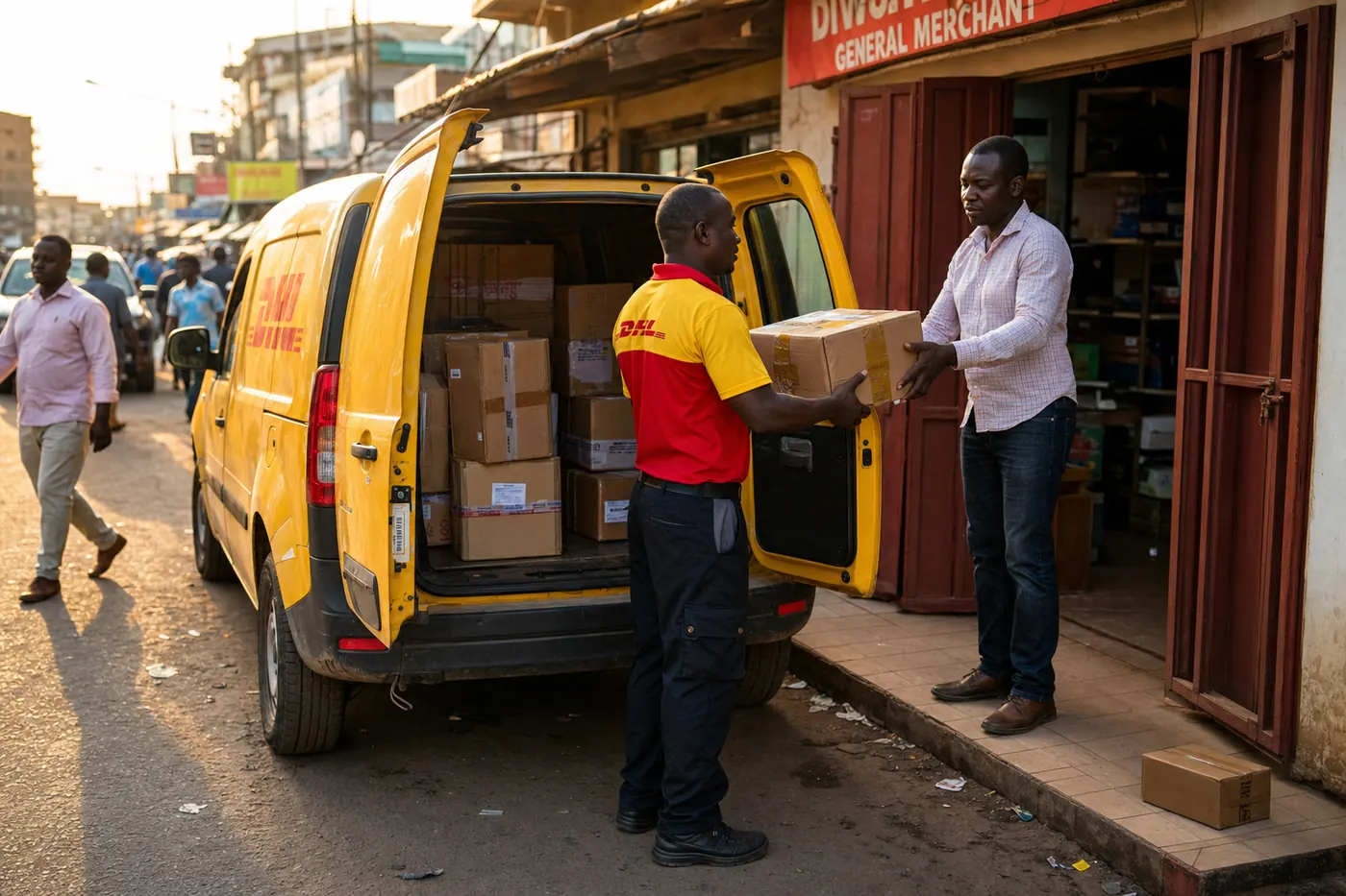
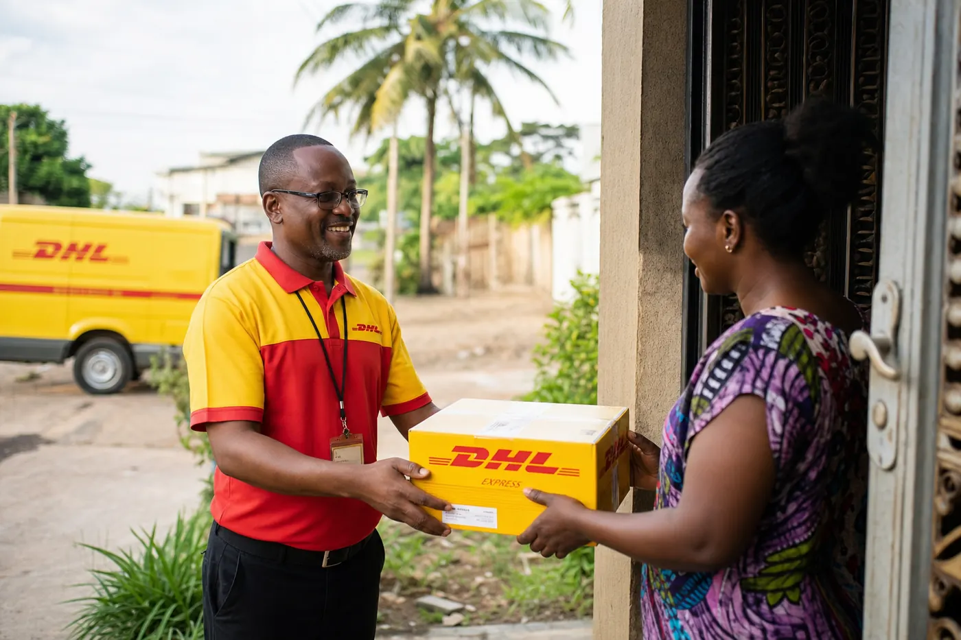
Catalogue, delivery, cash or Mobile Money, WhatsApp to order. A shop site people finish on a phone — Yaoundé and Douala, without the clutter.
See the live site →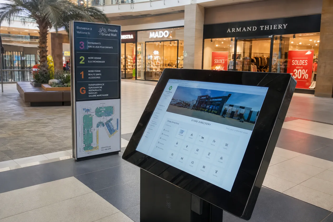
Malls
A directory like the atrium board: stores, hours, events. Fast on a phone. The hall stand says the same thing — one map, not two.
Get the mall site →// Why a studio
Classic type, natural photos, space to breathe. Built for your offer — not a leftover theme. A little fun, never noisy.
One path people enjoy finishing on a phone. Fewer taps. A button that does what it says. Ease first.
The site, the flyer and the stand tell one story. Same title, same ask. Your business feels like one piece.
If it doesn’t help someone finish, it doesn’t go on. Short pages. Clear hierarchy. Space for the photo.
Banners, flyers and roll-ups that use the same message as the site. One story, on paper and on the phone.
WhatsApp +237 691 582 121 — a person, not a ticket queue.
// Related flyers
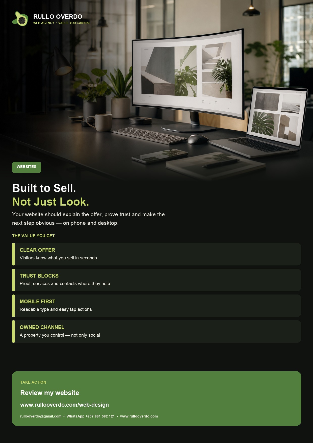
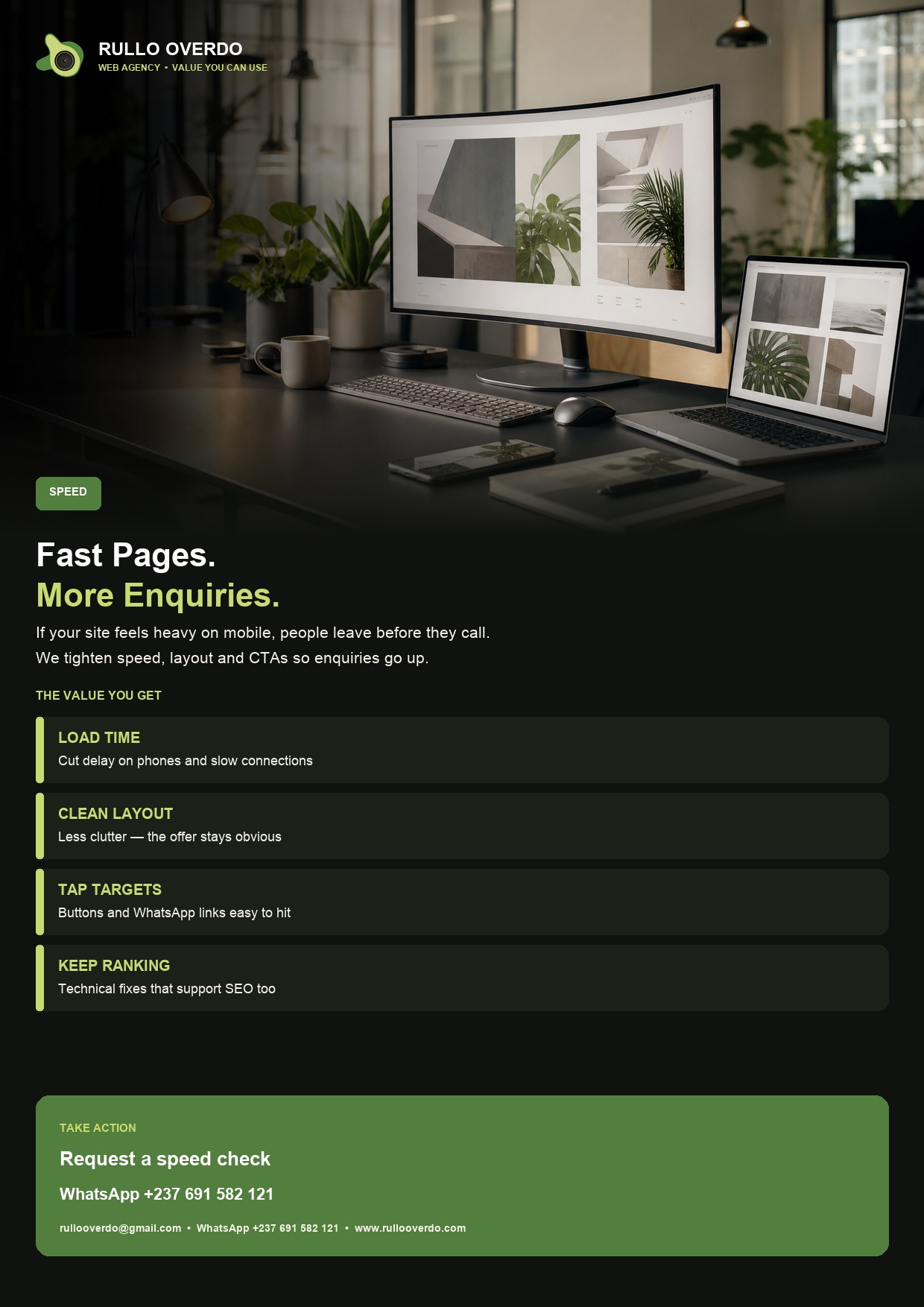
Same offers as above — ready to print or to send a client.
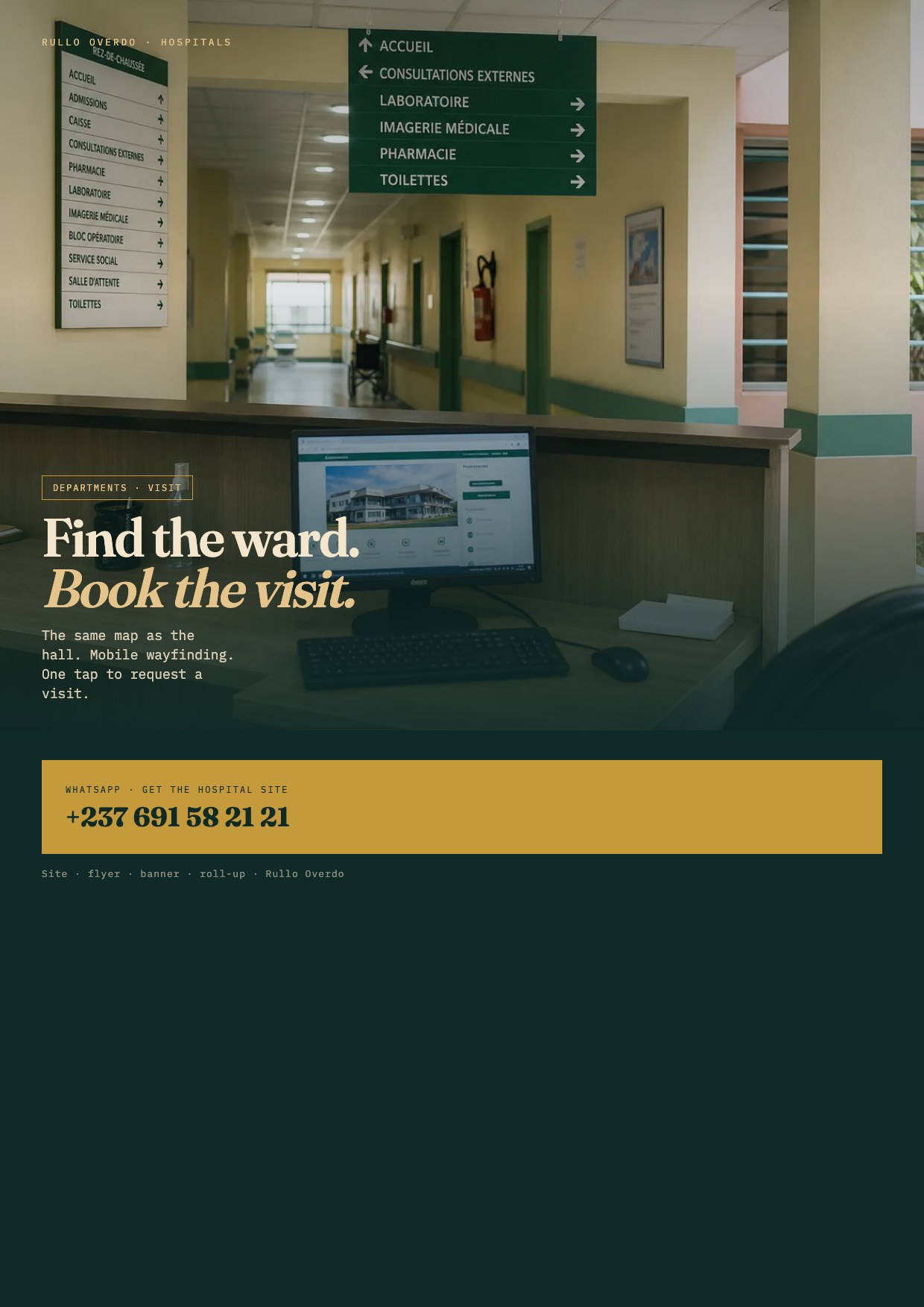
Hospitals
// How we build
We clarify goals, audience and the highest-value pages — enrollment, booking, consult or order.
We design the site around one commercial objective, then match banners and flyers to the same CTA.
We measure what people do, then improve speed, copy and the path to WhatsApp.
// Ready
Web building, SEO and print — one studio. See also rullooverdo.com.