Schools
Enrol in two taps.
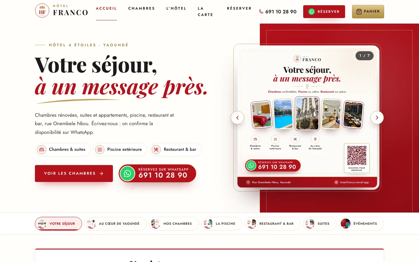
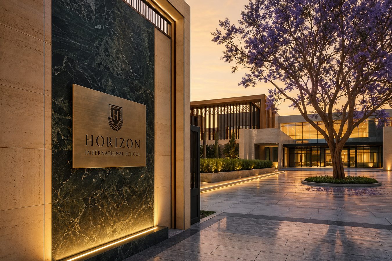
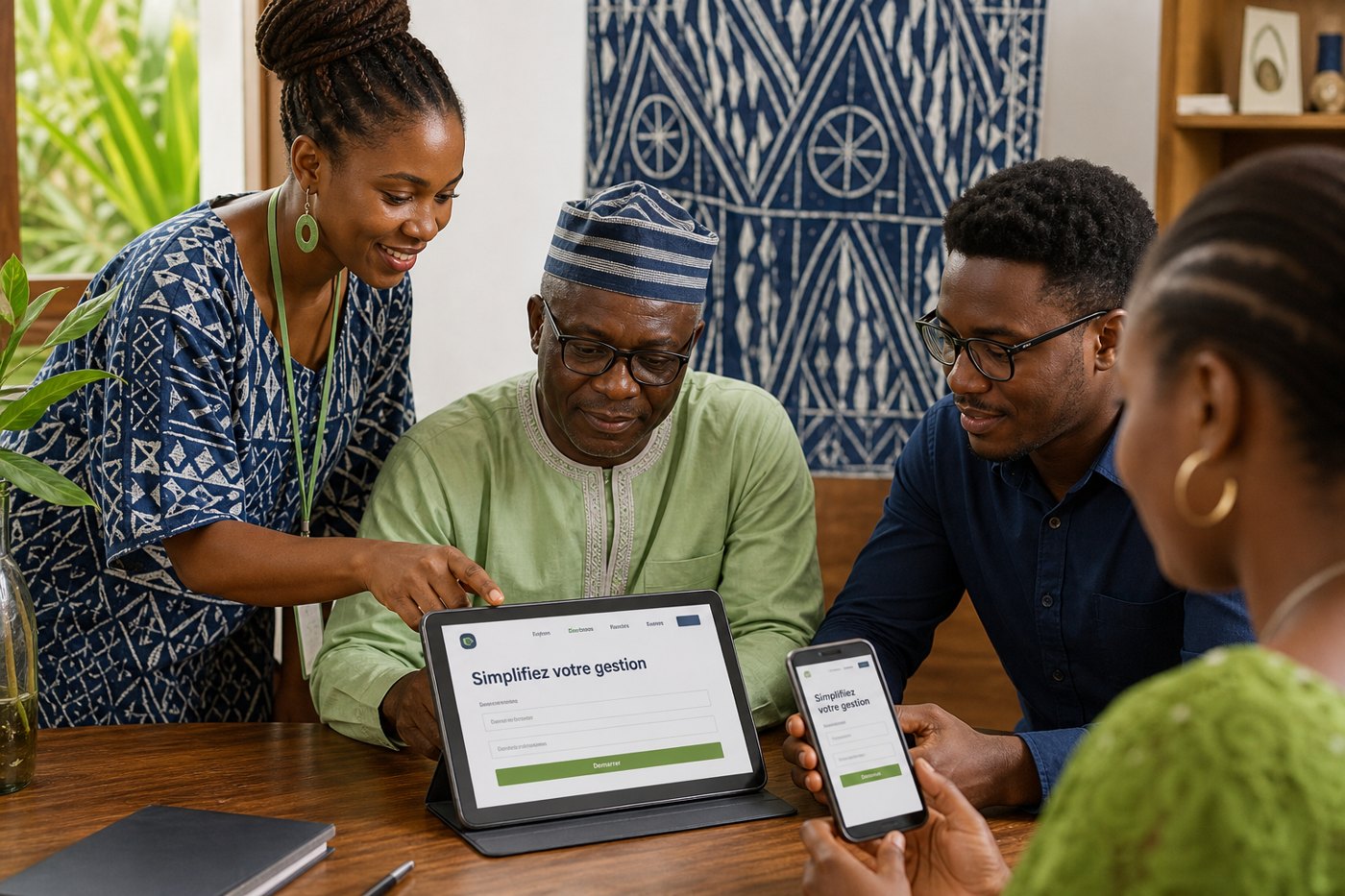
Parents shouldn’t hunt for fees on a faded poster. We design a calm school site — clear type, short pages, one WhatsApp. The gate flyer says the same thing. Easy, classic, nothing extra.
// Live websites
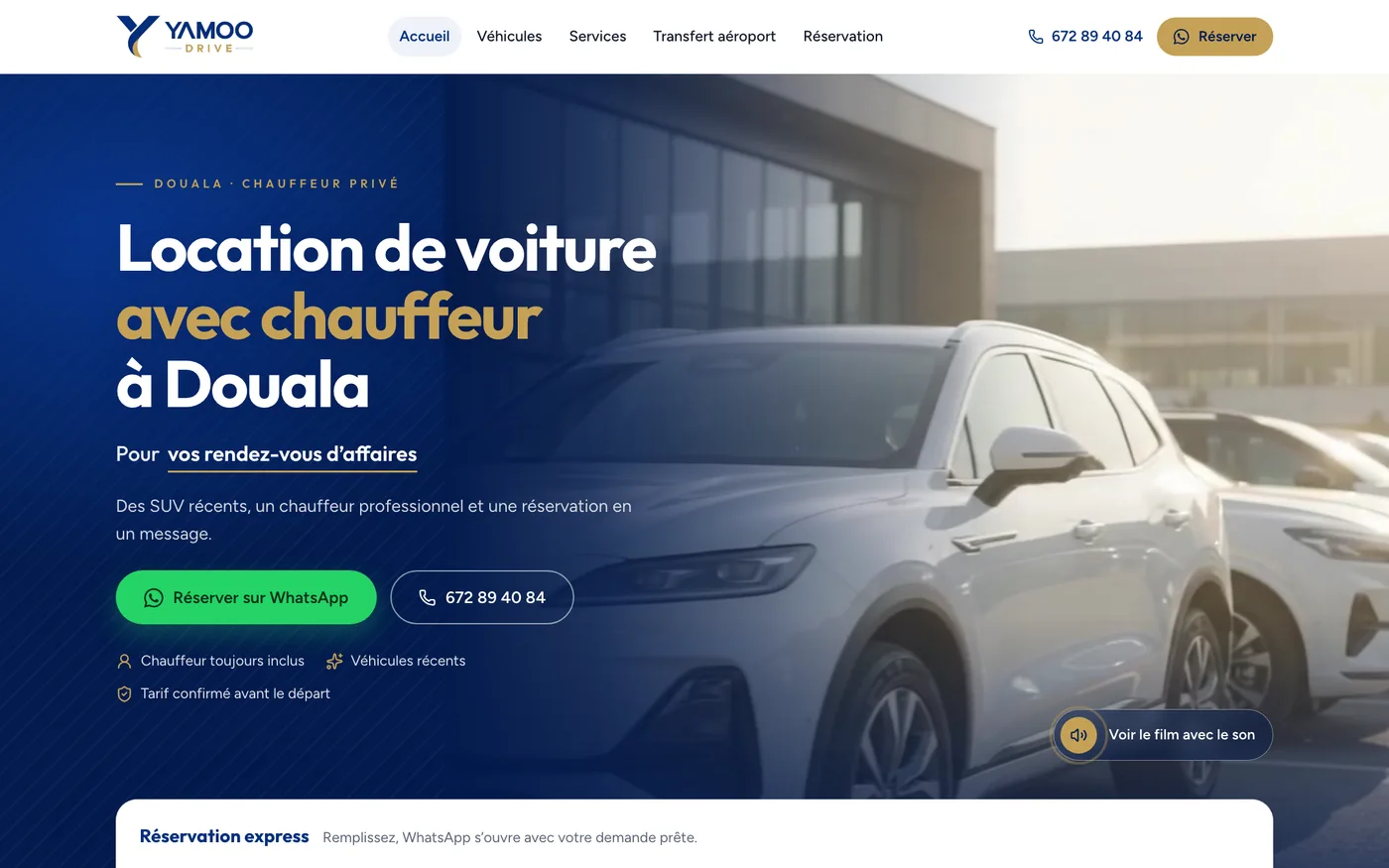
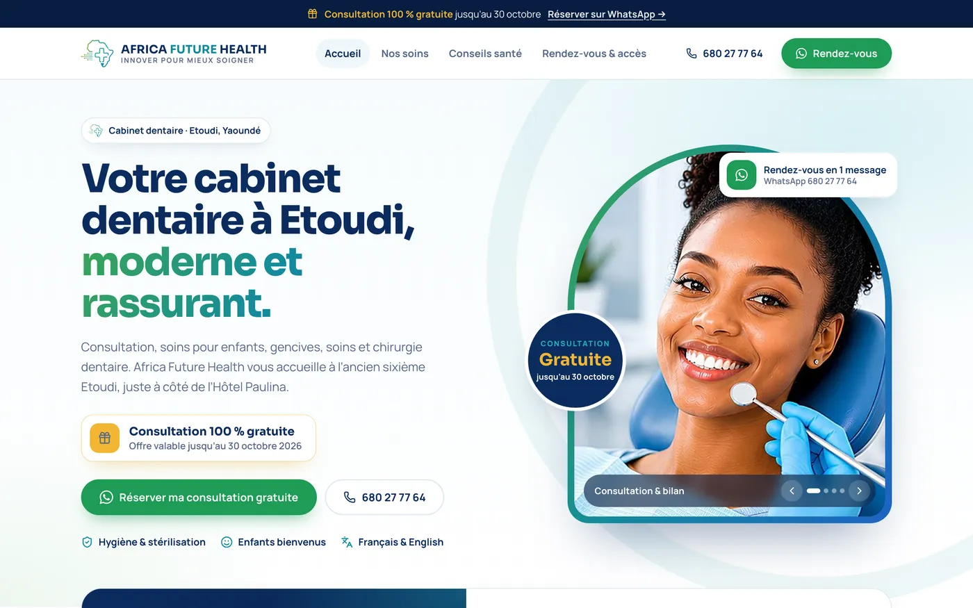
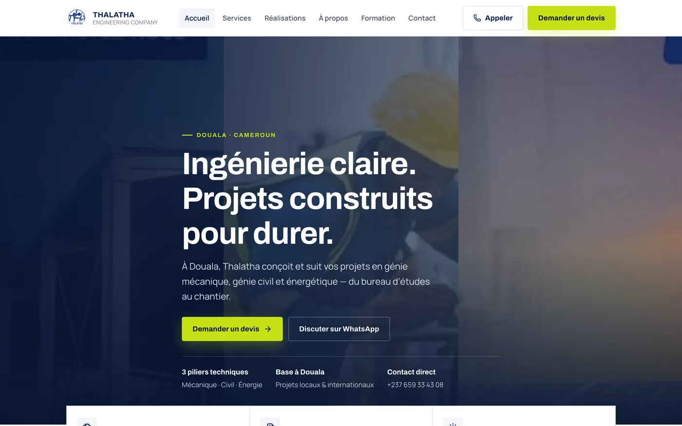
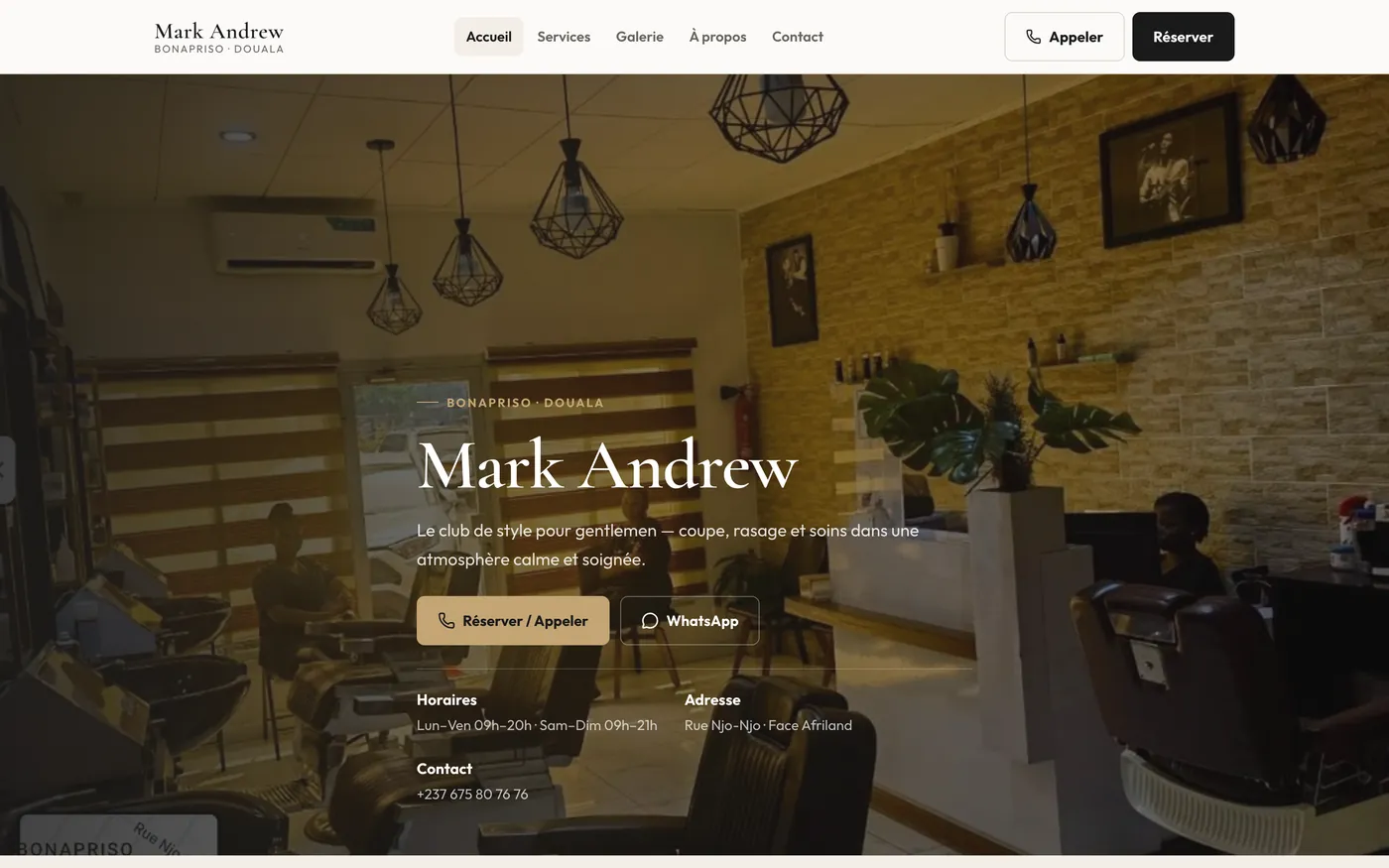
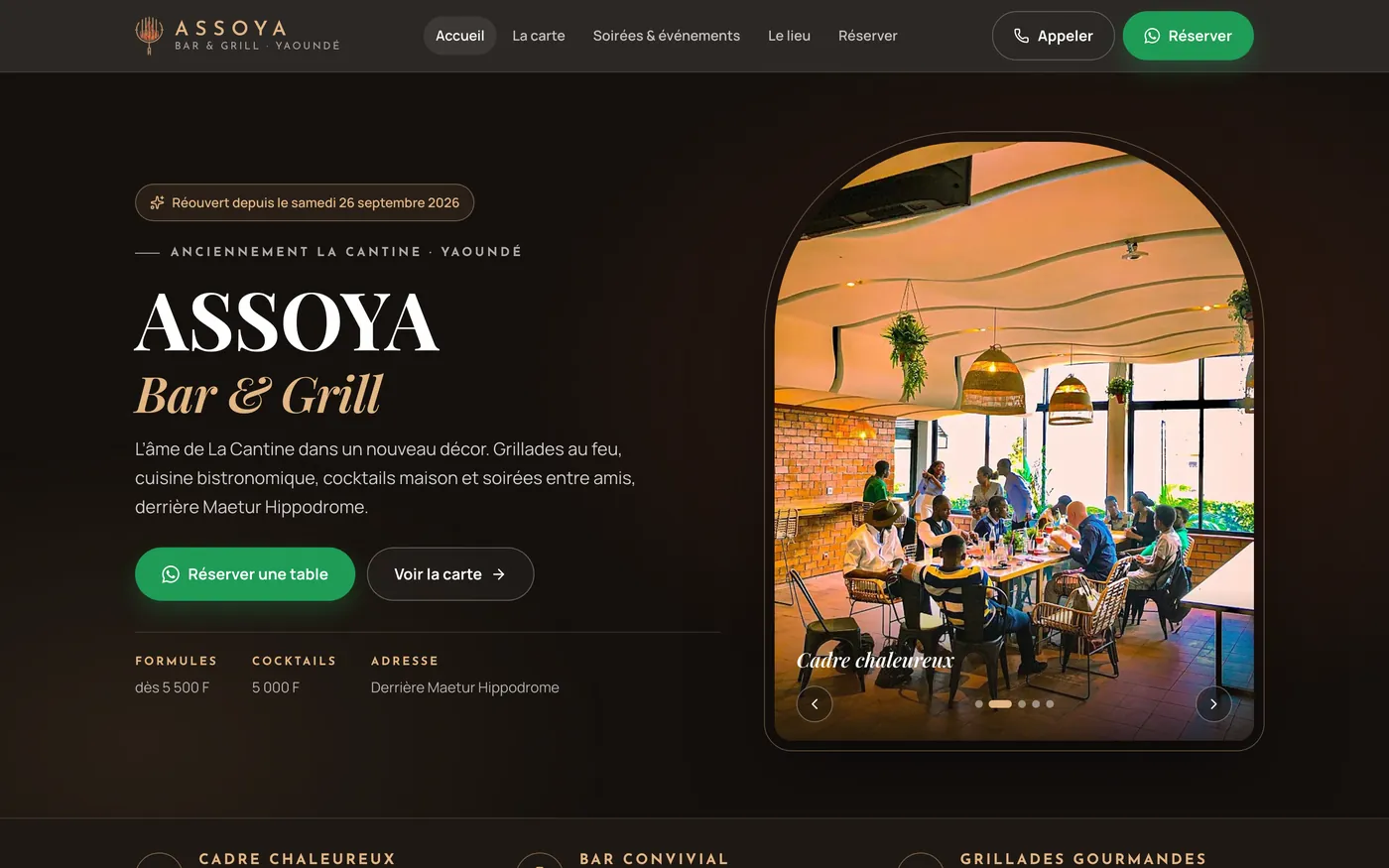
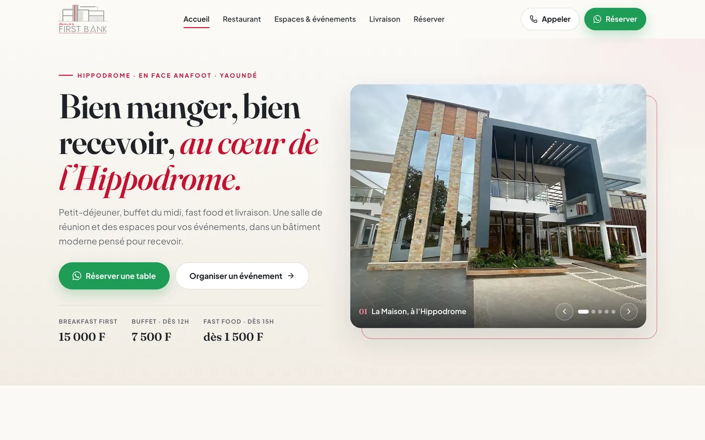
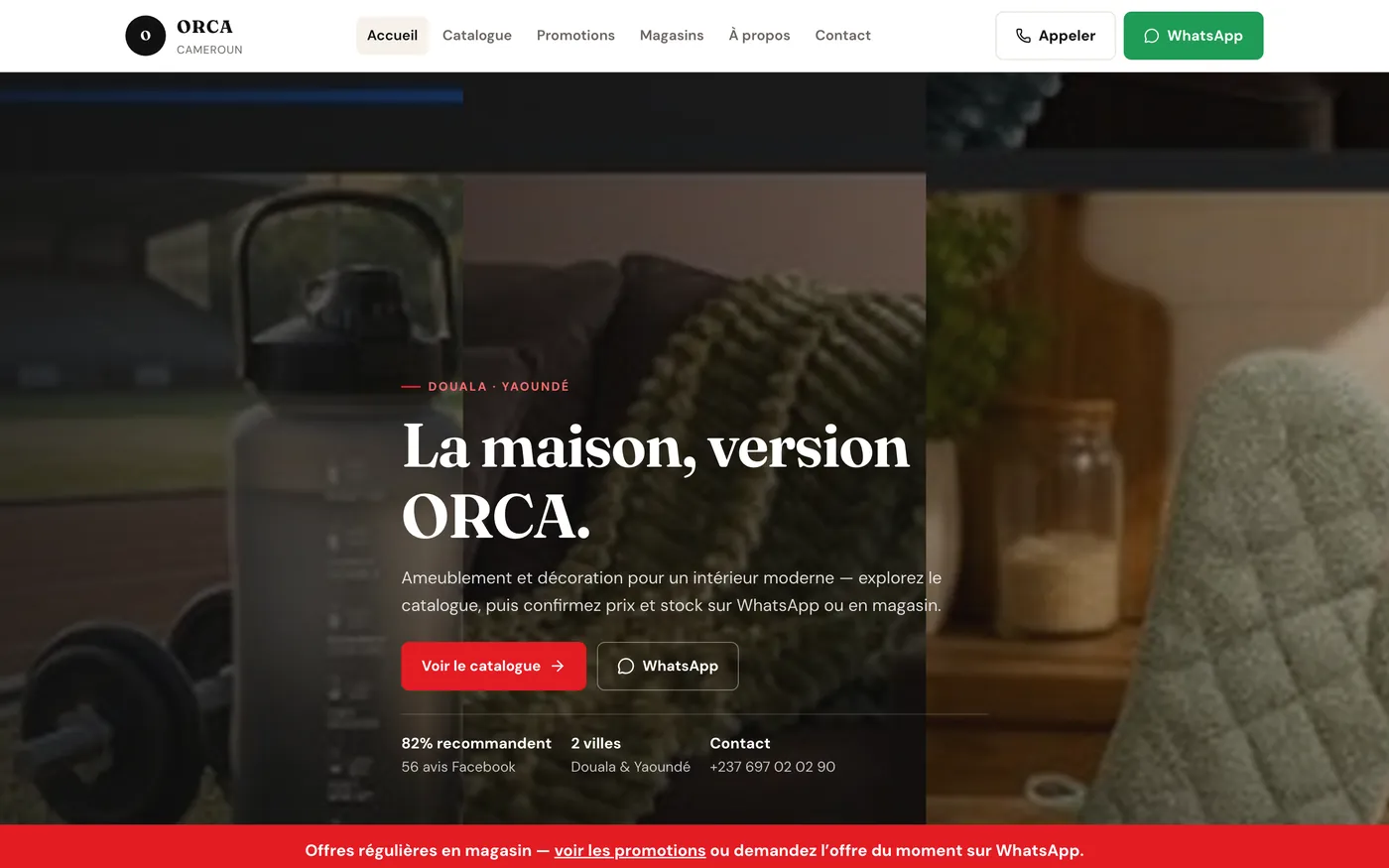
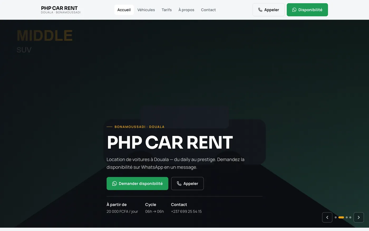
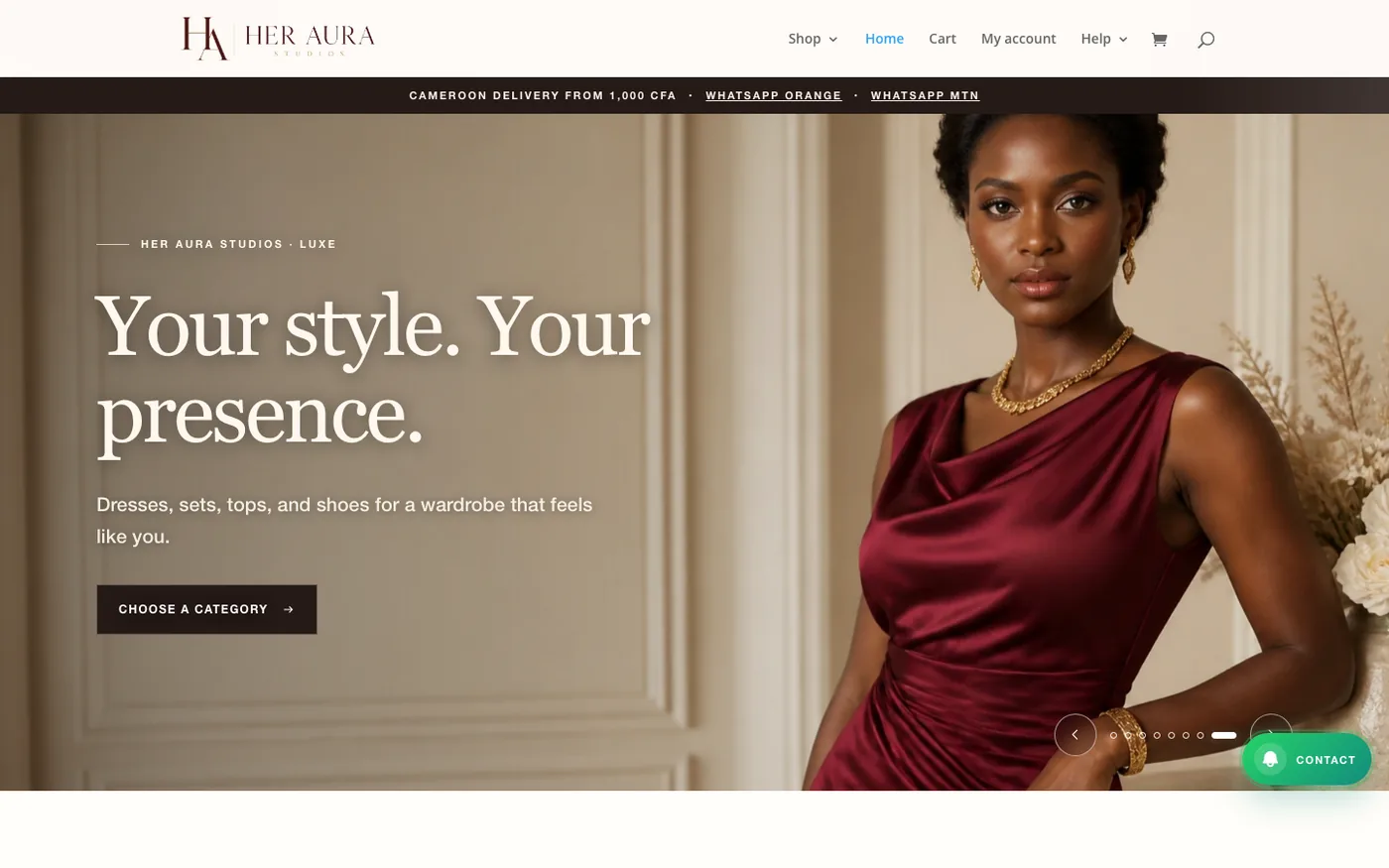
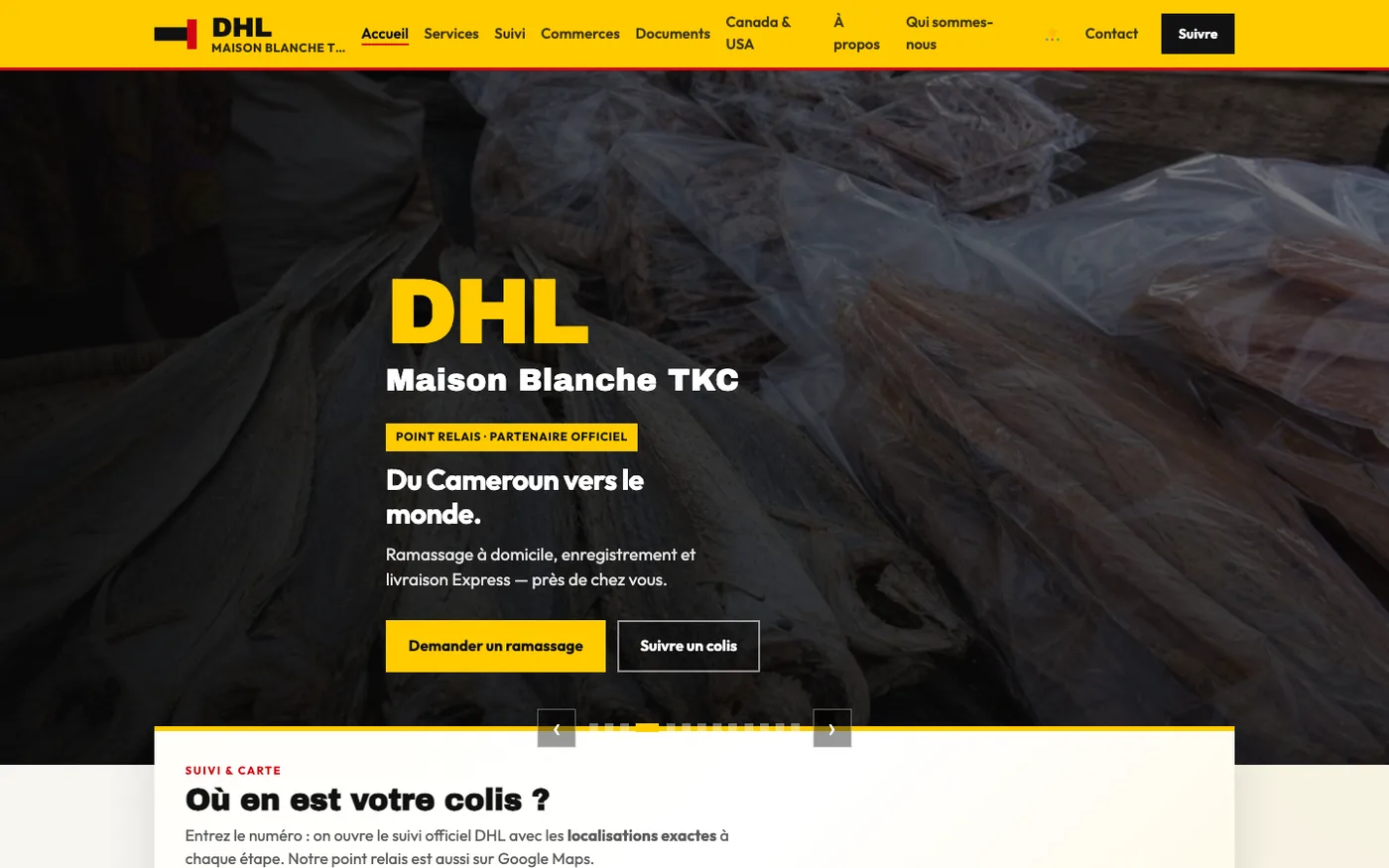
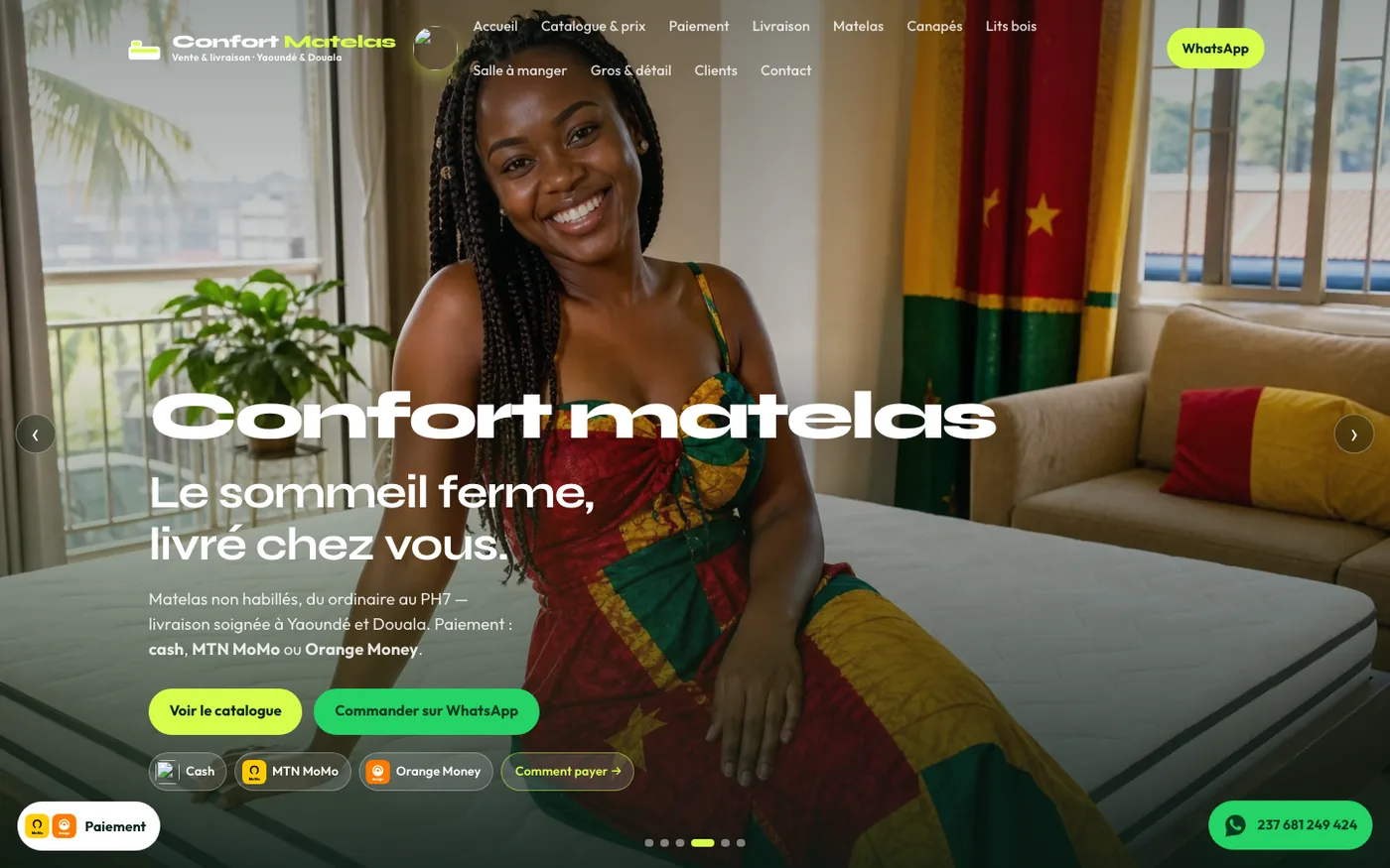
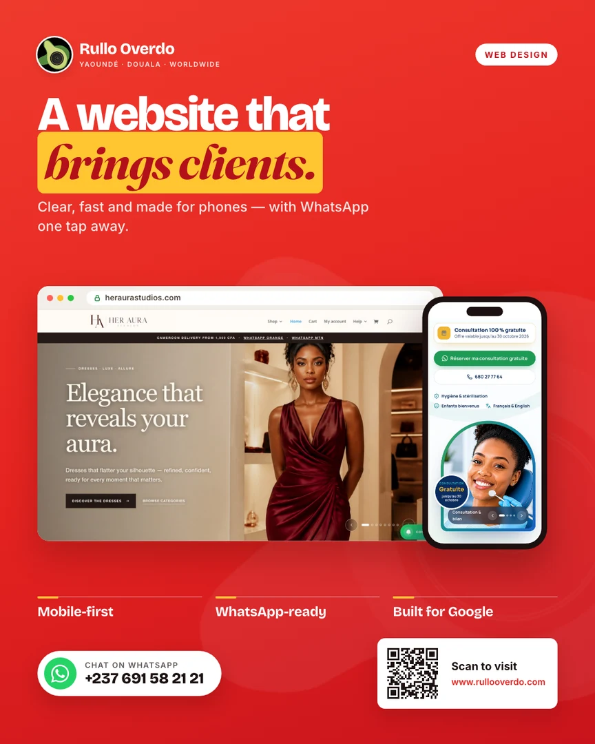
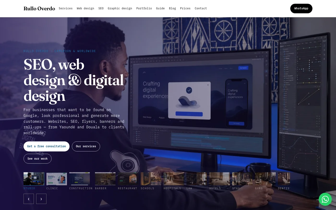
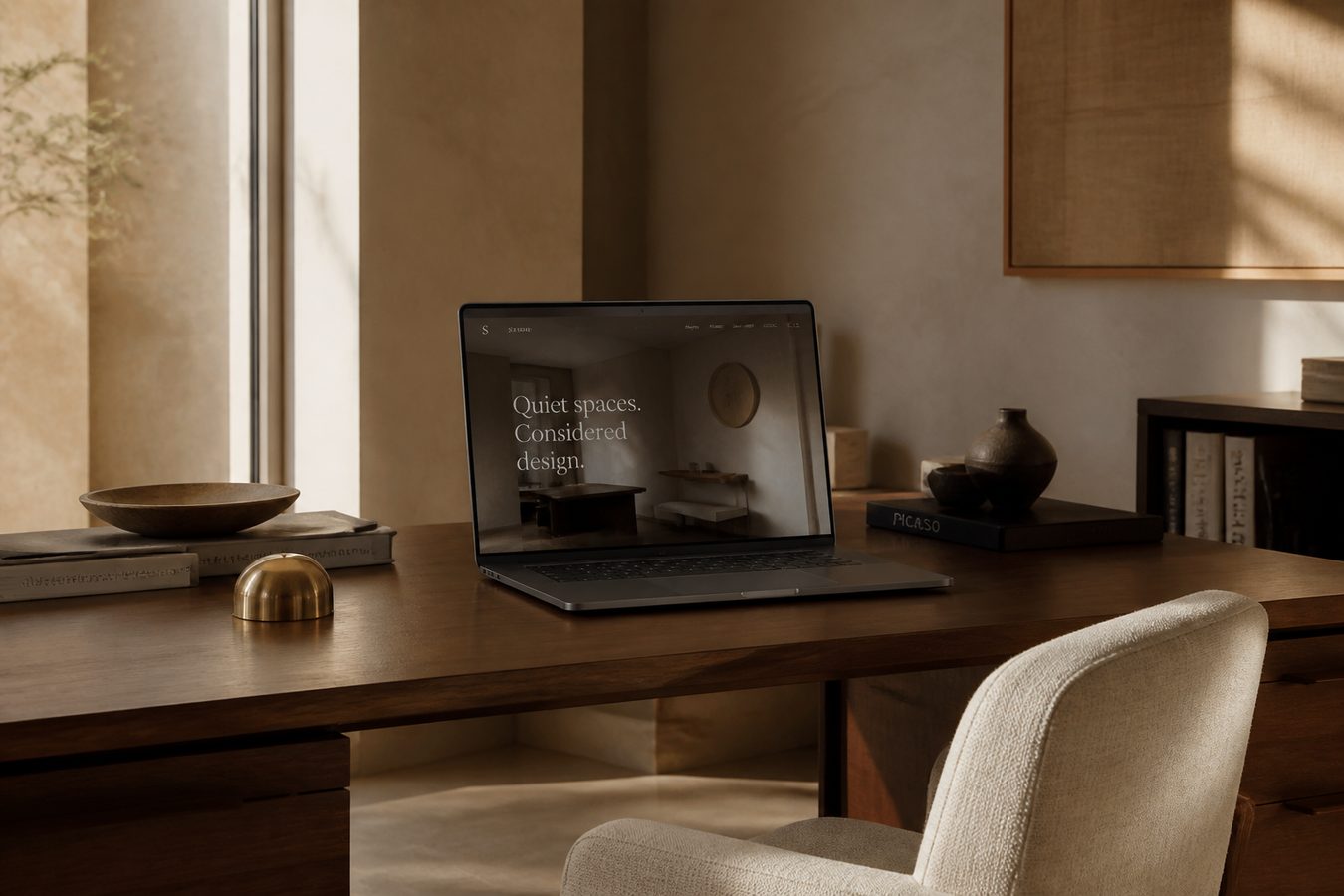
Studio, fashion, logistics, furniture — the pages people actually land on. Real light. One path. Designed to finish on a phone.
// Sites we build
Realistic sites for the trades we serve — home, then the page that does the work. Human, minimal, elegant. Open them.
// Printed work
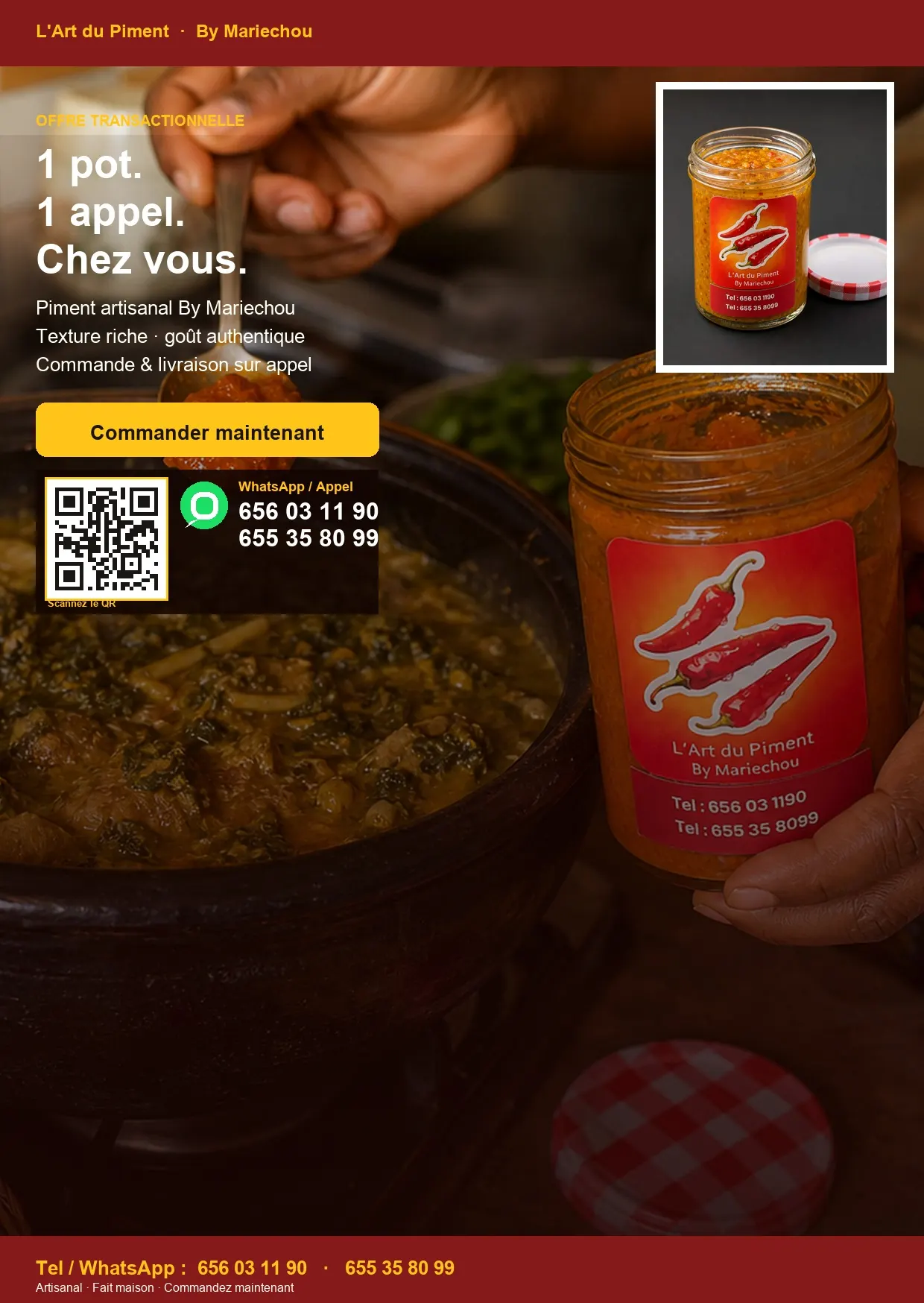
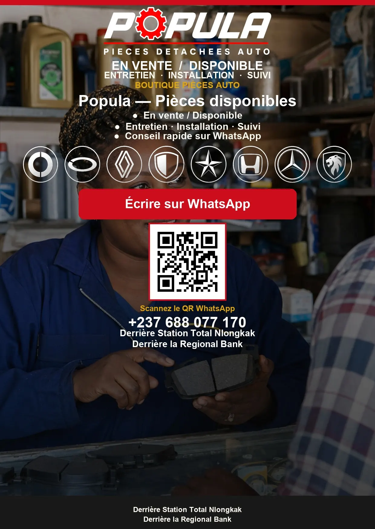
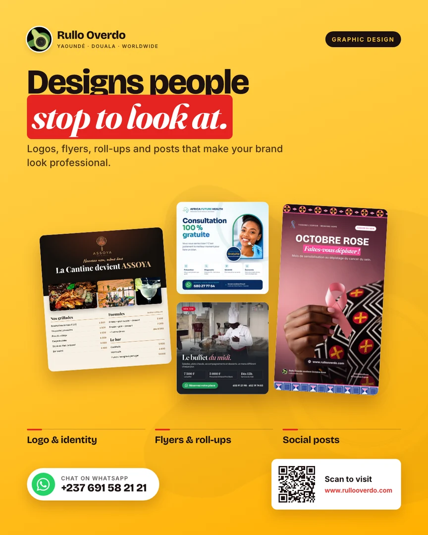
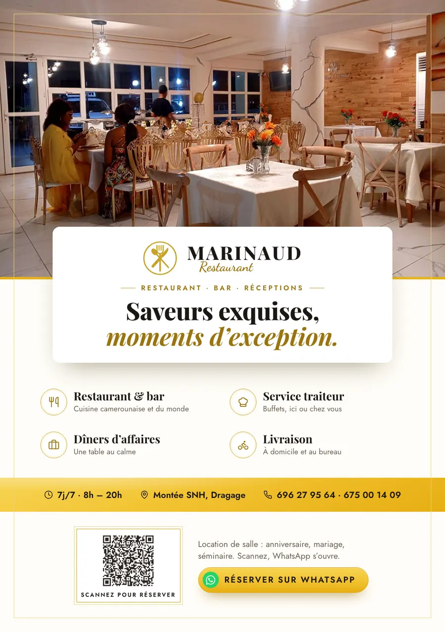
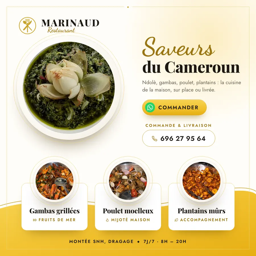
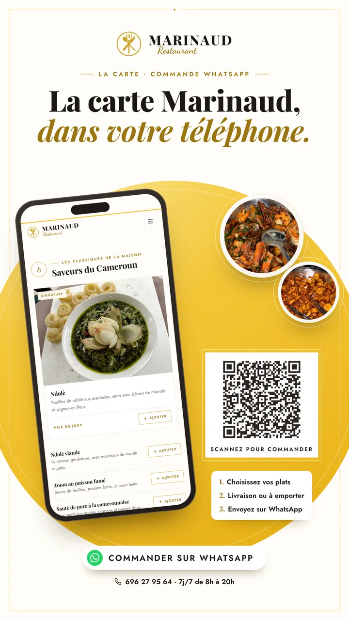
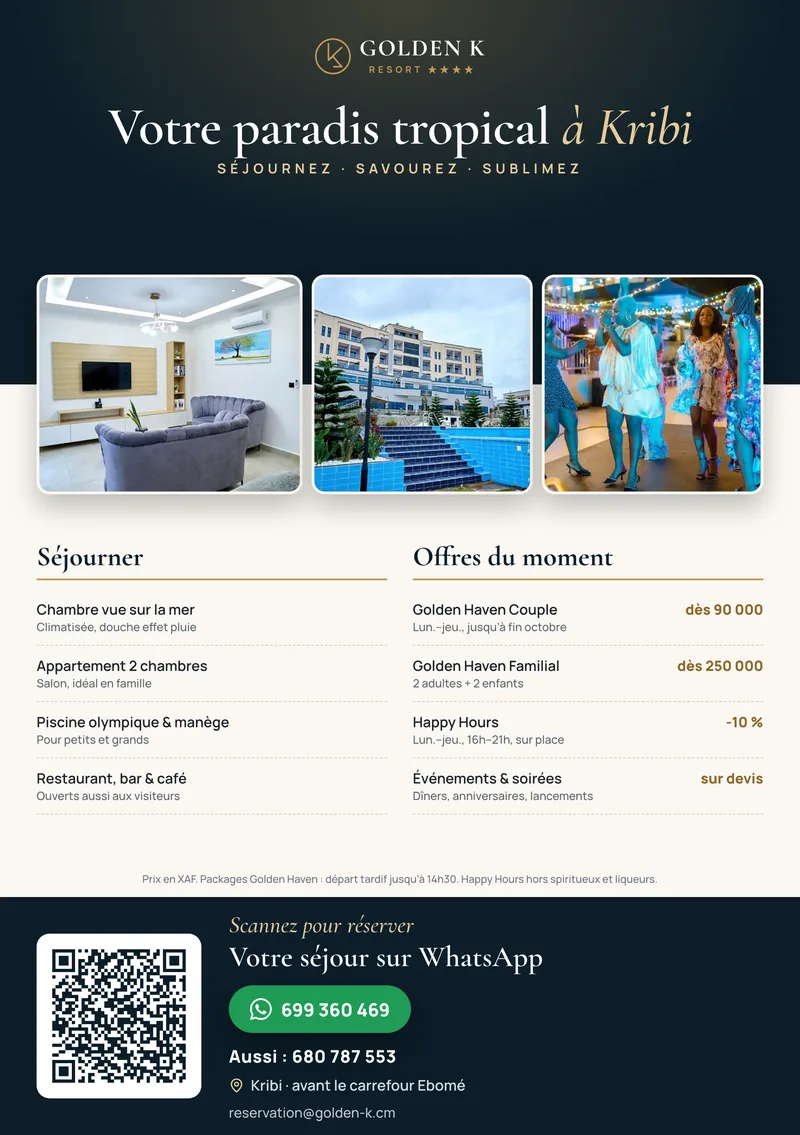
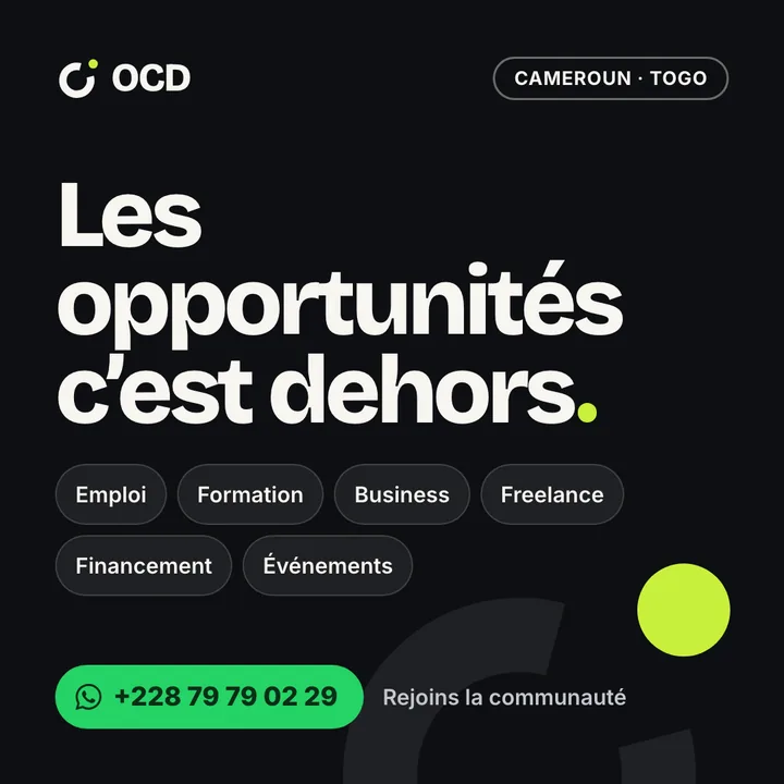
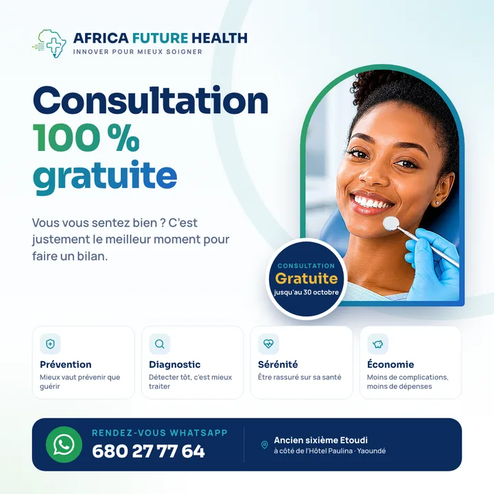
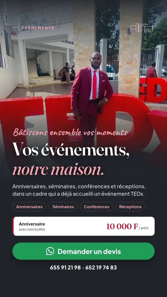
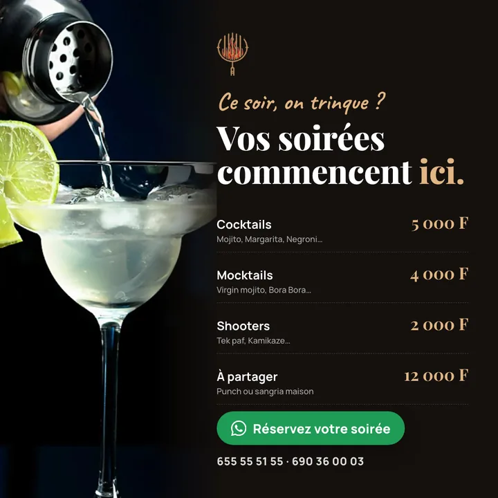
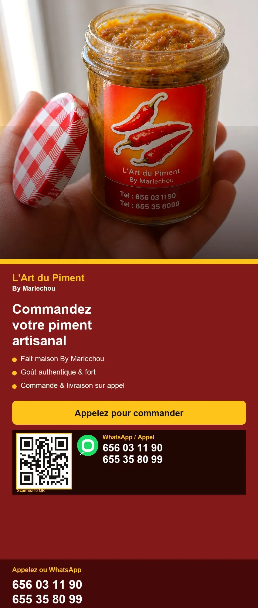
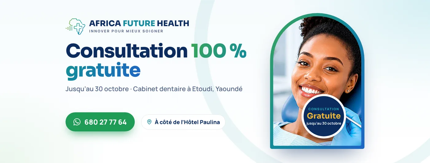
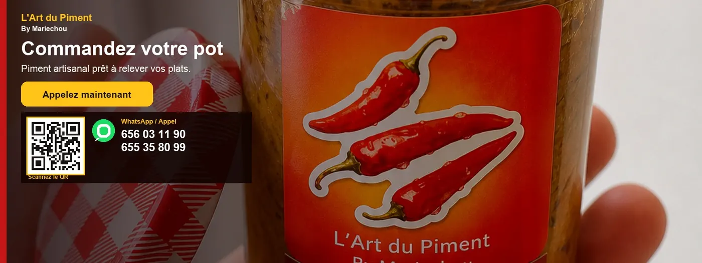
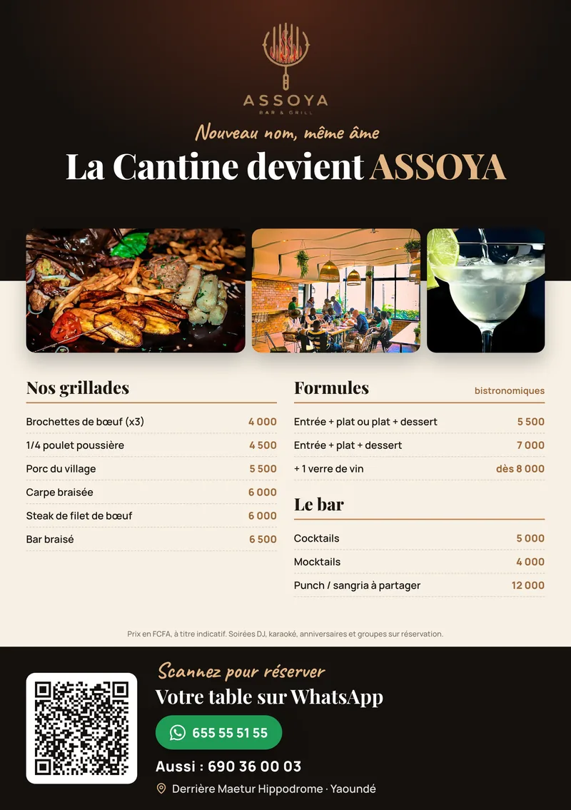
The flyers as they print — one offer, one ask, a number you can tap. Sauce brand and auto parts, both from the studio.
// Who we build for
Each trade gets its own layout — not a template with a new photo. Open the pages. Then see the print as it already sits: on a desk, on a wall, in the hall, at the door.
Schools
What we bring: a calm school site parents finish on a phone — courtyard, programmes, fees — then WhatsApp. The gate flyer, wall banner and hall stand say the same sentence.
A parent in a queue should not hunt twice. Split layout, ciel labels, one path. Print already on the desk.
Hospitals
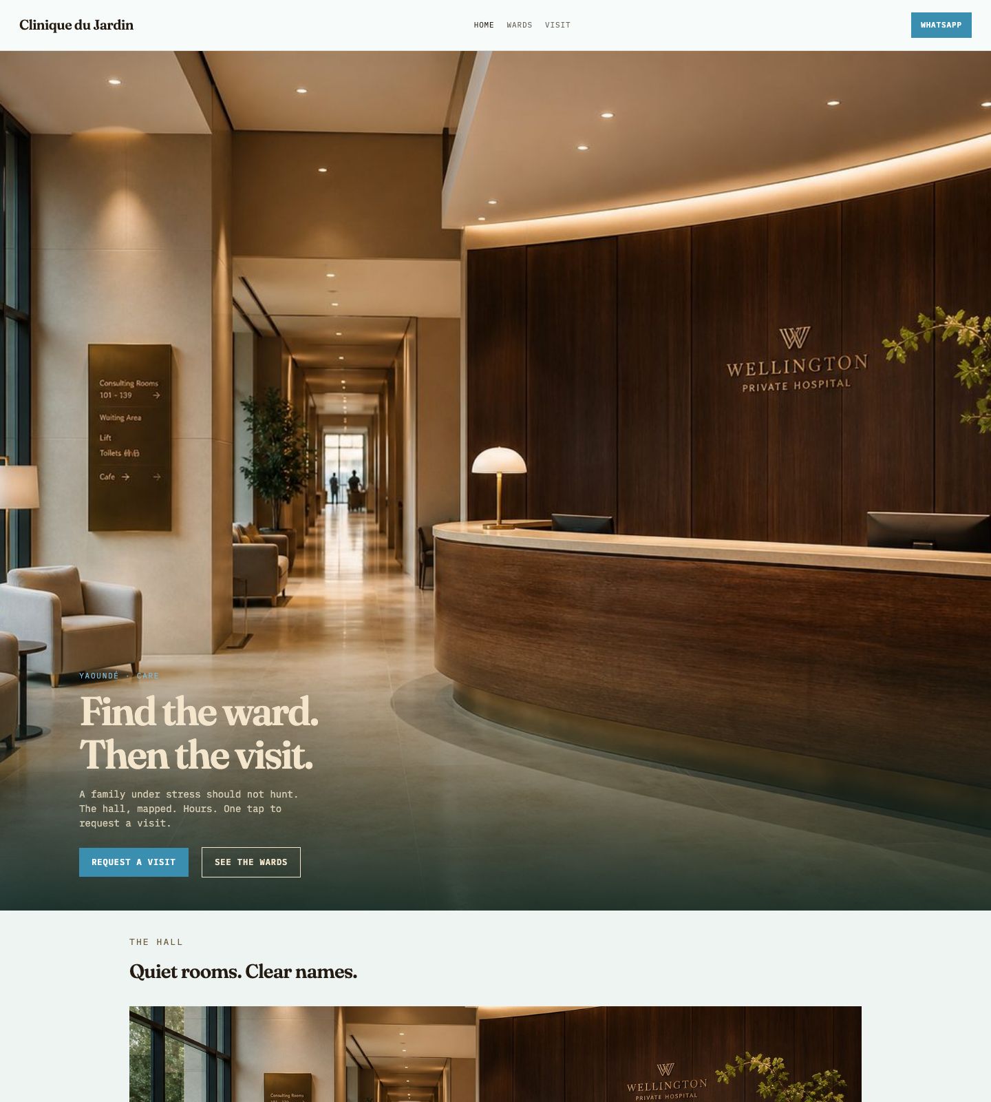
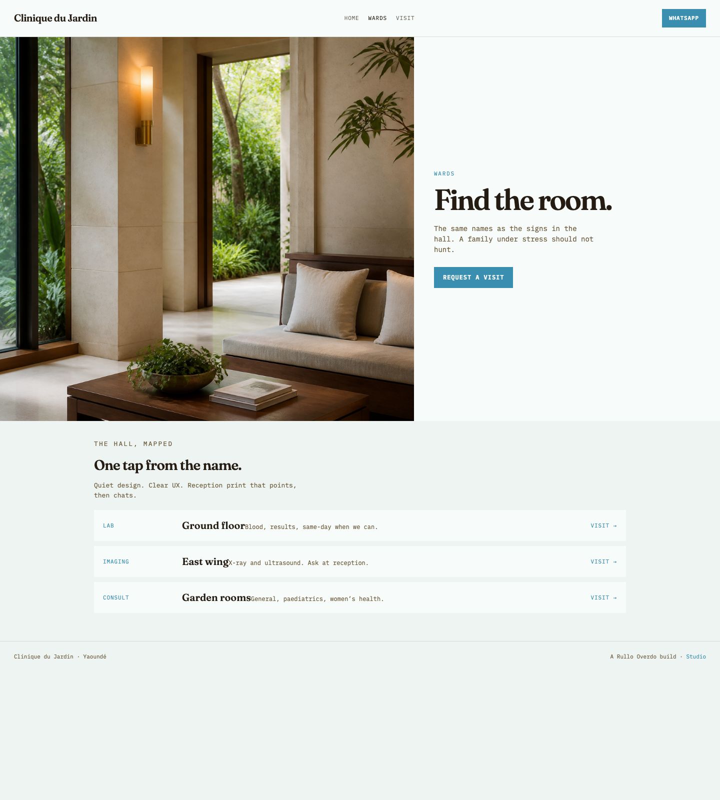
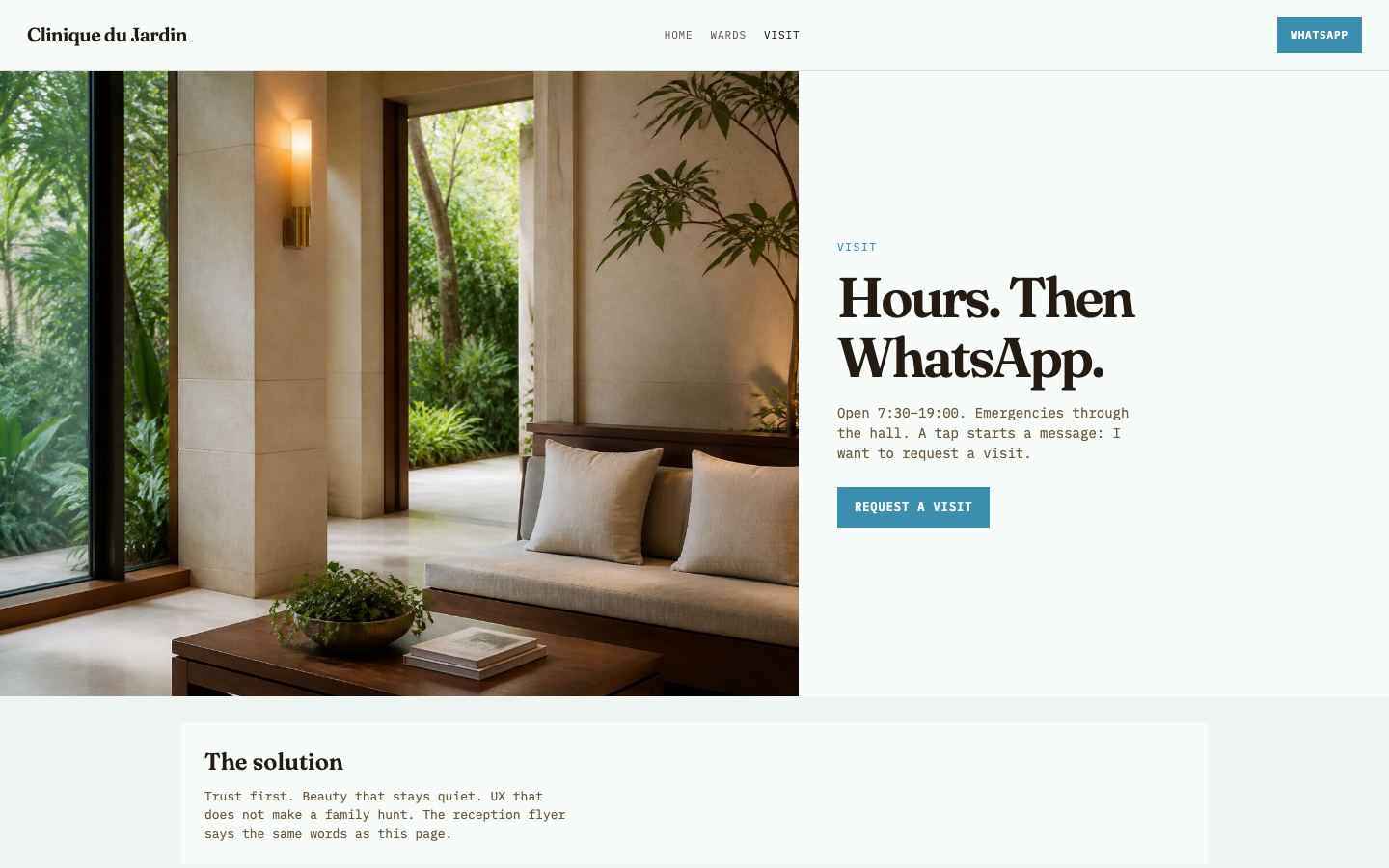
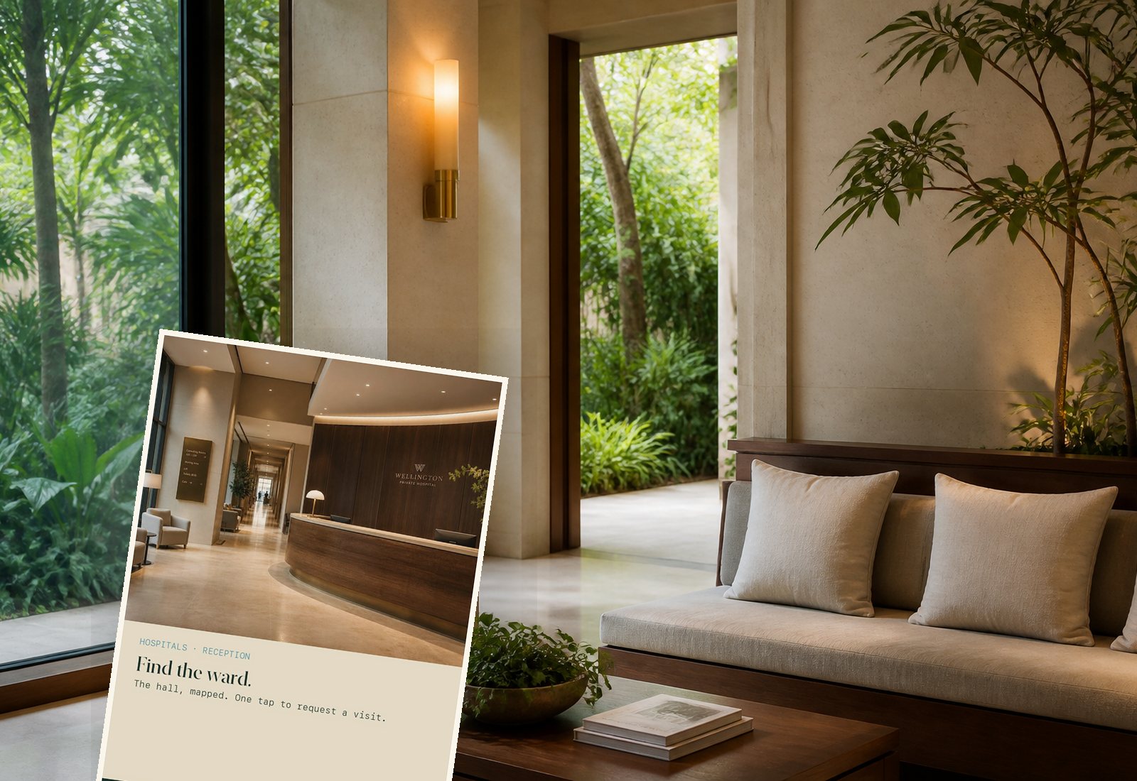
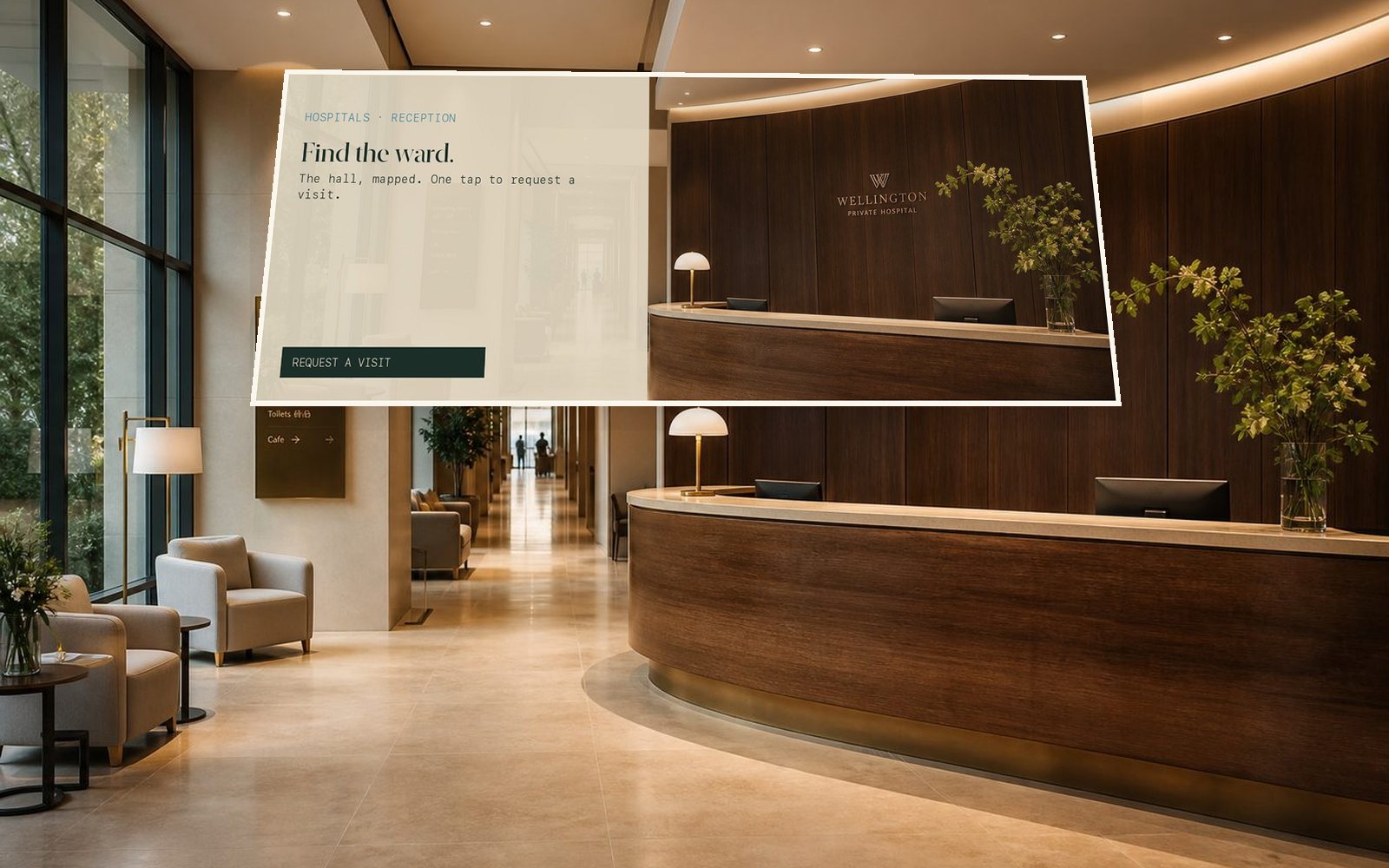
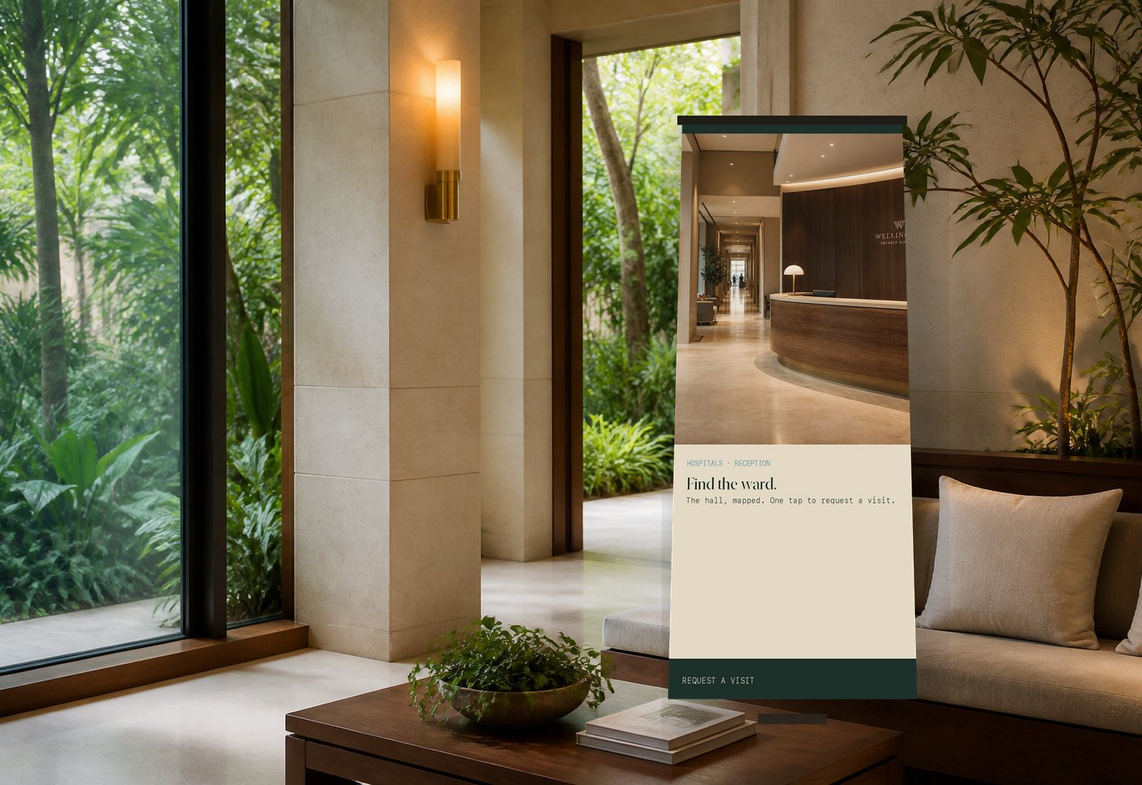
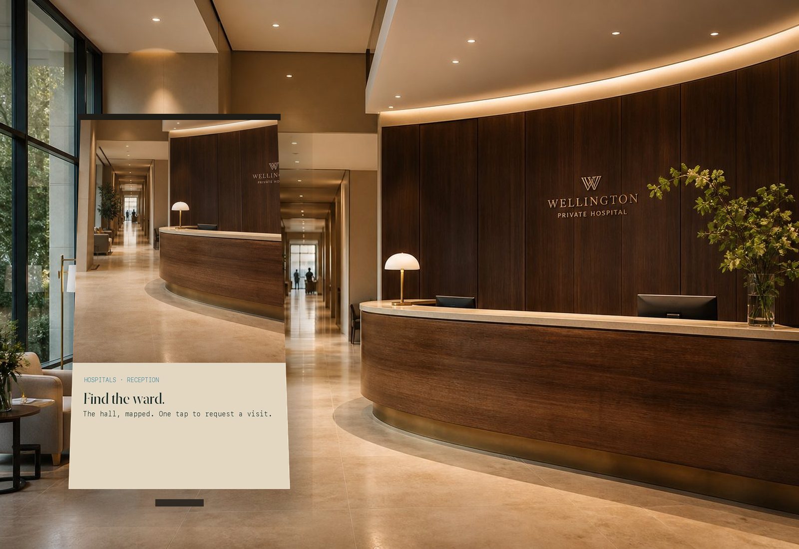
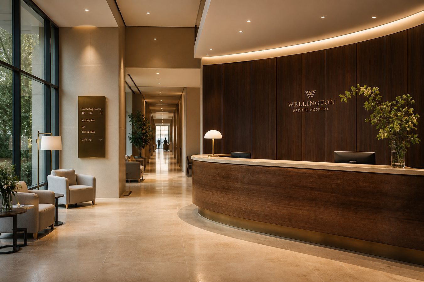
What we bring: a full-bleed, quiet site — the hall mapped, hours, one tap to request a visit. Reception flyer and lounge stand already pointing.
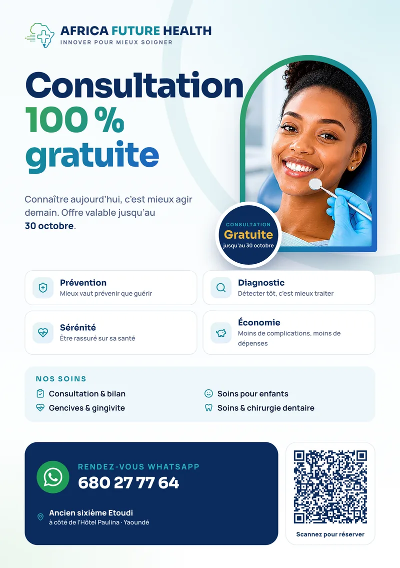
A family under stress should not hunt. Overlay copy on the lobby. Ciel for the tap. Print on the counter.
Law firms
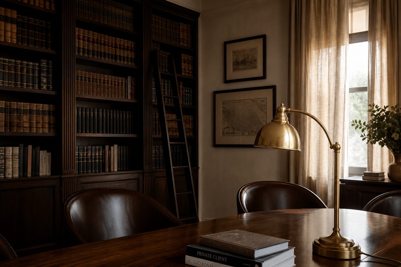
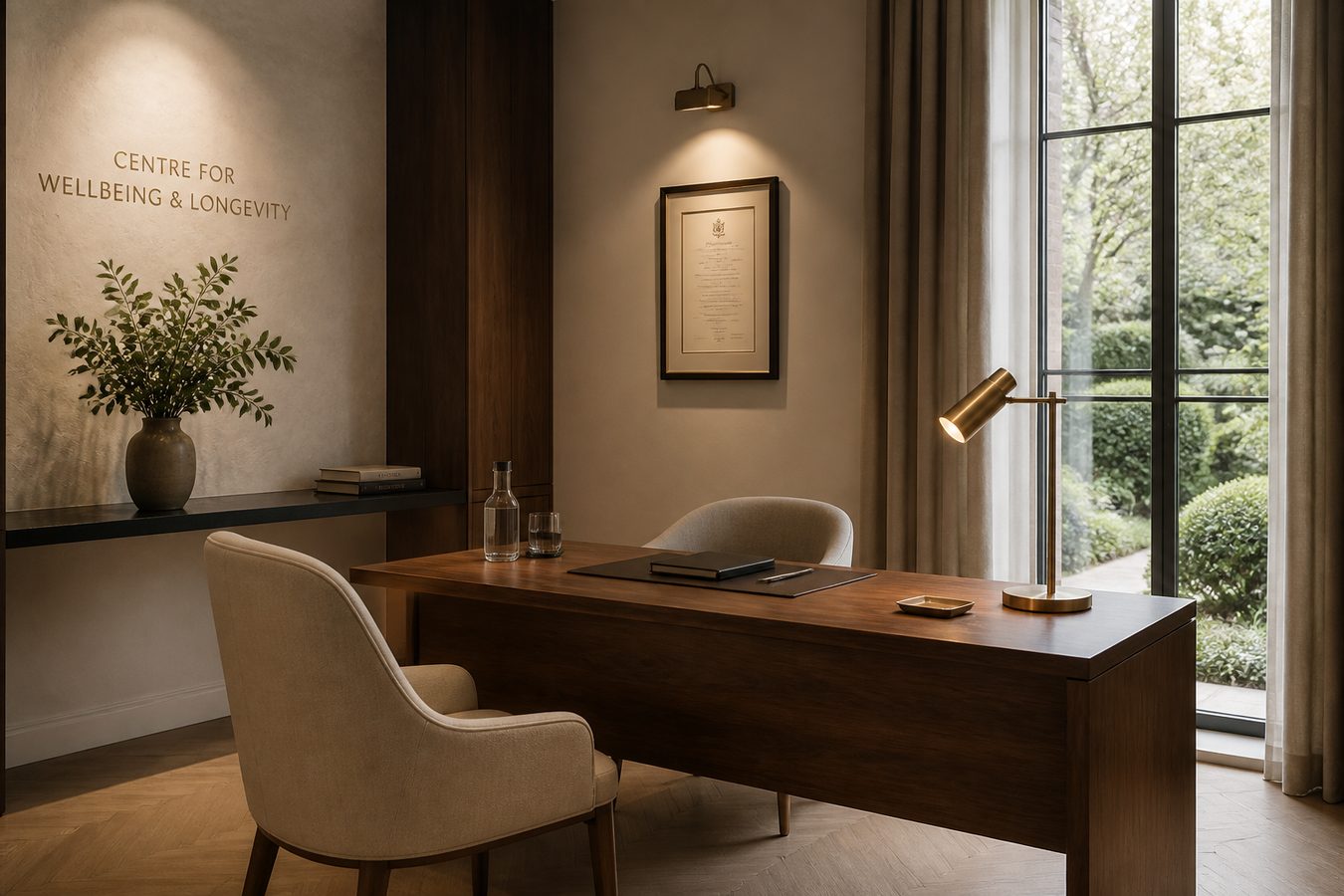
What we bring: a flipped layout — type first, the library second. Practice in plain language. A consult that doesn’t shout. Lobby stand in walnut light.
Clients decide before they call. Gold, ink, space. Print on the desk they already keep.
Guest houses
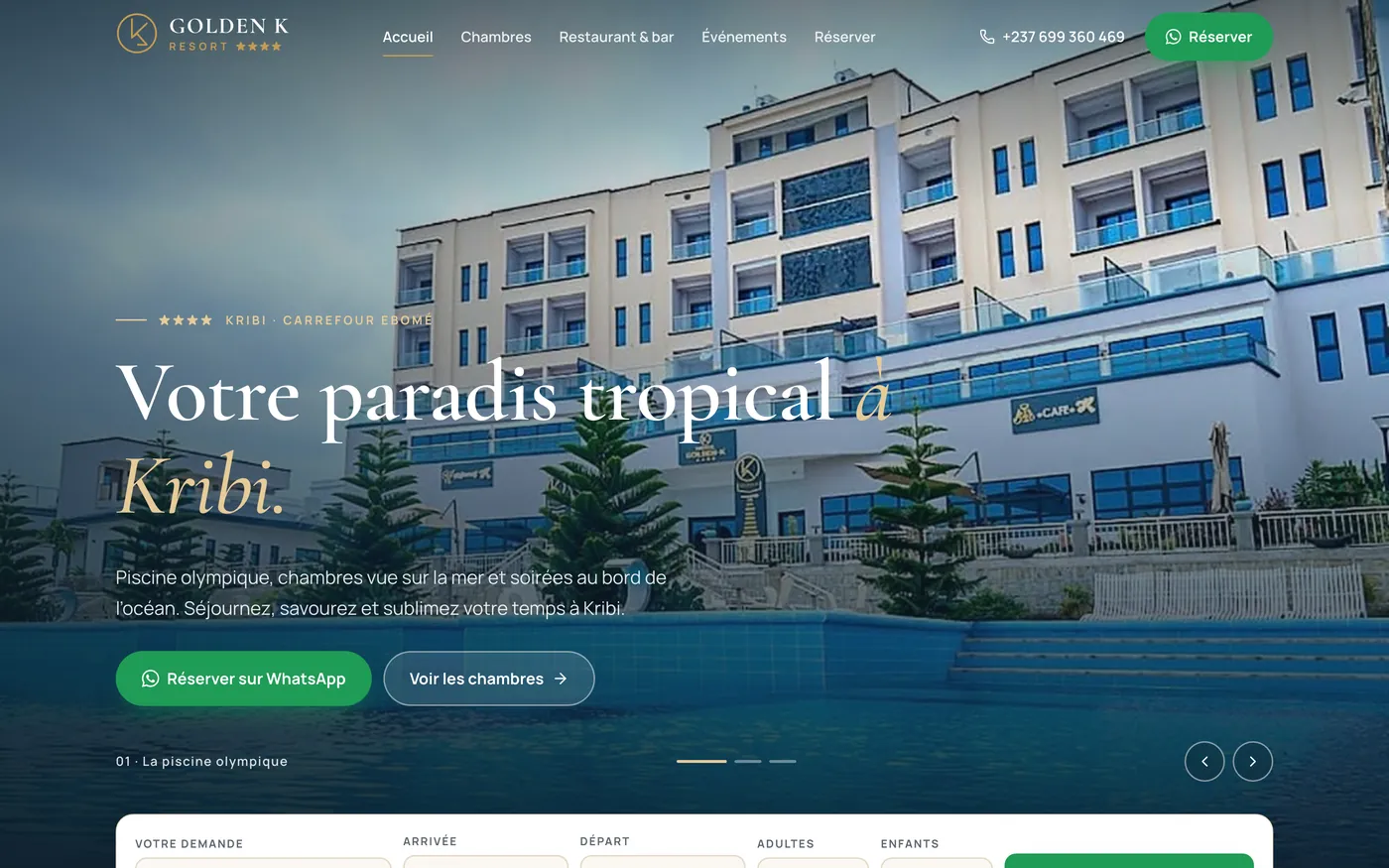
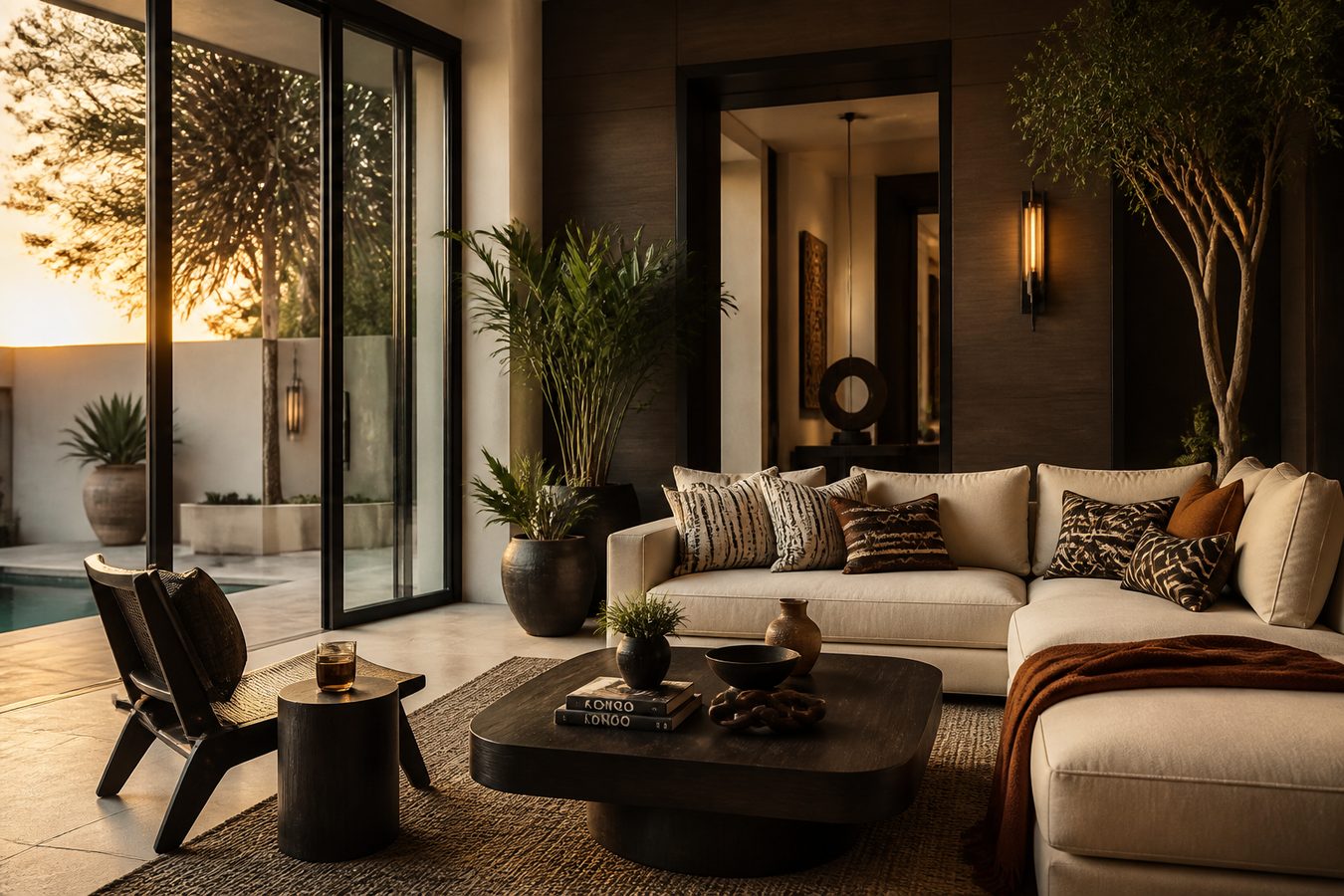
What we bring: a photo-first site — salon, bed, terrace in a slider — then WhatsApp. Gate flyer and arrival stand already telling the same story.
Guests book what they can picture. Nothing hotel-template. Print on the terrace table.
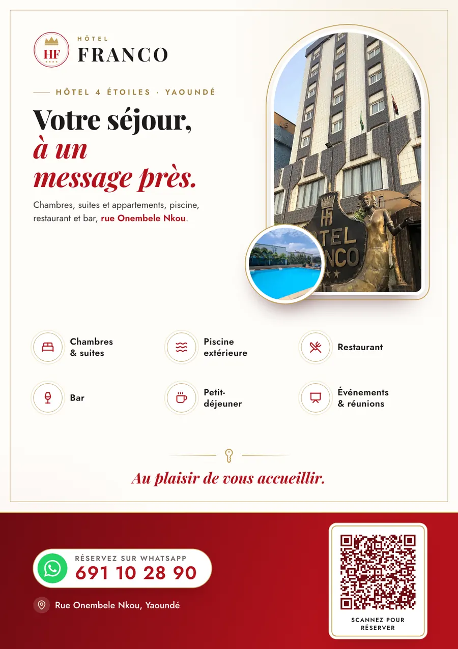
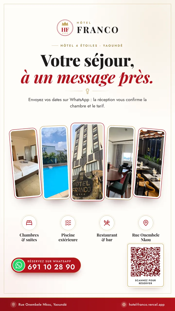
Hotels
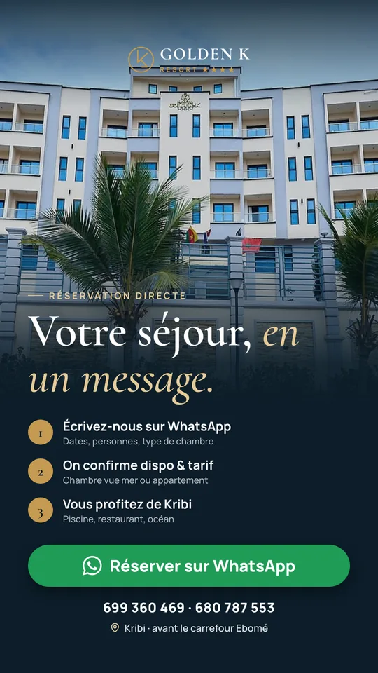
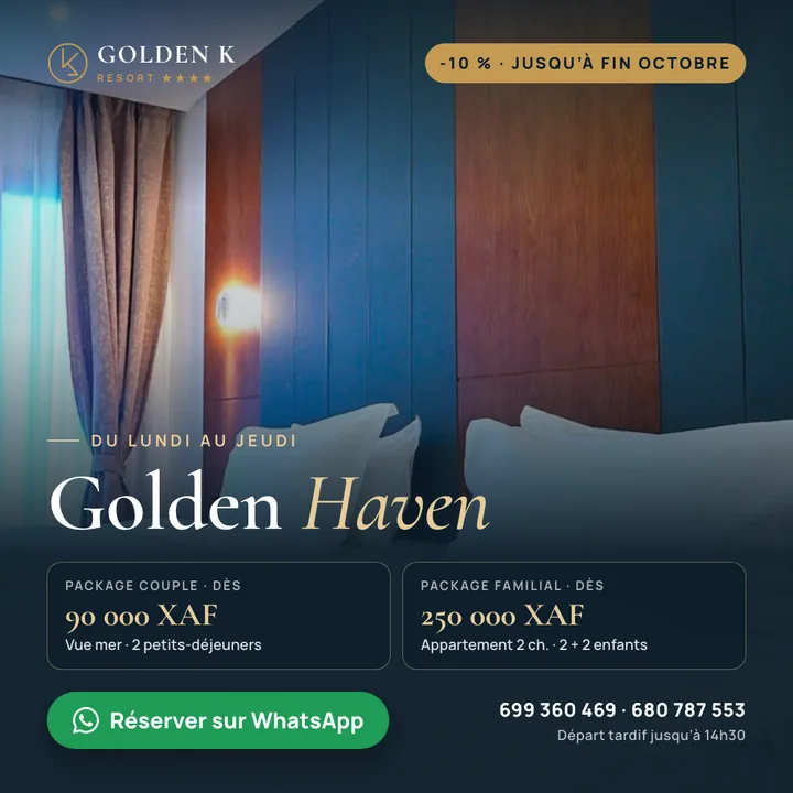
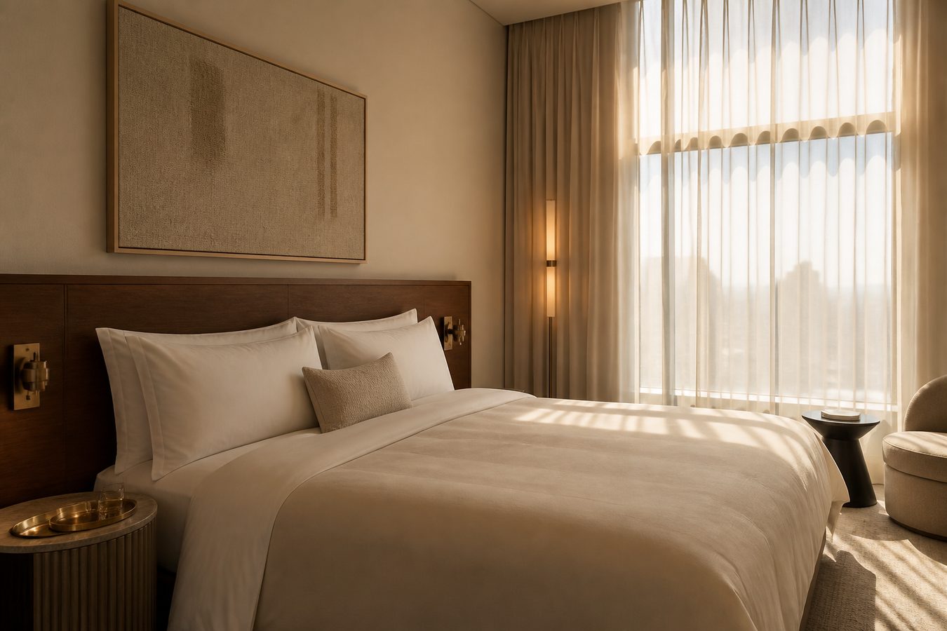
What we bring: a cinematic site — the bed full-bleed, copy on cream, rate then WhatsApp. Door banner and lobby stand already holding the room.
Guests should not send another email. Show the linen as it is. Print in the lobby they walk through.
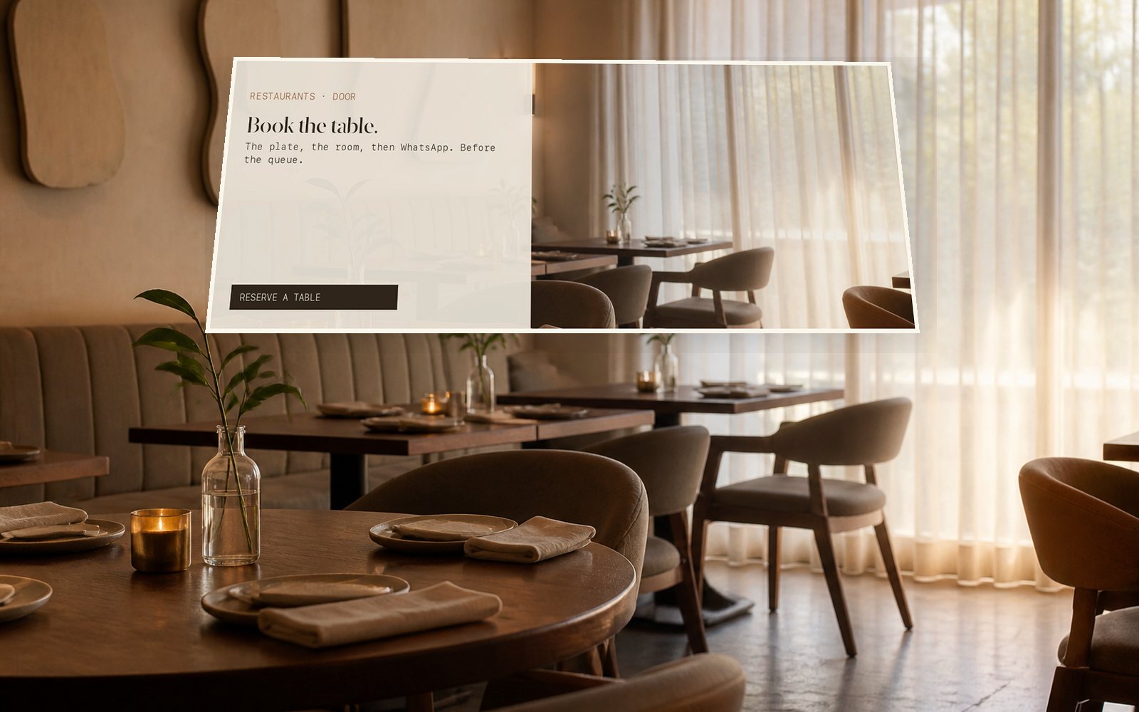
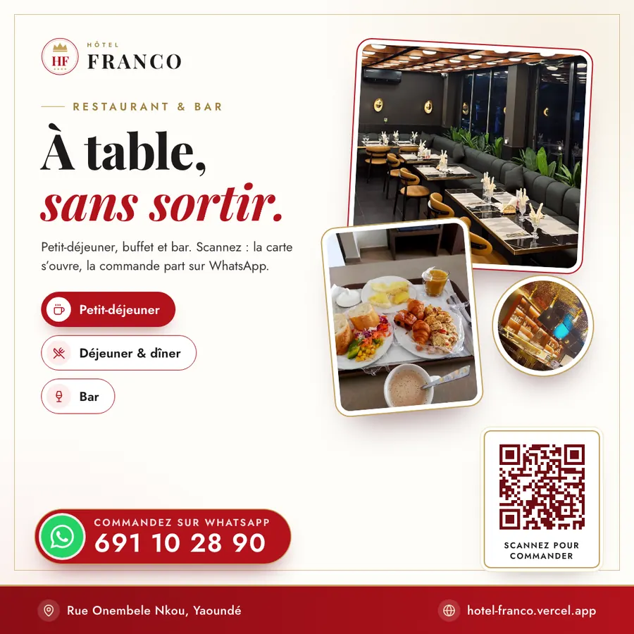
Restaurants
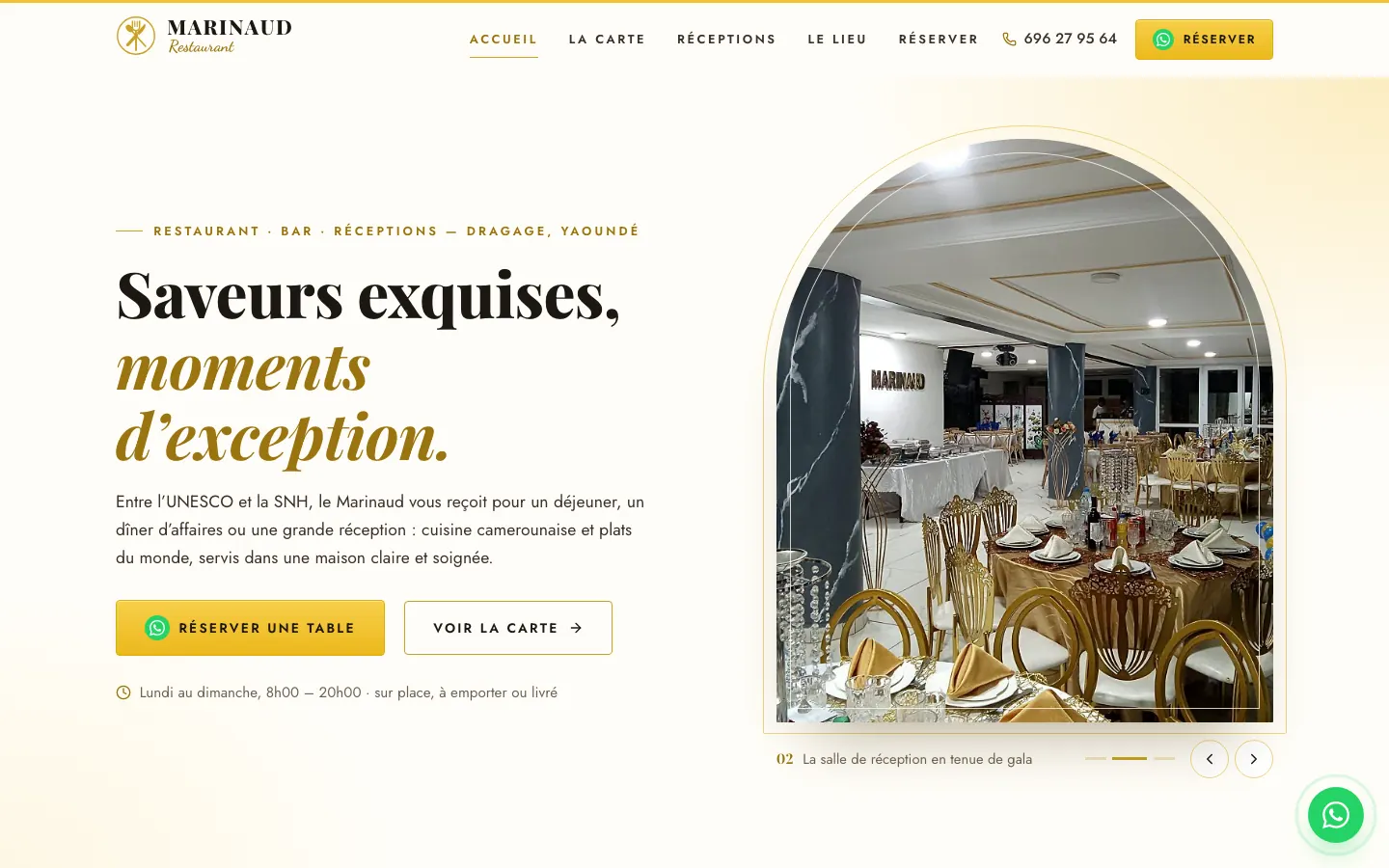
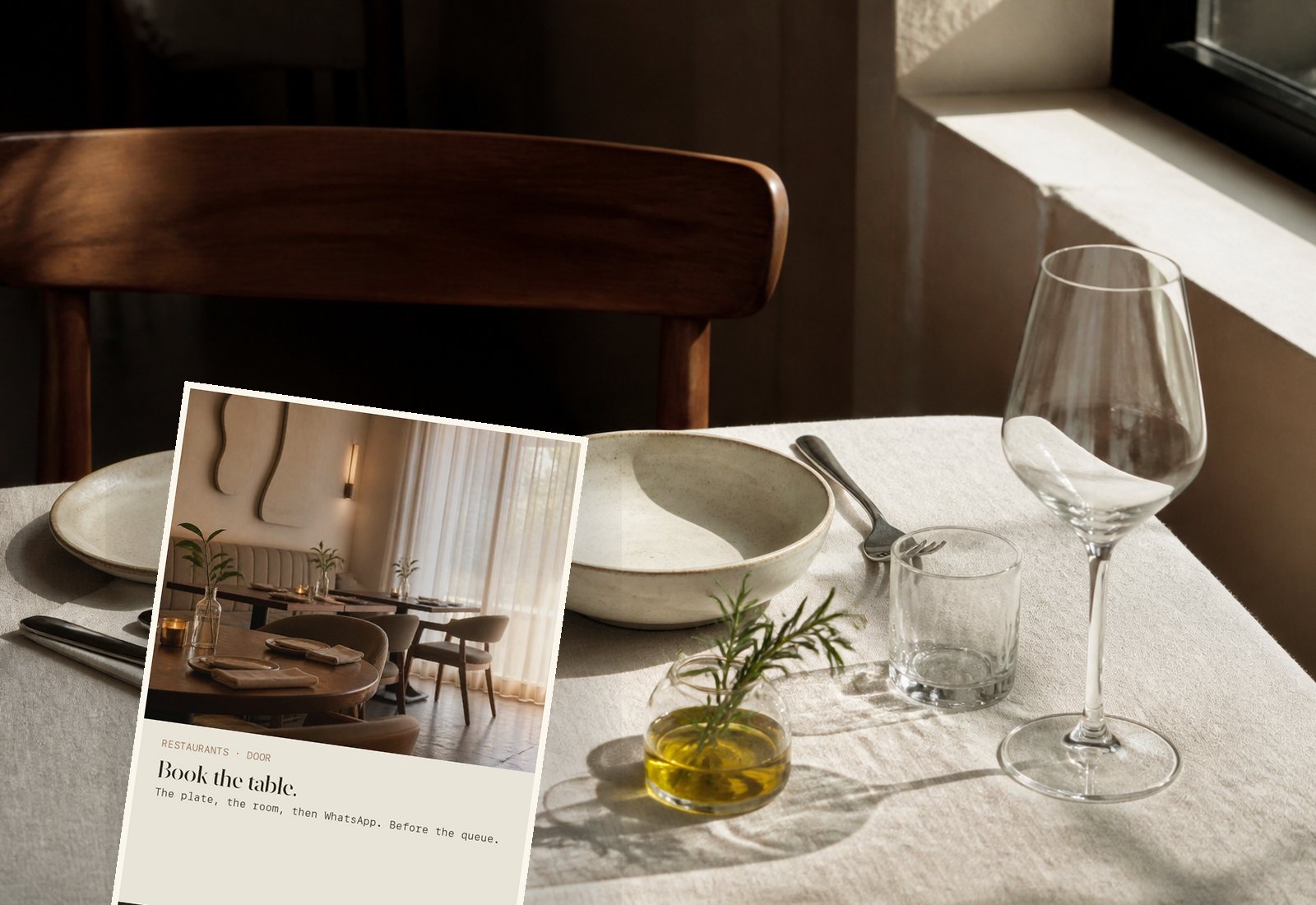
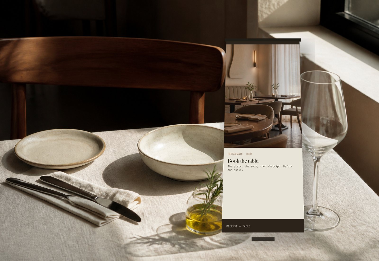
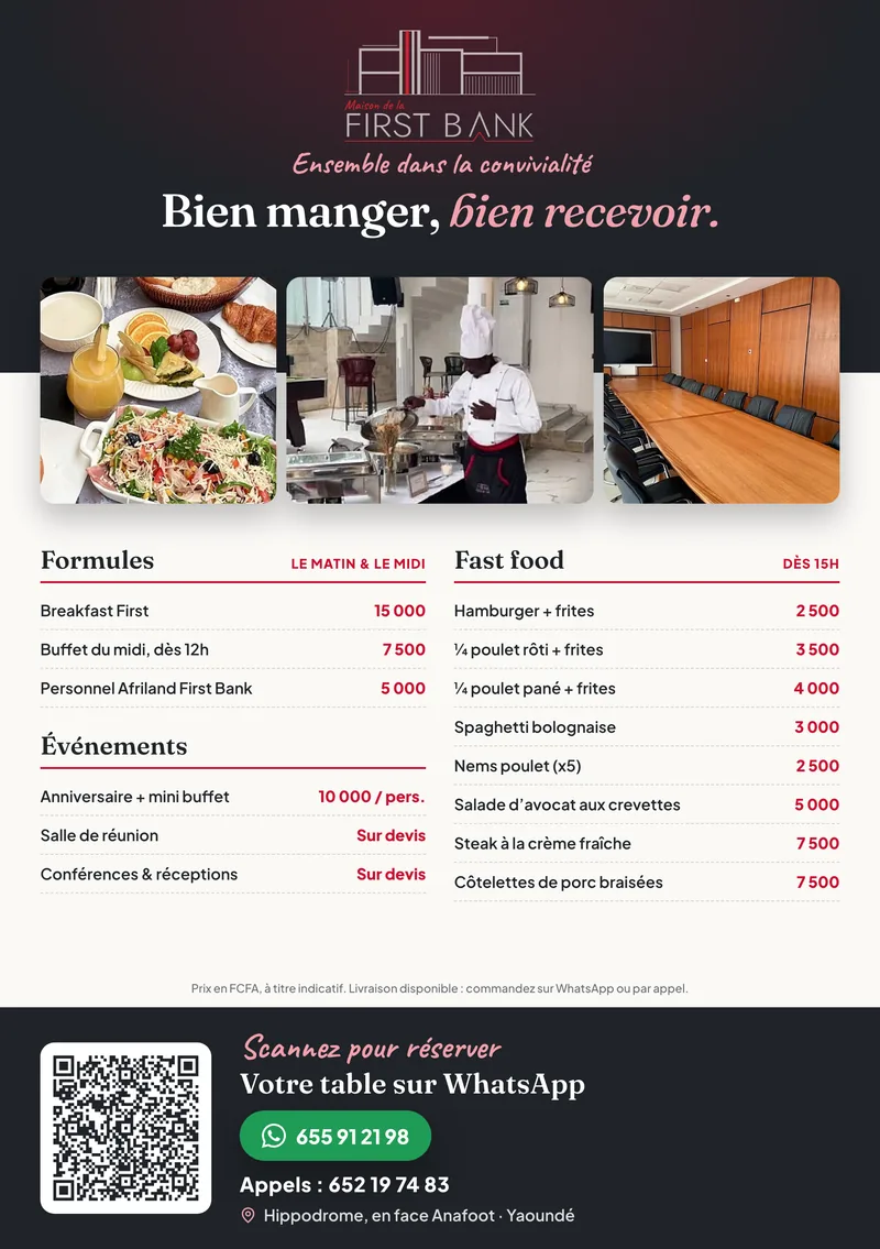
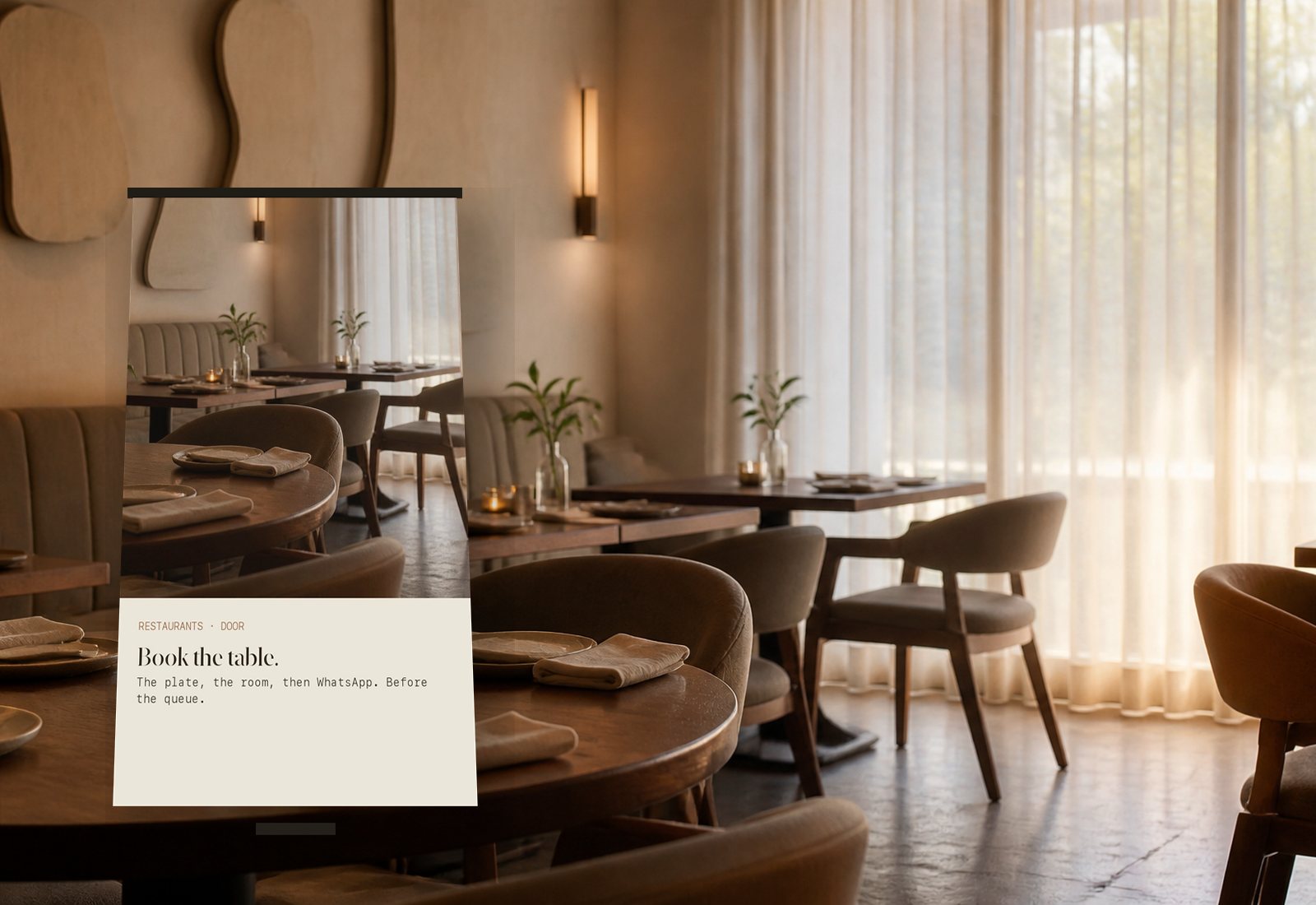
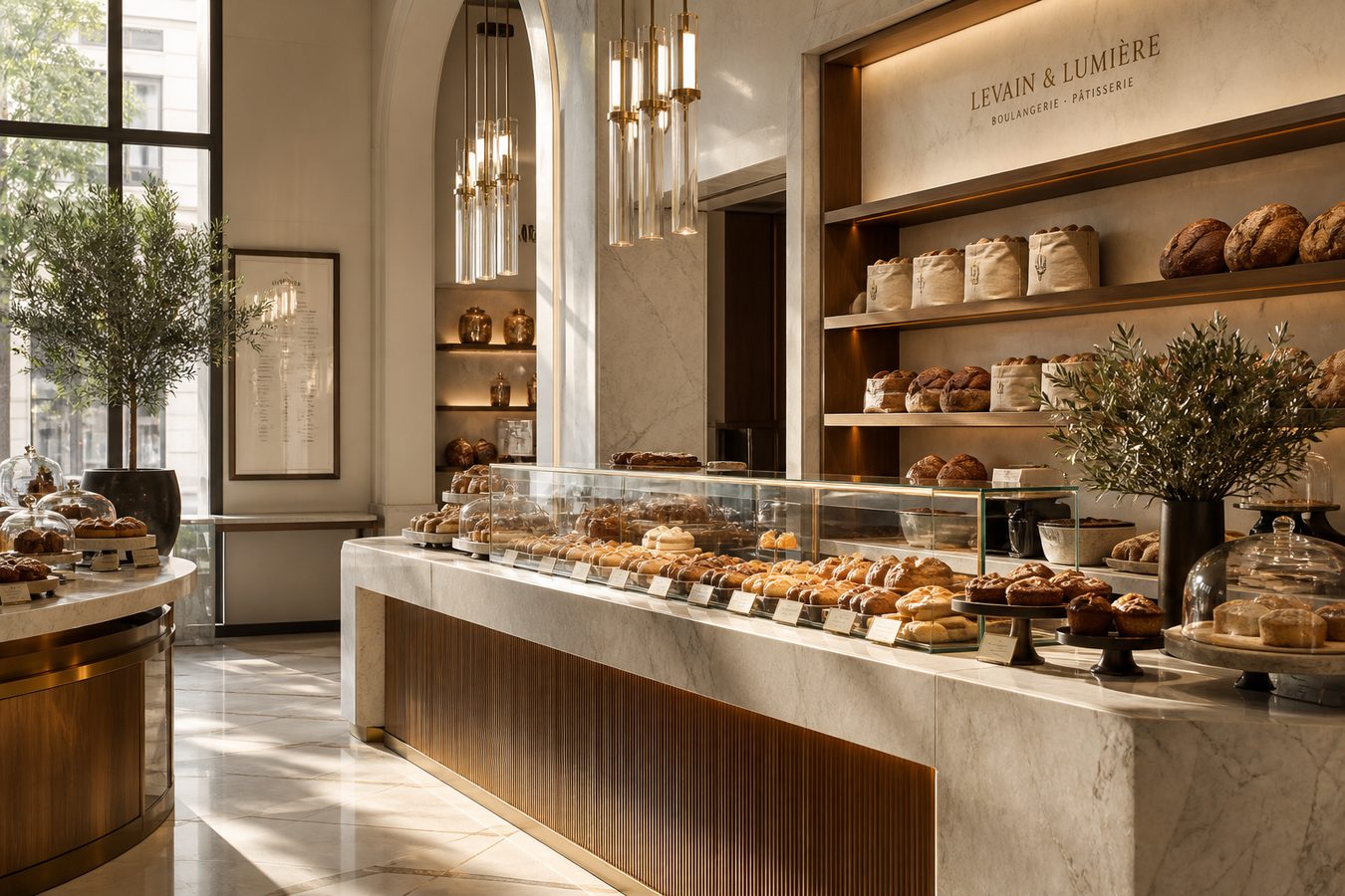
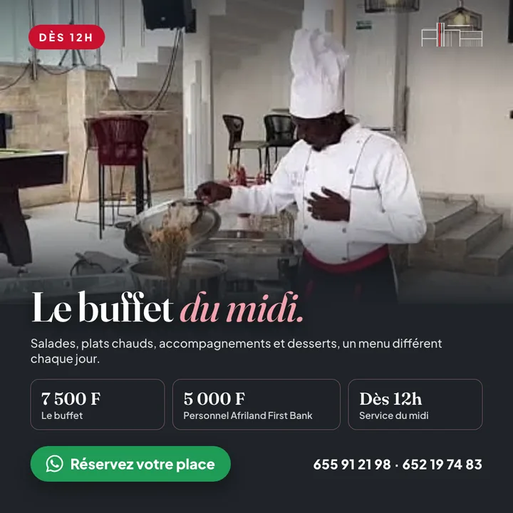
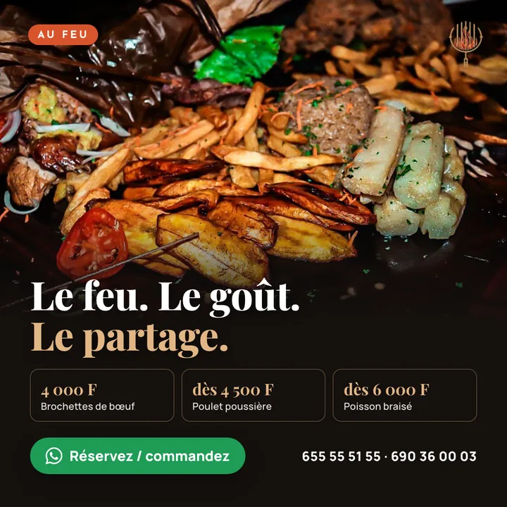
What we bring: a plate-first site — terracotta, menu slider, prices you can read, WhatsApp. Flyer on the table. Stand on the pavement.
Guests decide with their eyes. Show the ndolé, the linen, then a time. Print already at the door.
Pharmacies
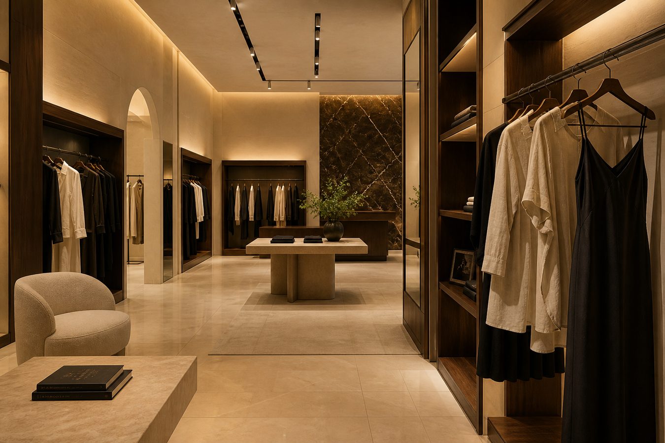
What we bring: hours on a ribbon before the hero — then a calm counter, a list, WhatsApp. Window banner and marble flyer already matching.
Open or closed should not be a rumour. Cool paper, ciel tap. Print on the marble they lean on.
Sauce · Food
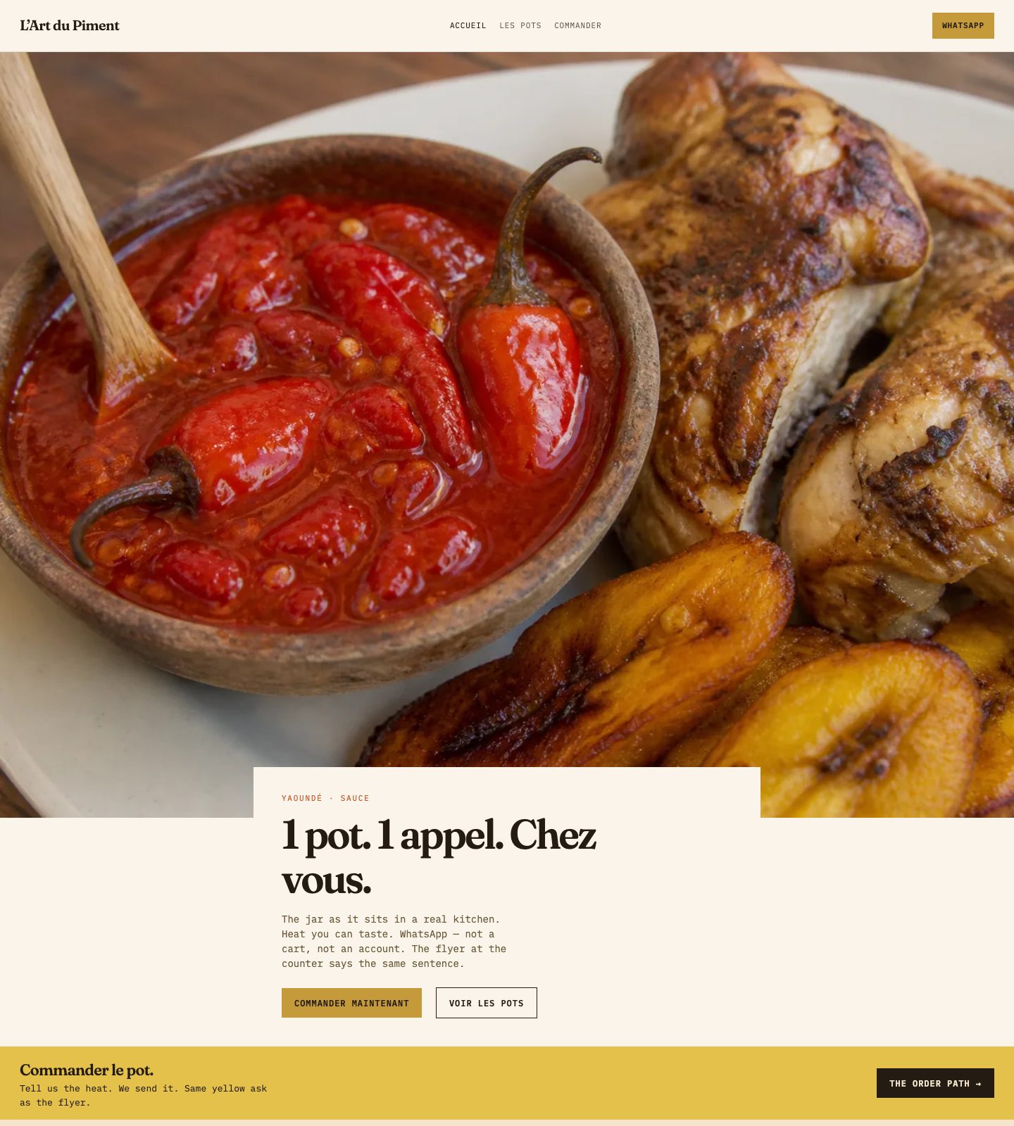
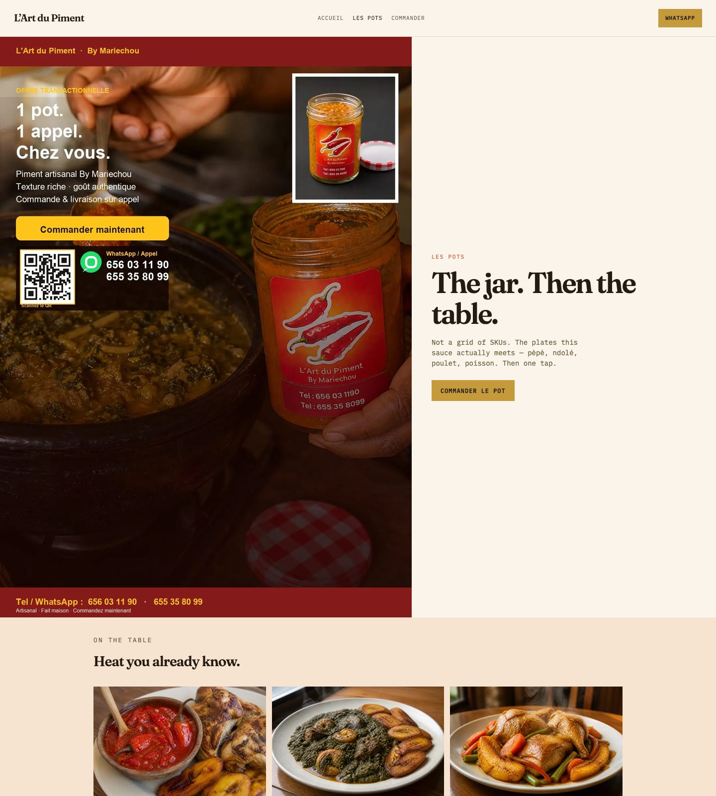
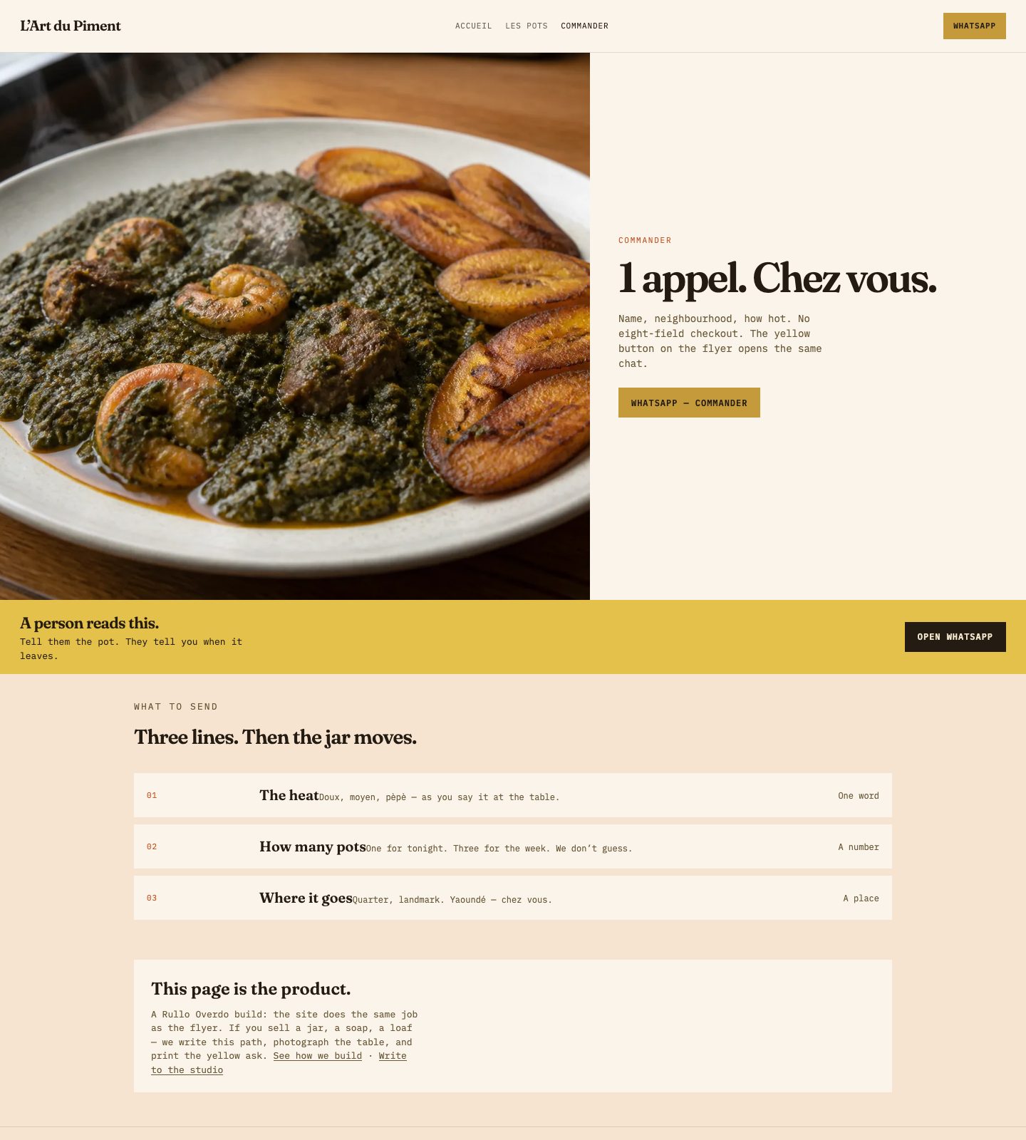
What we bring: a kitchen site — the jar, the stew, a yellow ask — then WhatsApp. Counter flyer, street banner and floor stand already saying the same sentence.
People don’t browse sauce. They remember lunch. Cinema hero, real plates, one path. Print already on the table.
Auto parts
What we bring: a shop site that behaves like the counter — brands you can read, a photo of the part, WhatsApp. Flyer and aisle stand already matching. Nlongkak on the footer.
A mechanic with oily hands should not pinch-zoom a menu. Dark header, gold mark, four jobs: sale, maintenance, installation, follow-up.
// Who we build for
We design sites people enjoy finishing — on a phone, without a hunt. Classic type. Natural photos. A short path to WhatsApp. The flyer and the stand say the same thing, so your business feels like one piece, not a pile of files. Design, UX, coherent, minimal.
// Local understanding
Based in Cameroon, we build for ambitious brands everywhere. Cultural intelligence, human-centred design, and pages people actually enjoy using — classic, natural, coherent.
// Human experience
Someone is holding a phone in a queue, a hall, a shop. We design for that person: fewer taps, clearer type, a button that does what it says. Ease first. A little fun. Never a maze.
Understand what they need. Remove the extra. Keep the site, the flyer and the stand as one story.
// Website banners
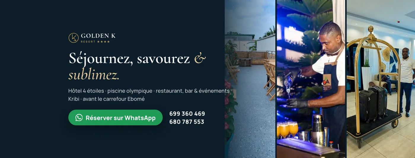
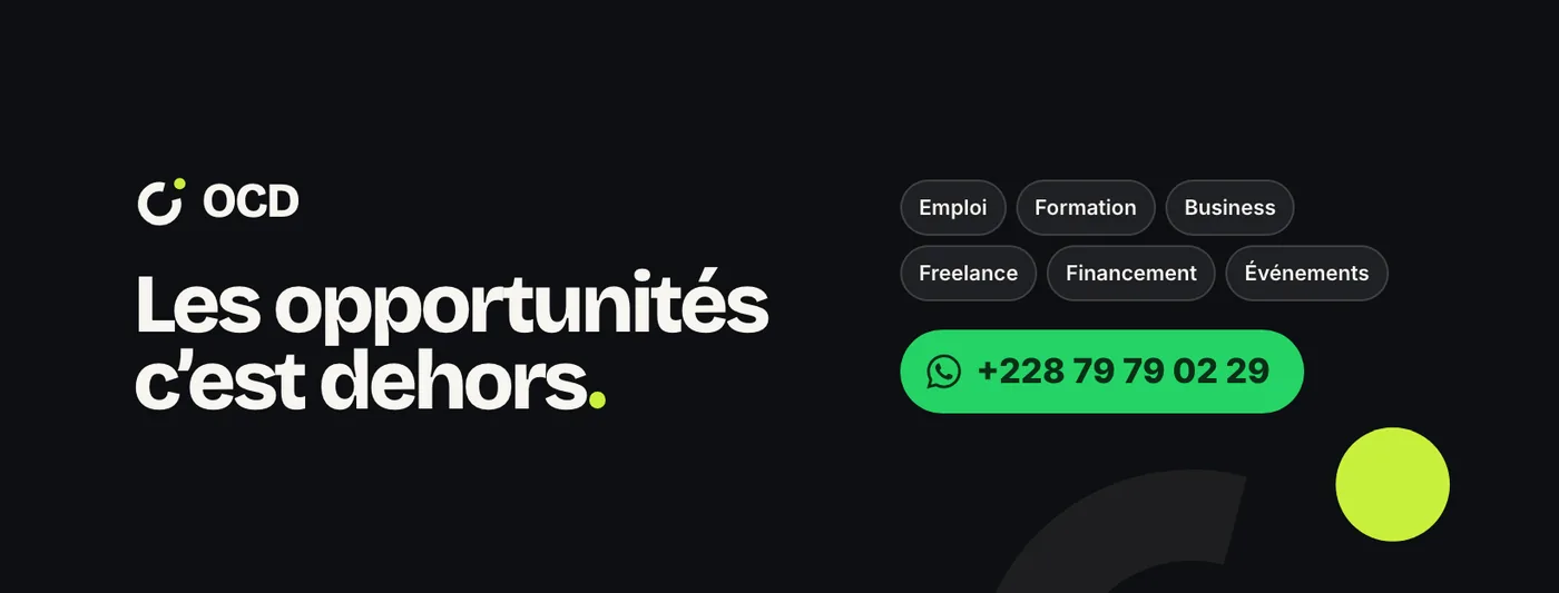
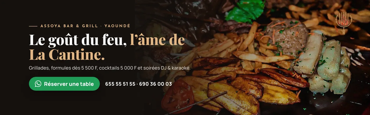
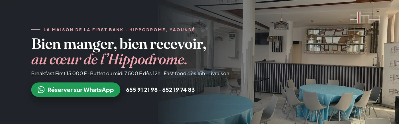
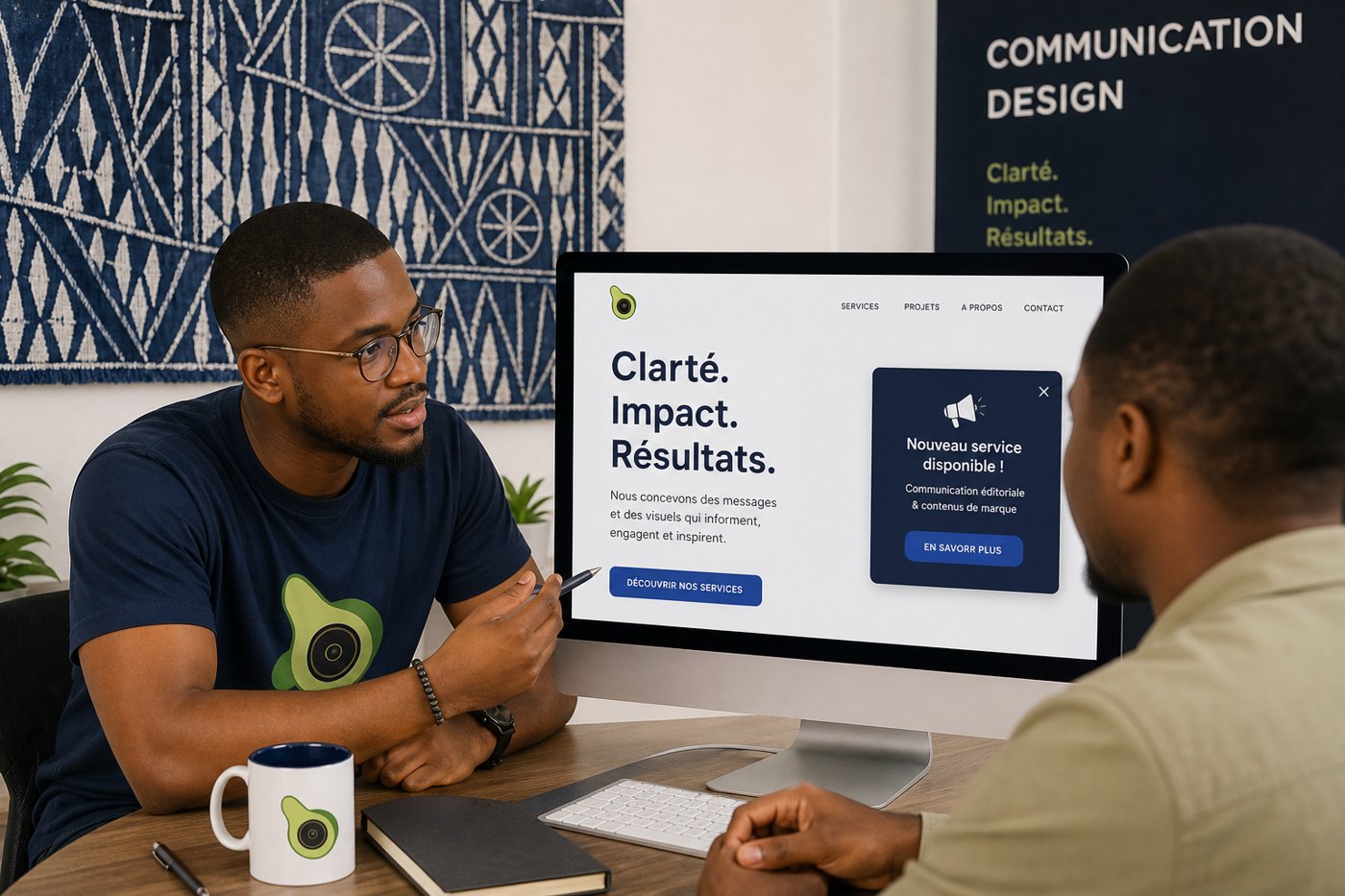
Each banner is a full-bleed photo, a strong title, and the solution — design, UX, a coherent ask. Same words as the site.
// Flyers
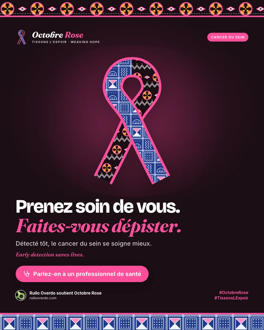
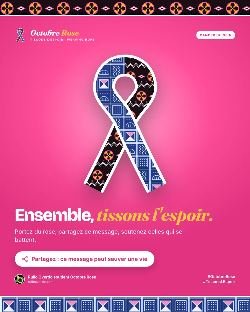
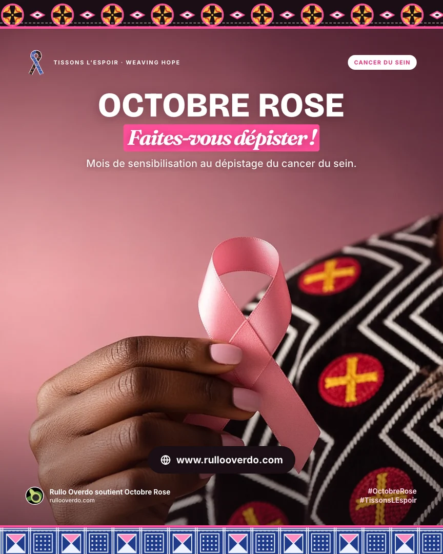
Each flyer is a photo, a title, and the path we design — easy to read, one ask, coherent with the site. Classic type. Natural pictures. Nothing extra.
Schools
Parents shouldn’t hunt for fees on a faded poster. We design a calm school site and a gate flyer that say the same thing — clear type, one WhatsApp, nothing extra.
Clinics
Hours, services, location — then WhatsApp. Nearby patients find you without five phone calls. Calm pages, one path, a waiting-room flyer that matches.
Law firms
A firm should feel like the room you already keep. Minimal pages, plain practice areas, a consult that doesn’t shout. The flyer is the same tone.
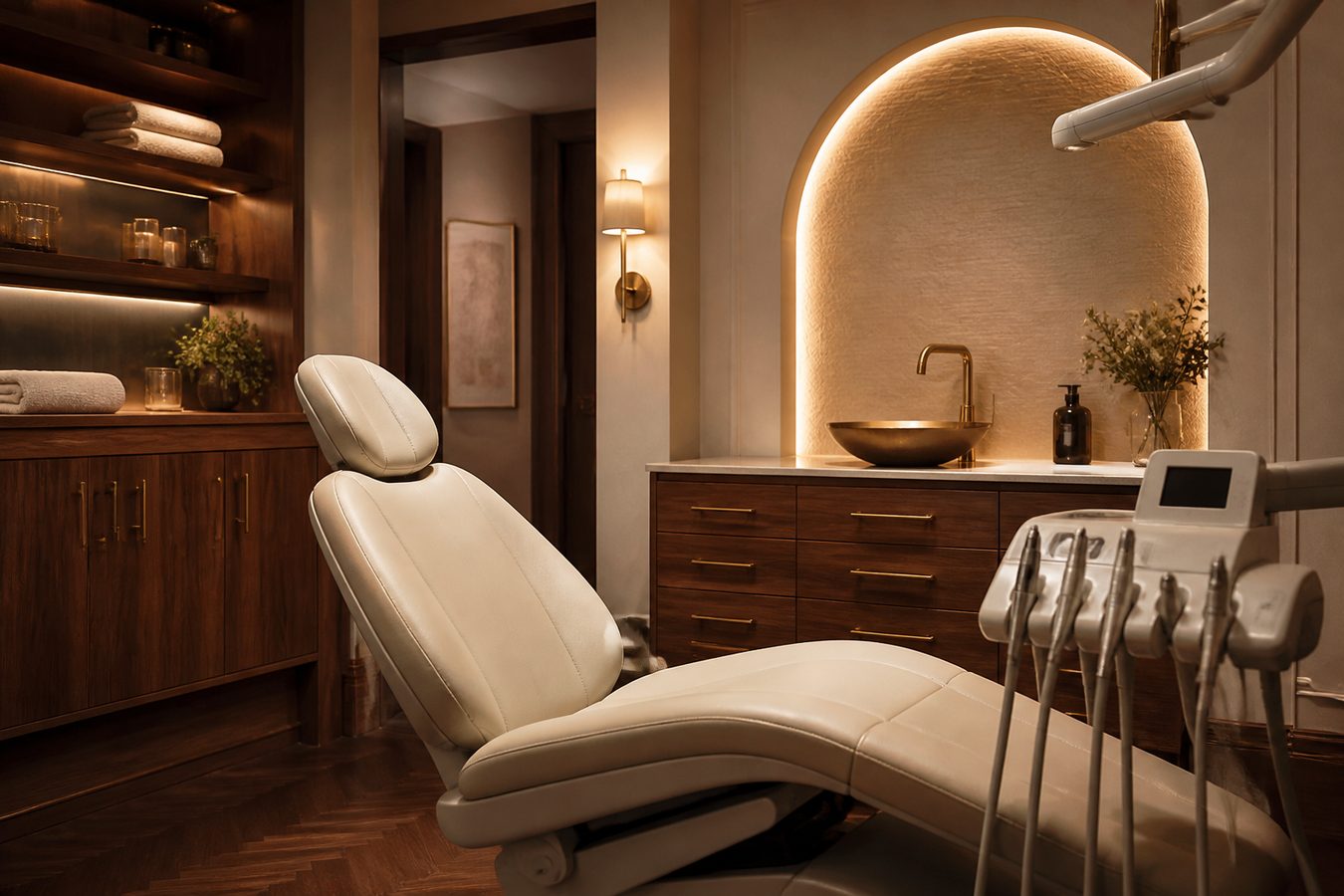
Dentist
Hours on the first screen. Services in plain words. WhatsApp for the chair. Calm, minimal — as quiet as the waiting room.
// Guide
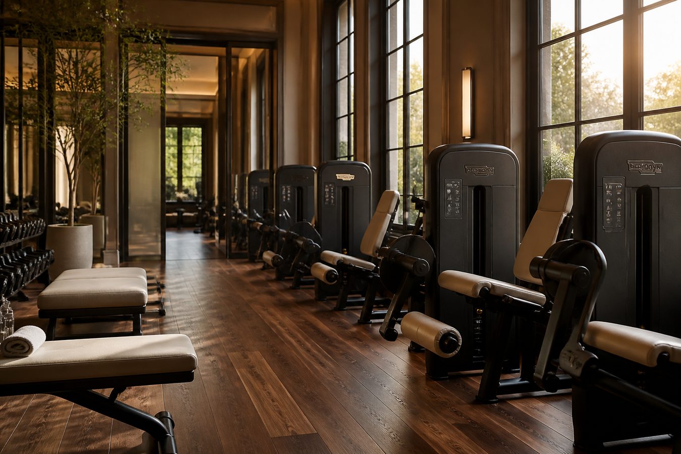
Articles on who you are — schools, hospitals, lawyers, hotels, guest houses, gyms, dentists, shops — and on the services we hire out. Problems, solutions, sliders of the work. Then WhatsApp.
// Services
// A clear process
Every project starts with your business goals, not a generic package.
We review your market, audience, competitors and current digital presence to identify the highest-value opportunities.
We shape the message, campaign, search strategy, authority plan or website around a clear commercial objective.
We measure performance, share clear insights and improve the work as your audience and business evolve.
// Ready
Web design, marketing, SEO, banners, flyers and roll-ups built for measurable growth.