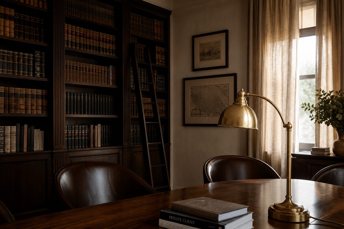
// Guide · Law firms
⚖️ Get a law firm website that gets you hired
Minimal, serious design. Practice areas. Consult in one tap.
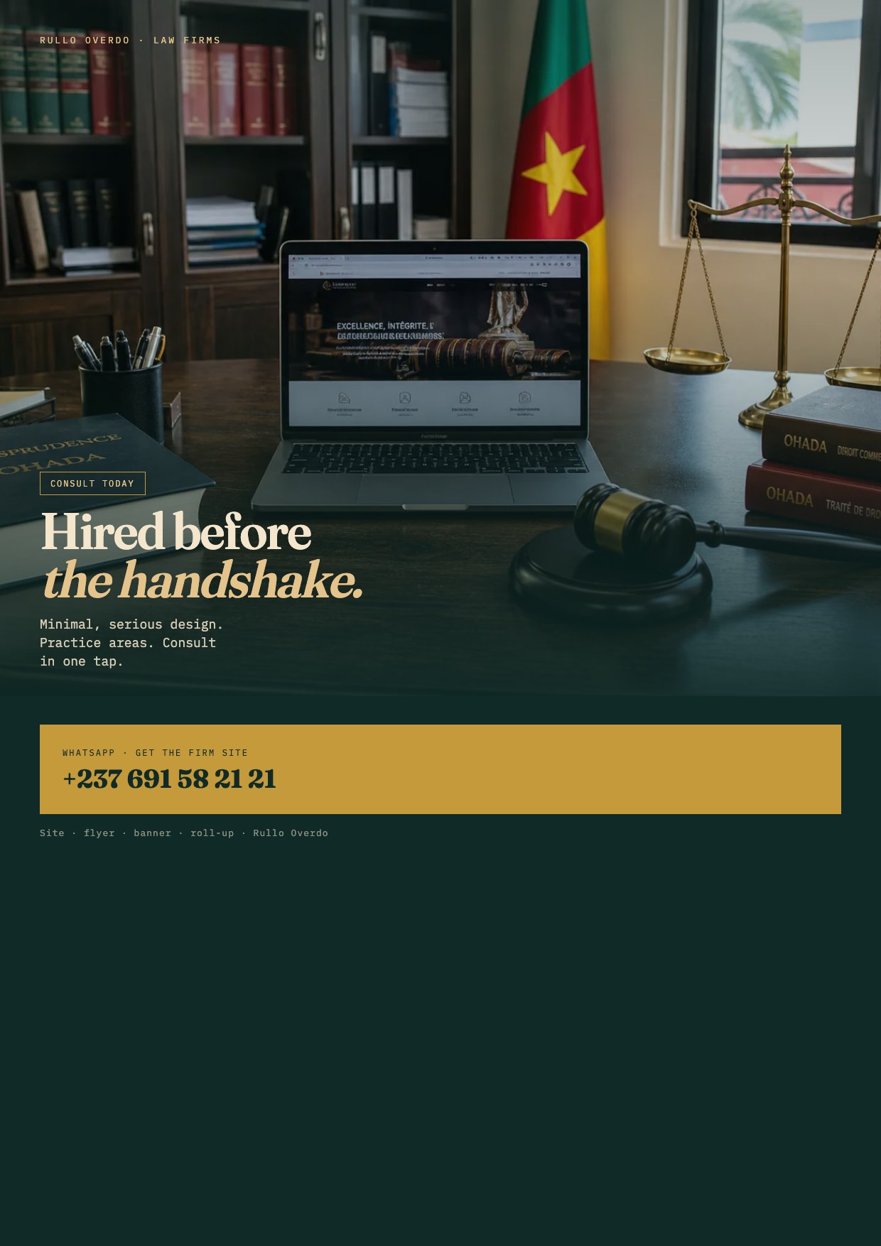
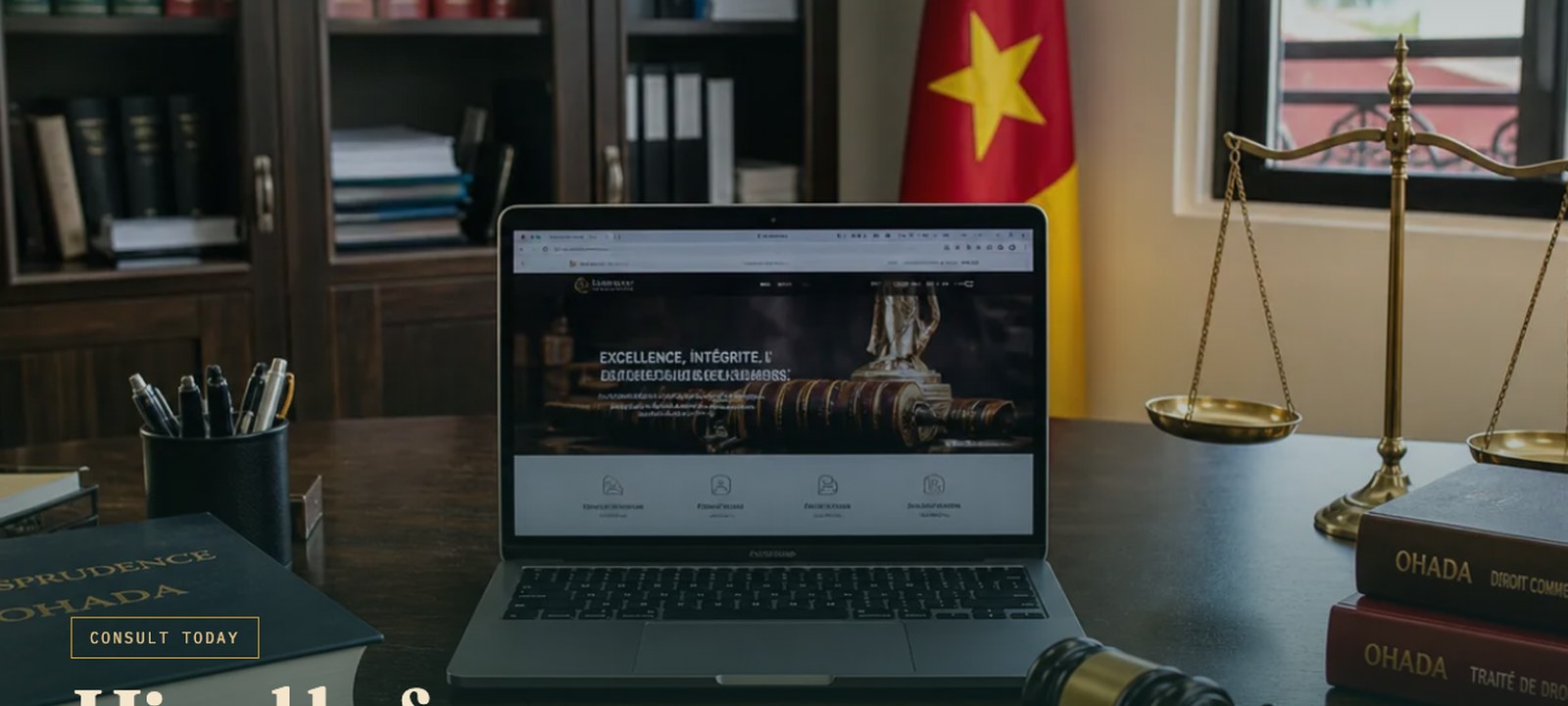
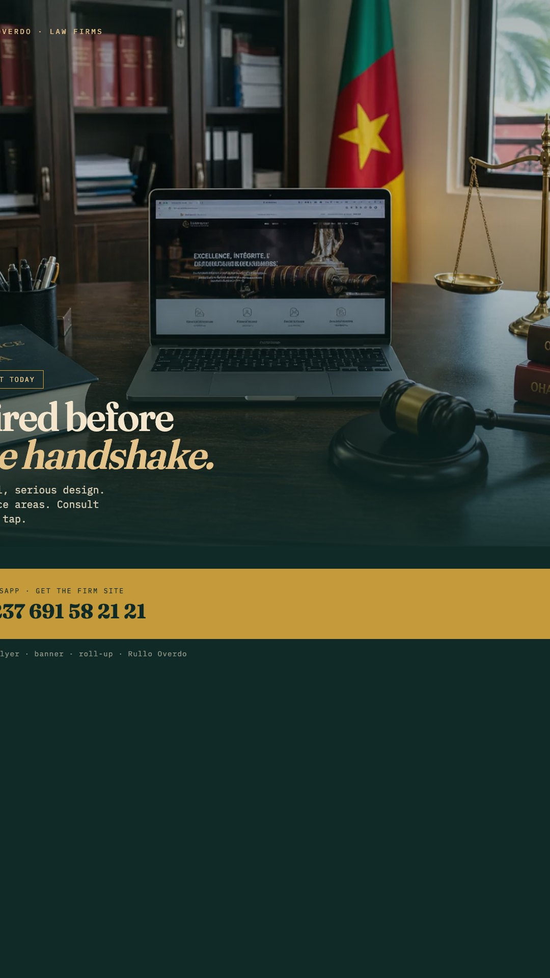
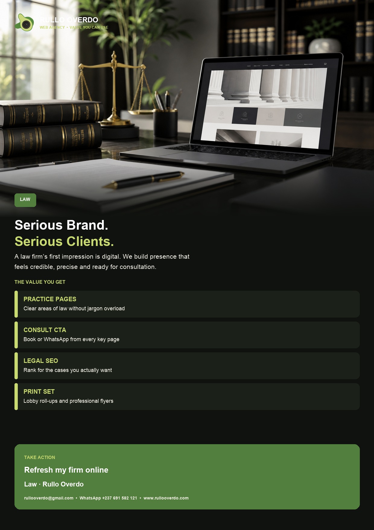
// Proof in the slider
If you need to get a law firm website that gets you hired, the problem is rarely a missing Latin motto. It is that a serious person cannot tell what you actually take, cannot request a consult without an email that dies, and lands on a template that looks like a nightclub. We design so they hire you before the handshake.
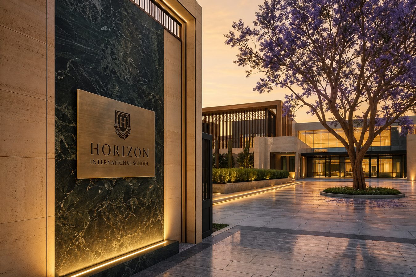
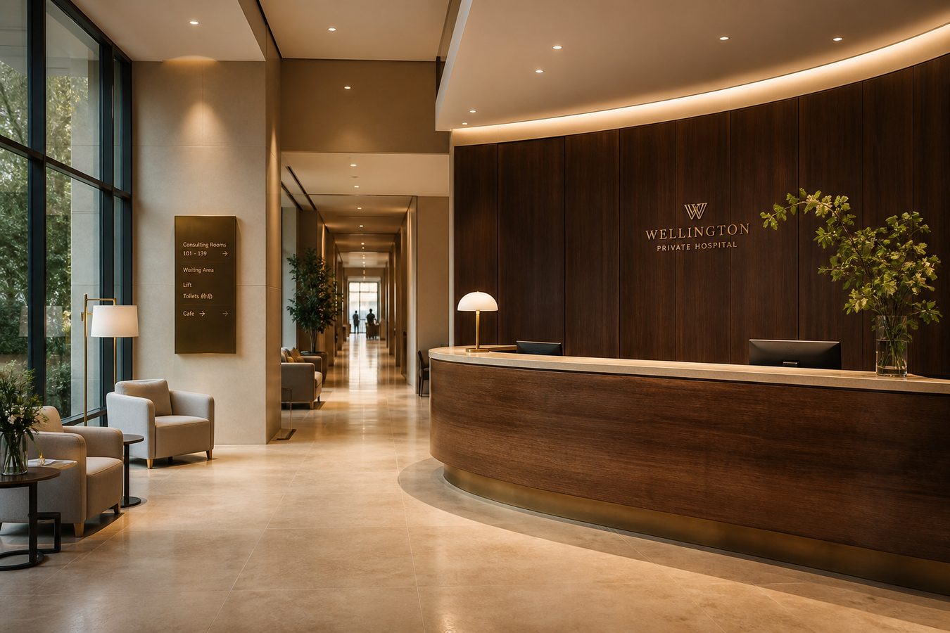
Slider: the office scene, the flyer, the banner, the lobby stand. Same line everywhere. Then get the firm site on WhatsApp.
Practice areas buried under “Welcome”. Stock columns. A contact form that asks for a life story before a time slot. Animation that does not match a cabinet. Clients who hire lawyers are busy and slightly afraid. Friction feels like disrespect.
We do not shout. We do not use gold 3D icons. We use type, space, and a photograph that looks like the work. Minimalistic, classic, modern — not playful. See the law flyer and banner already on this site.
“Excellence, integrity, justice” is not a practice area. Labour, family, land, commercial — named like the problem the client woke up with. Each area can be a short page with one consult CTA. That is SEO and honesty.
Email is slow in this market. WhatsApp with “I want a consult” is how people actually hire. We still can list an email. We do not make it the only button. Communication is the craft.
💬 Ornament fights credibility. The law flyer is photo, title, consult. Keep it. Print flyers that sell still applies — here “sell” means hire.
A calm site: who you are, what you take, where, WhatsApp. Optional: a short bio that does not read like a CV dump. Speed. Contrast you can read. Matching lobby print so the first visit already feels like the page.
Emerald and cream if you want the studio system; your colours if the cabinet already has them. We will not paste a bakery red onto a firm because a theme defaulted to it.
People search the problem: avocat droit du travail Yaoundé, land dispute Douala. We write those sentences on the right pages. Buy SEO as a follow-on if the site is already live and invisible.
Flyer they keep. Banner in the lobby. Roll-up for a conference table in the hall. Files: 86, 96, 108.
💬 Web design, UX, Web building. This page is the law-shaped brief.
Two practice areas you actually take. The city. Whether walk-ins exist. The tone of the current site if you have one — we will tell you if it is saving or sinking trust. A photograph of the office if it looks like the work; a generated scene if you need a placeholder until the shoot. Then we write: problem, proof, consult.
Partners often disagree on the homepage sentence. We pick one. “Hired before the handshake” is our studio line; yours might be quieter. It still must be a verb a client can do. If three partners want three mottos, the page will hire no one. That is not politics. That is UX.
Conferences and open days: a lobby stand with the same consult CTA as the site. Do not print a different slogan for the banner because the printer had clipart. See plan a campaign. If you only need the site, we still write it as if the stand exists — so next quarter does not rewrite the brand.
Linked from this page: hire a web designer, buy SEO for avocat + city, UX if people land and bounce, Web building if you are choosing a rebuild. The homepage law tile now points here so a stranger can go Guide → law → WhatsApp.
WhatsApp: “I want to upgrade my firm site.” Name two practice areas. We come back with hierarchy and whether print is worth it for your lobby. Related: firm SEO, hospitals (calm professional), Guide hub.
// Next step
Tell us who you are and what you need. We reply on WhatsApp.
Hire Rullo Overdo →// Keep reading
// Ready
Fast websites, SEO, banners, flyers and roll-ups — designed to be used.
WhatsApp +237 691 582 121