// Guide · UX
🧭 Get a user-friendly website
Fewer taps. Clearer type. A button that does what it says.
// Proof in the slider
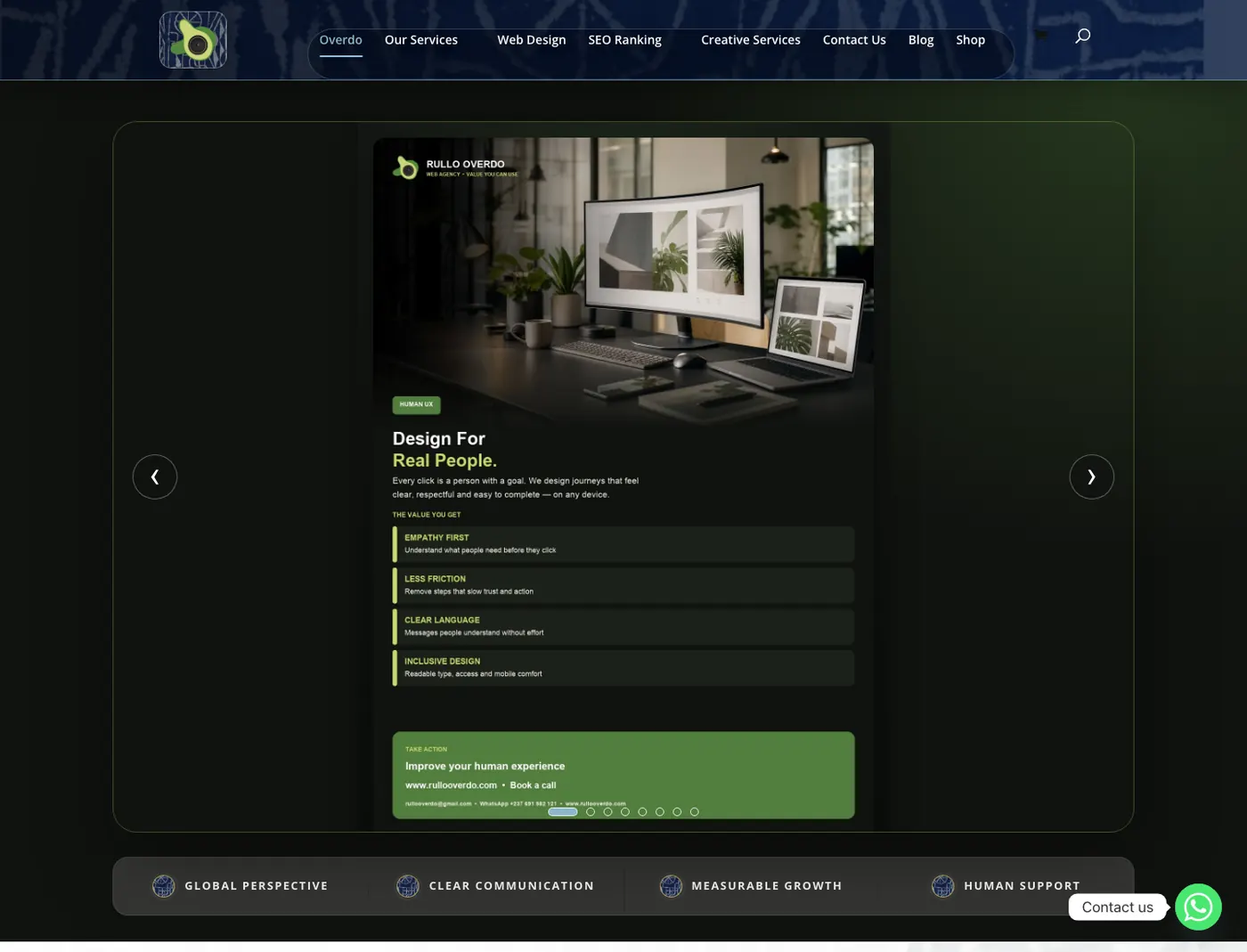
User experience is whether a real person can finish. Not whether a mockup looked clever. If you want to get a user-friendly website, you are asking for fewer taps, clearer type, and a button that does what it says. That is the work behind enrol in two taps, book in one tap, and lookbook to WhatsApp.
This guide is for anyone tired of sites that look expensive and behave like a maze. Pair it with web design (how it looks) and communication (what it says). Then hire us to improve the experience.
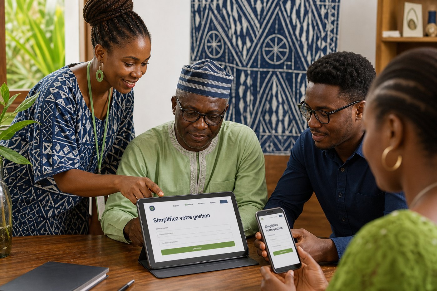
A parent on school Wi-Fi. A patient in a corridor. A guest who will not send another email to hold a room. We design for those people, not for a Behance shot. That means large tap targets, contrast you can read outdoors, and language at the level of the street — not the boardroom.
Inclusive design is part of this: type that scales, colour that is not the only signal, pages that work with a slow connection. Minimalistic UX is the same ethic: do not make someone hunt.
Home has a job: pick a direction. A service page has a job: understand and act. A gym page has a job: book a session. When a page tries to sell six things, it sells none. We write the job first, then place the photography and the CTA. See the gym and guest-house cases on Flyers and Portfolio — print and site sharing one path.
Accounts to view a price. Forms before a chat. Carousels that auto-advance while you read. Popups that cover the button. If it delays WhatsApp, it is usually wrong for this market.
Primary actions sit where a thumb reaches. Secondary links can wait. The WhatsApp chip is visible without scrolling on the hero whenever the offer is simple enough to ask now.
💬 A tap should feel like something happened: a page change, a chat window, a confirmation. Dead buttons train people to leave.
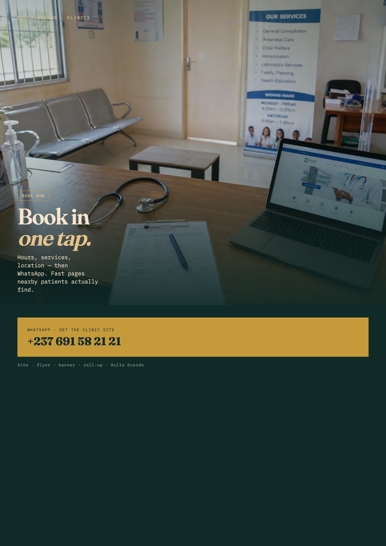
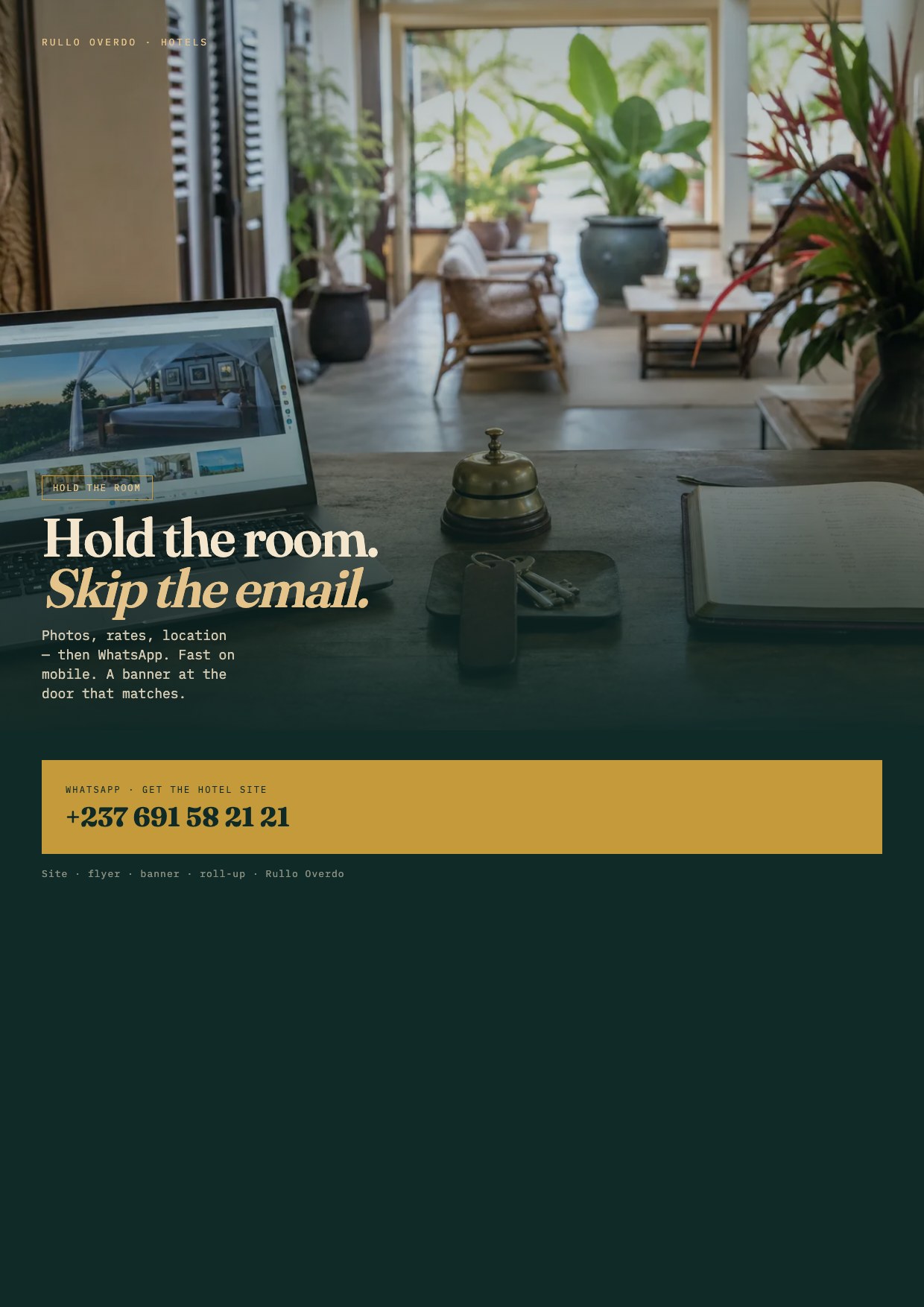
Schools need dates, fees, and a question button — see the school case and the enrollment flyer. Hospitals need wayfinding that matches the hall — find the ward. Law needs calm credibility — the firm case. Hotels skip email ping-pong. Bakeries show today’s bake. Malls show who is open. Shops show what you sell and when. Fashion shows the garment, then chat. Furniture shows the mattress and the cities you deliver to.
We do not invent a different UX religion for each. We change the content and the proof. The skeleton stays: offer, proof, ask.
We read the page on a real phone. We time the first tap. We ask: can someone who has never heard of you still finish? SEO then has something worth ranking. Campaigns then have a landing page that does not leak. If you plan a campaign, start from the campaign guide so ads do not send traffic into a broken path.
Those three words on every industry card are not decoration. Design is how it looks. UX is whether they finish. Speed is whether they wait. Hire all three. A beautiful slow maze is still a maze.
A flyer with no price is a broken checkout. A roll-up with eight paragraphs is a broken mobile menu. We treat print as a small screen: one job, one ask. That is why the industry flyers use the same titles as the site, and why gym packs and dentist hours sit on the photo. If you get a user-friendly website but hand out a cluttered flyer, you trained people to ignore you. Order both from the same brief — flyers, banners, roll-ups.
Forms: we avoid them unless the law or a hospital workflow truly needs a record. A WhatsApp tap is a lower-friction form. When a form is required, we ask only what we will use, we label every field, and we never block paste. Accessibility is not a badge. It is whether a tired person can still book. Contrast, tap size, language, and load time are the four checks we run before we call UX done.
Motion stays purposeful. A slide can change. A button can lift. Nothing should hide the CTA or fight the photo. The home hero already rotates live websites — that motion has a job: show proof. If animation is only decoration, we cut it. Minimalistic UX is often just refusing to entertain ourselves.
The live URL. Who uses it (parent, patient, guest, shopper). The one job they must finish. Screenshots of the print you already hang, if any. That is enough. We will tell you whether the problem is copy, layout, speed, or a missing WhatsApp chip. Then we fix that, not a twelve-page redesign nobody asked for. If the site cannot be saved, we say so and point you to Web building to get a user-friendly website from a clean skeleton.
Walk the studio site as a test: Home should show proof in seconds. Web building should let you pick a type. Banners, Flyers and Roll-ups should filter or scan without a hunt. Portfolio should prove the work. Guide should explain it. If any of those paths fail for you, they will fail for your clients — tell us. That is how we test our own UX, and how we will test yours.
Live examples to copy the feeling, not the colours: Her Aura (lookbook to chat), Confort Matelas (catalogue to order), DHL Maison Blanche (ship, pickup, track). None of them hide the next step. That is the bar when you hire us to improve the experience.
WhatsApp: “I want to improve the experience” or “I want a user-friendly website”. Send the URL. We will tell you whether you need copy, layout, speed, or a full rebuild. Then we ship. Related: Web building, hire a web designer, buy SEO.
// Next step
Tell us who you are and what you need. We reply on WhatsApp.
Hire Rullo Overdo →// Keep reading
// Ready
Fast websites, SEO, banners, flyers and roll-ups — designed to be used.
WhatsApp +237 691 582 121