// Blog · August · Informational
✨ Improve website user experience
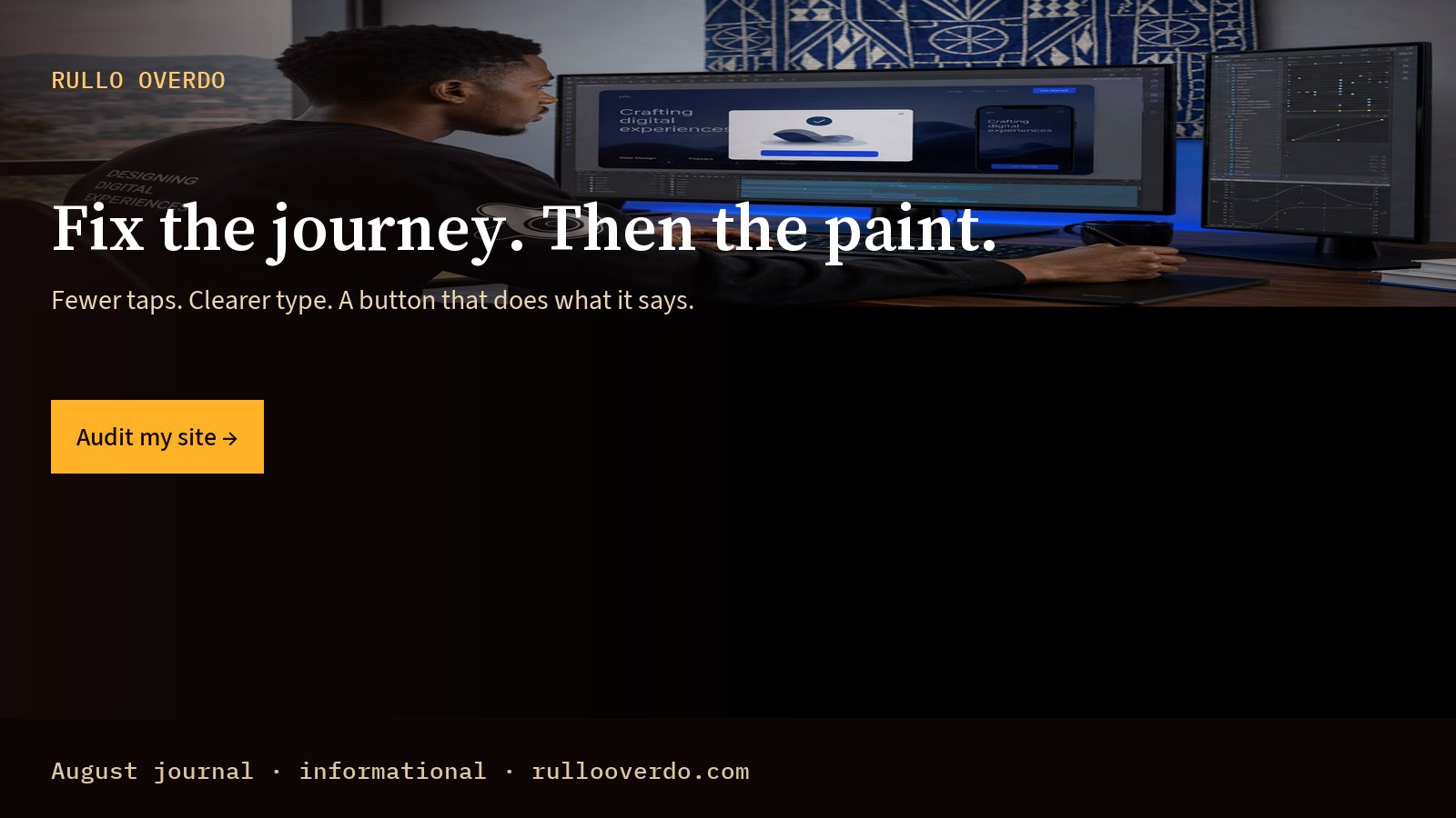
Fewer taps. Clearer type. A button that does what it says.
// 2026-08-03 · Informational intent · ~1000 words
This guide answers what people search when they want to understand improve website user experience — then points to work you can hire. At Rullo Overdo we design for humans first: parents booking schools, patients finding wards, guests holding a room, owners who chat on WhatsApp. Improve Website User Experience is not a trend deck — it is how your page behaves when someone is tired, late, or on slow data.
If you only remember one line: one job per page, one clear next step. That idea links web building, SEO, and print (flyers, banners, roll-ups). It also threads through our August journal — start with Hire a web designer in Yaoundé, then Get a website redesign quote.
People do not experience “design systems” in the abstract. They experience whether the type is readable in sunlight, whether the phone number is tappable, whether the photo matches the room they will walk into. When improve website user experience is weak, trust leaks. When it is strong, the same visitor finishes the task and remembers you kindly.
In Cameroon and across the diaspora, search is personal. Someone types website UX tips or user-friendly website because a real need showed up today. Your page should answer that need in plain language, then offer a human channel — usually WhatsApp — without trapping them in a form maze. That is the heart of reduce bounce rate done well.
Write for the person, not the persona spreadsheet. A mother comparing schools. A guest comparing linen. A shopper deciding whether the boutique is worth the trip. Your layout should respect their time: hero, proof, path. Related reading: Inclusive design for real users.
Calm photography, honest copy, and generous space lower anxiety. Anxiety is a conversion killer. If your brand sounds loud everywhere, nothing sells — one accent, one message, the rest quiet.
Real photos of your space beat stock. Clear hours beat poetry. Named services beat vague “excellence.” Pair that with SEO so the right strangers find you.
We use informational queries (learn), commercial queries (compare/hire), and transactional queries (quote/order/book) so the journal helps both readers and buyers. This article leans informational while still linking the full path.
Our studio method is simple enough to ship: (1) name the human job, (2) strip the page to one primary action, (3) match print and site language, (4) measure whether people finish. For improve website user experience, that means reviewing hierarchy, type, contrast, mobile thumb reach, and the WhatsApp handoff.
We open with a short conversation on WhatsApp — not a discovery workshop that bills for theatre. You send screenshots or photos. We reply with what is broken and what to ship first. That same rhythm works for web building projects and for print campaigns.
Most sessions start on a phone. Buttons need height. Type needs contrast. Images need compression without looking cheap. If your “desktop masterpiece” fails on 4G, it fails the human. Deep dive: mobile-first patterns in our August series and the UX guide.
A flyer that shouts a different offer than the homepage confuses the room. We align verbs: Book. Order. Enrol. Visit. See flyers and banners when the street and the screen must agree.
Clean headings, descriptive alt text, fast HTML, and honest titles help both Google and people. SEO-friendly design is not stuffing — it is structure. Hire SEO when ranking is part of the brief.
Too many CTAs. Hero text that fights the photo. Grey type on grey. Carousel noise. Stock smiles that do not match Cameroon light. Forms before value. These are not “style opinions” — they are friction. Friction is disrespect.
Another common miss: treating improve website user experience as decoration after development. Involve design and UX at the start. If you already shipped, book a review — see our audit and quote posts in this August index — then fix the top three issues before redesigning everything.
First: clarity and speed. Second: hierarchy and type. Third: photography and brand polish. Fourth: expansion (new pages, campaigns, roll-ups). That order protects cash and keeps humans moving.
Informational readers: keep learning with Hire a web designer in Yaoundé and Get a website redesign quote. Commercial readers: compare our web building and SEO pages, then message us. Transactional readers: use the WhatsApp button with a ready sentence — quote, audit, order print, or start a project.
Prefer email or a form? Use contact. Prefer standing print for an event next week? Order roll-ups with the same headline as your hero.
Small UX fixes can ship in days. A focused redesign takes clearer scoping. Print often runs in parallel once the message is locked. We tell you which lane you are in before work starts.
International finish without fake accents. Local honesty without looking cheap. Human photos. Calm type. Gold for action, never for decoration alone.
We will not bury you in jargon. We will show the before/after in language owners understand. And we will leave you with pages people can finish.
Improve Website User Experience means shaping your site and print so a real person can understand, trust, and finish a task without friction — on the phone they already hold.
It is written primarily as a informational piece, while interlinking informational guides, commercial service pages, and transactional WhatsApp CTAs so the full journey stays inside rullooverdo.com.
Yes. That is the point of a human studio: web building, SEO, flyers, banners, and roll-ups share one voice.
Tap WhatsApp with a short brief, or open contact. For August reading next, try Inclusive design for real users.
// Next step
Design, UX, and print with a human pulse. Tell us who you serve.
Audit my site →// Keep reading · August